cultivate
Led the design and planning for SePRO booth at Cultivate '24.

the problem
Bring the Past to the Present
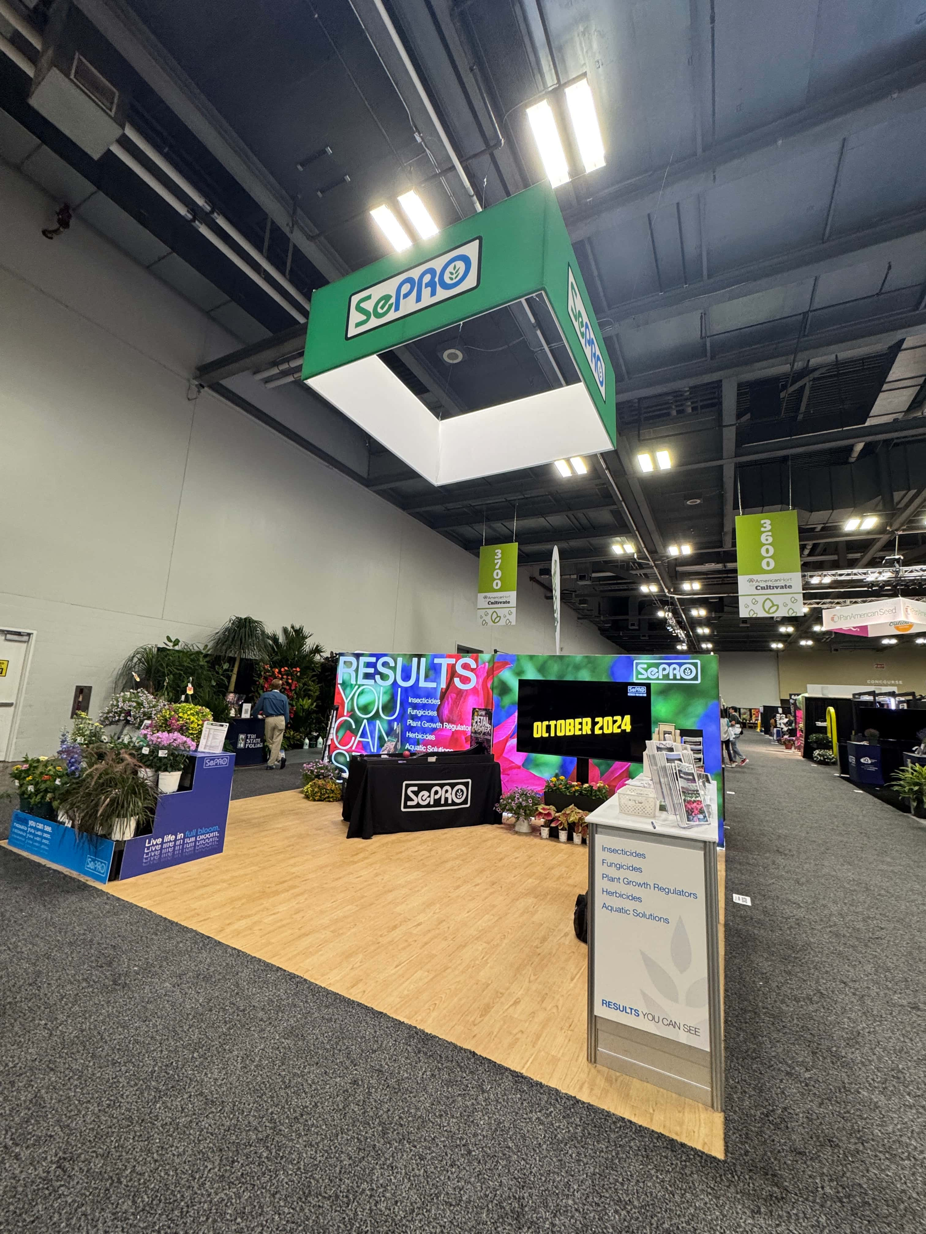
The first brainstorming sessions with the design team and portfolio leader focused on creating a booth that was new and different from anything SePRO had done before. Key phrases like “clean and simple,” and “red, white, and blue” guided the design. The aim for simplicity was to counter previous years’ designs. Those designs were typically slapped-together signage. The red, white, and blue theme hinted that SePRO is made in America. We aimed to showcase an eye-catching booth. It could engage a viewer and make them want to learn more about SePRO.
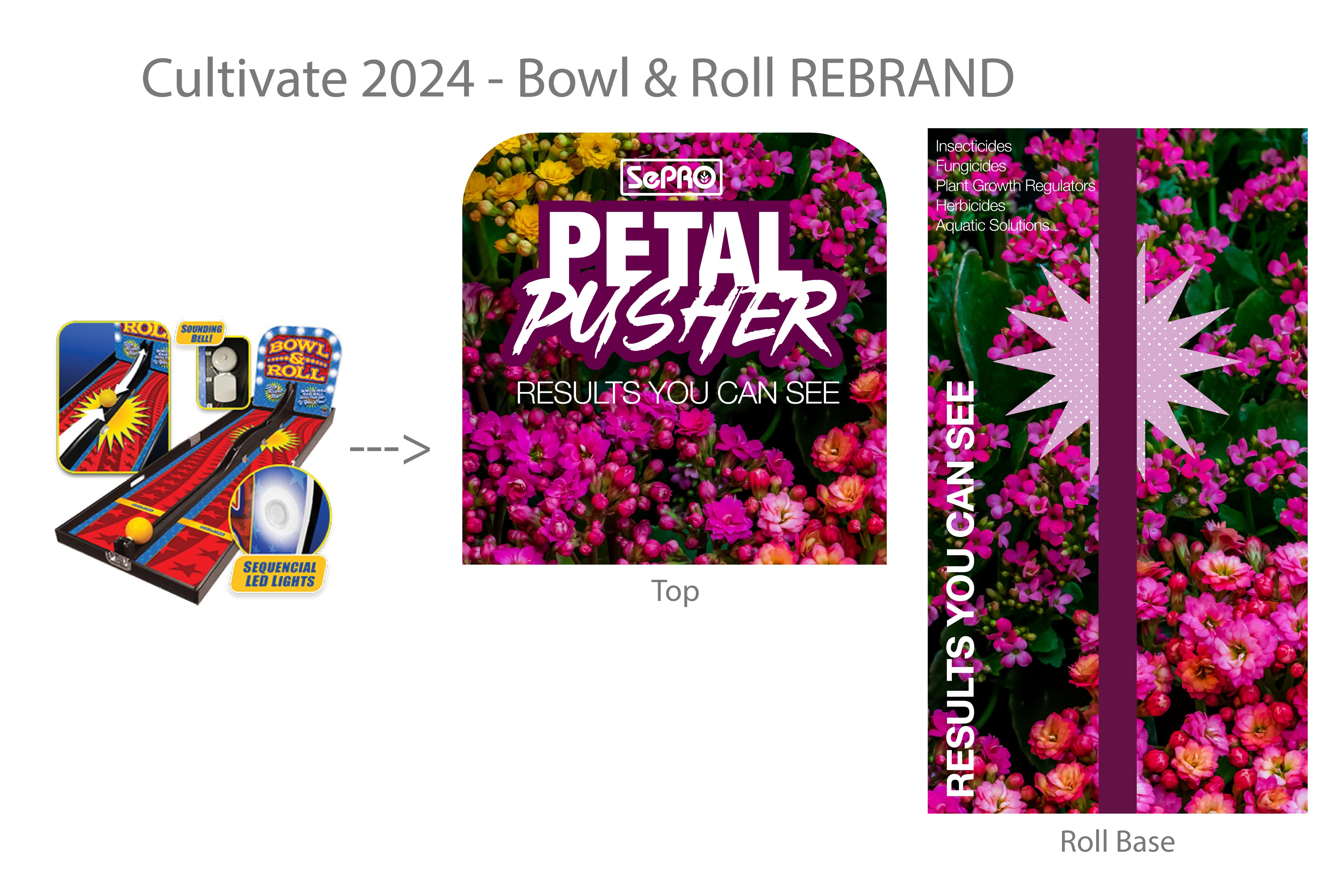
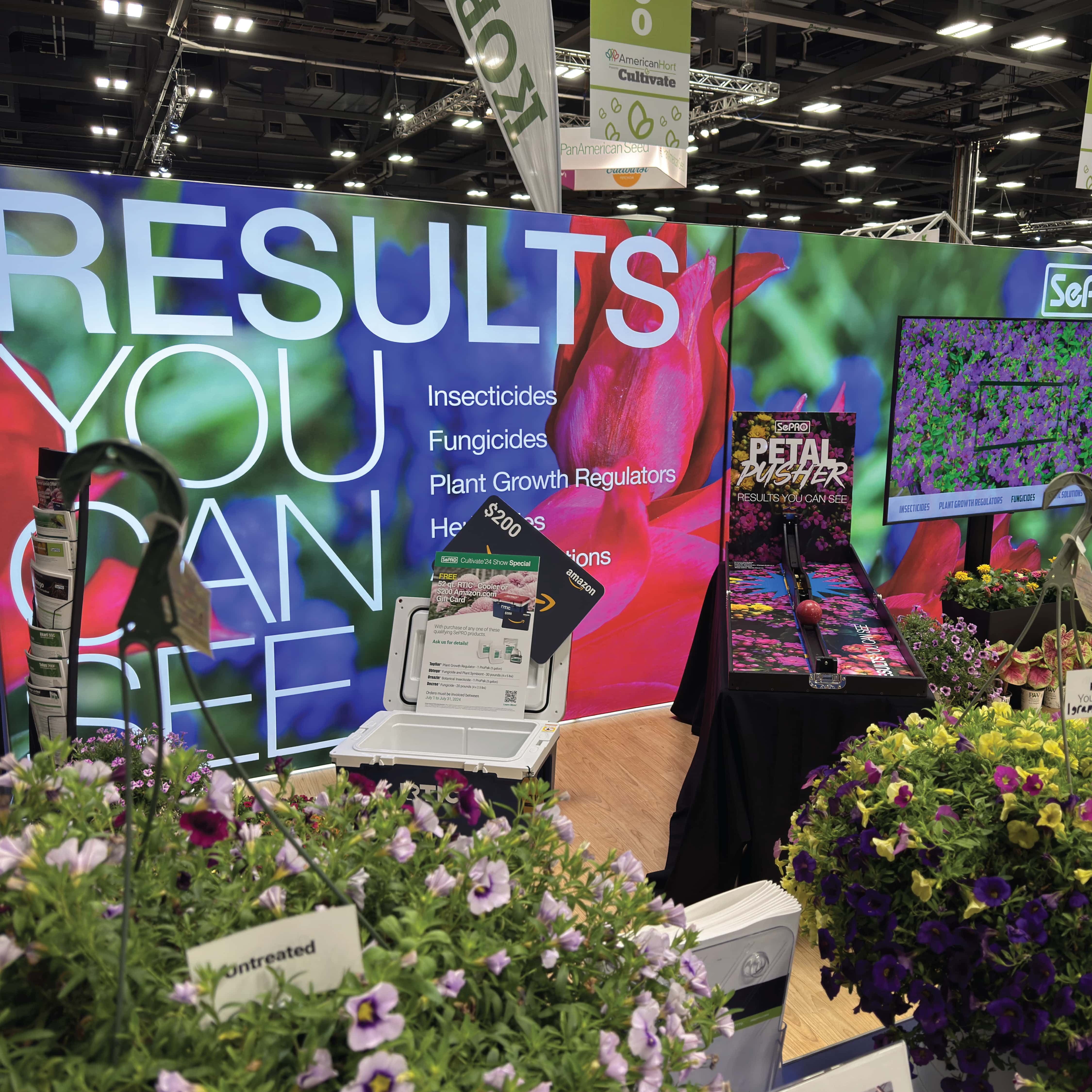
We explored visuals associated with classic Americana. This means bowling and baseball. We wanted to achieve a blend of “nostalgia” and “modern”. Gradients and textures were incorporated to further enhance the design’s depth. Leveraging a previously successful bowling-themed carnival game, we repurposed it into an all-ages game for the booth. The combination of ringing sounds and flashing lights proved to be a crowd-pleaser.
the process
Branding a Booth
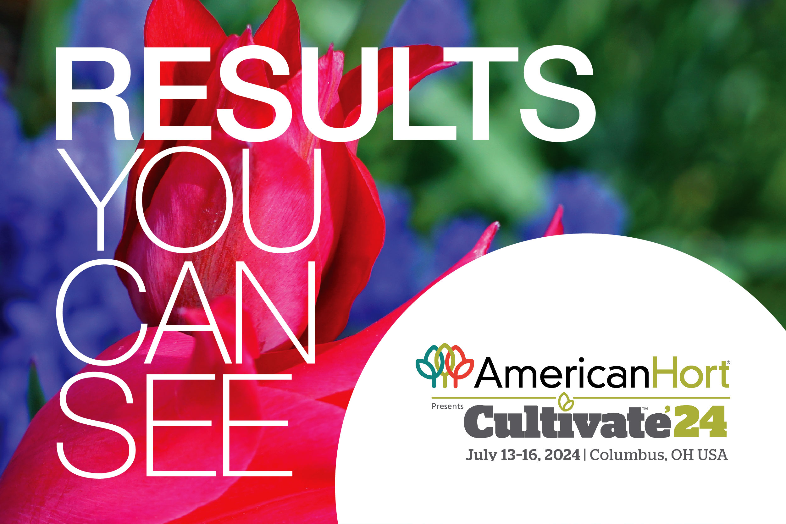
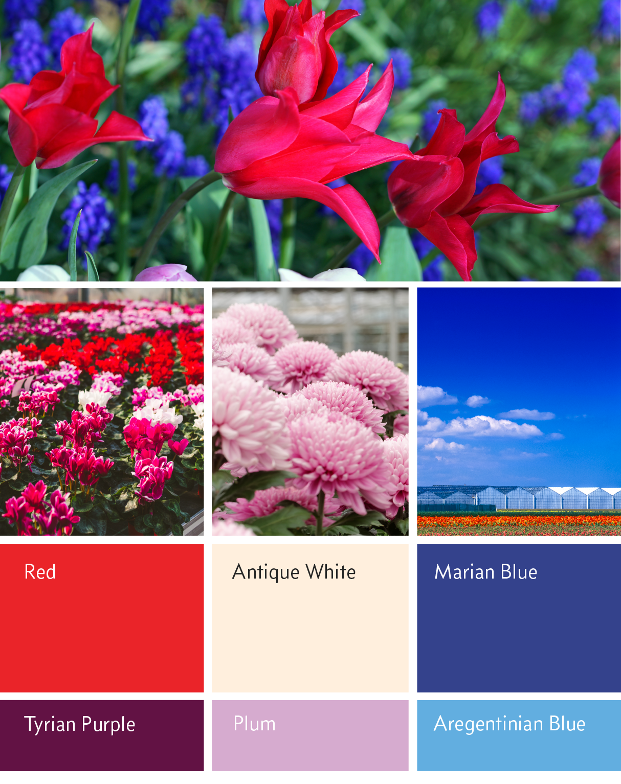
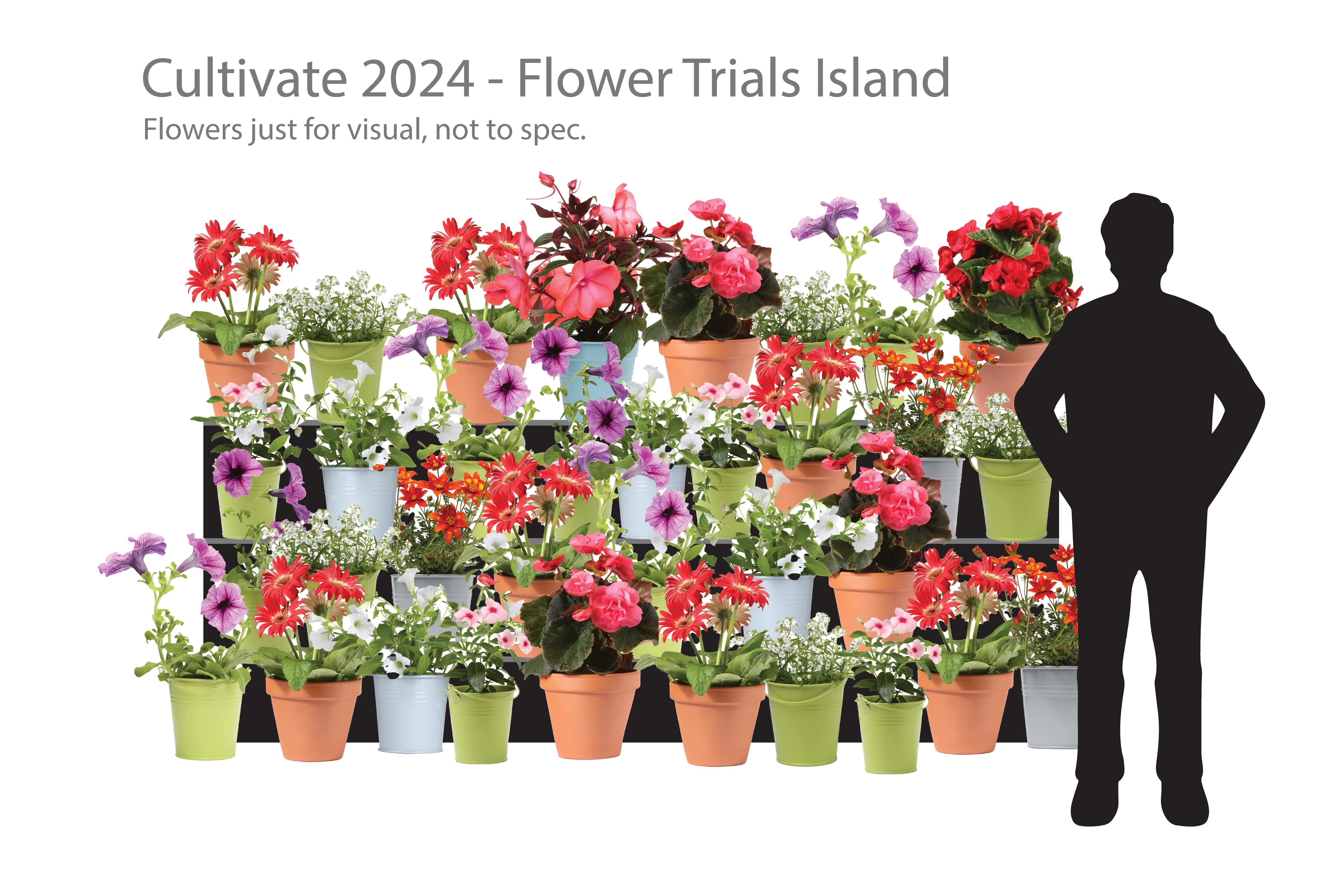
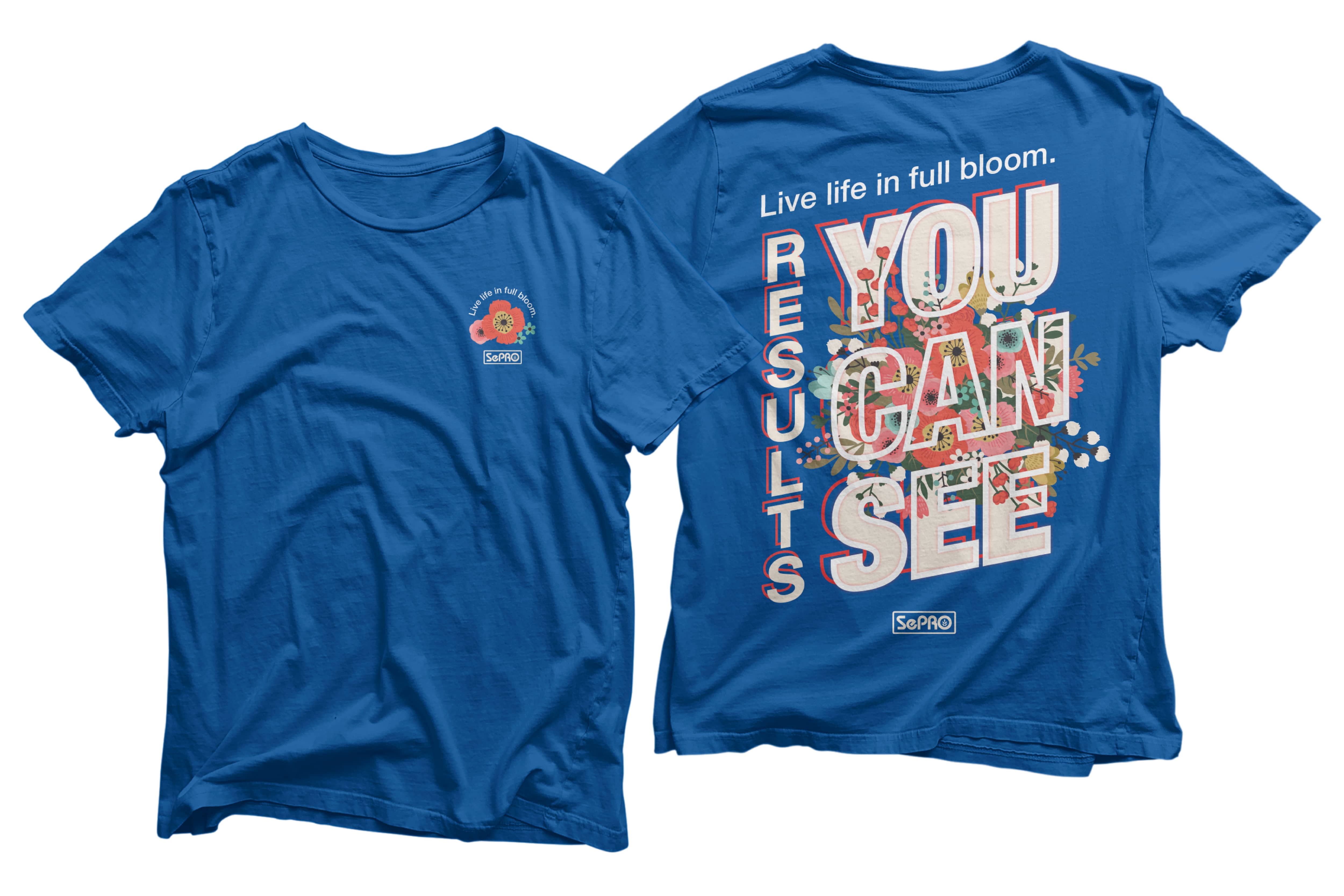
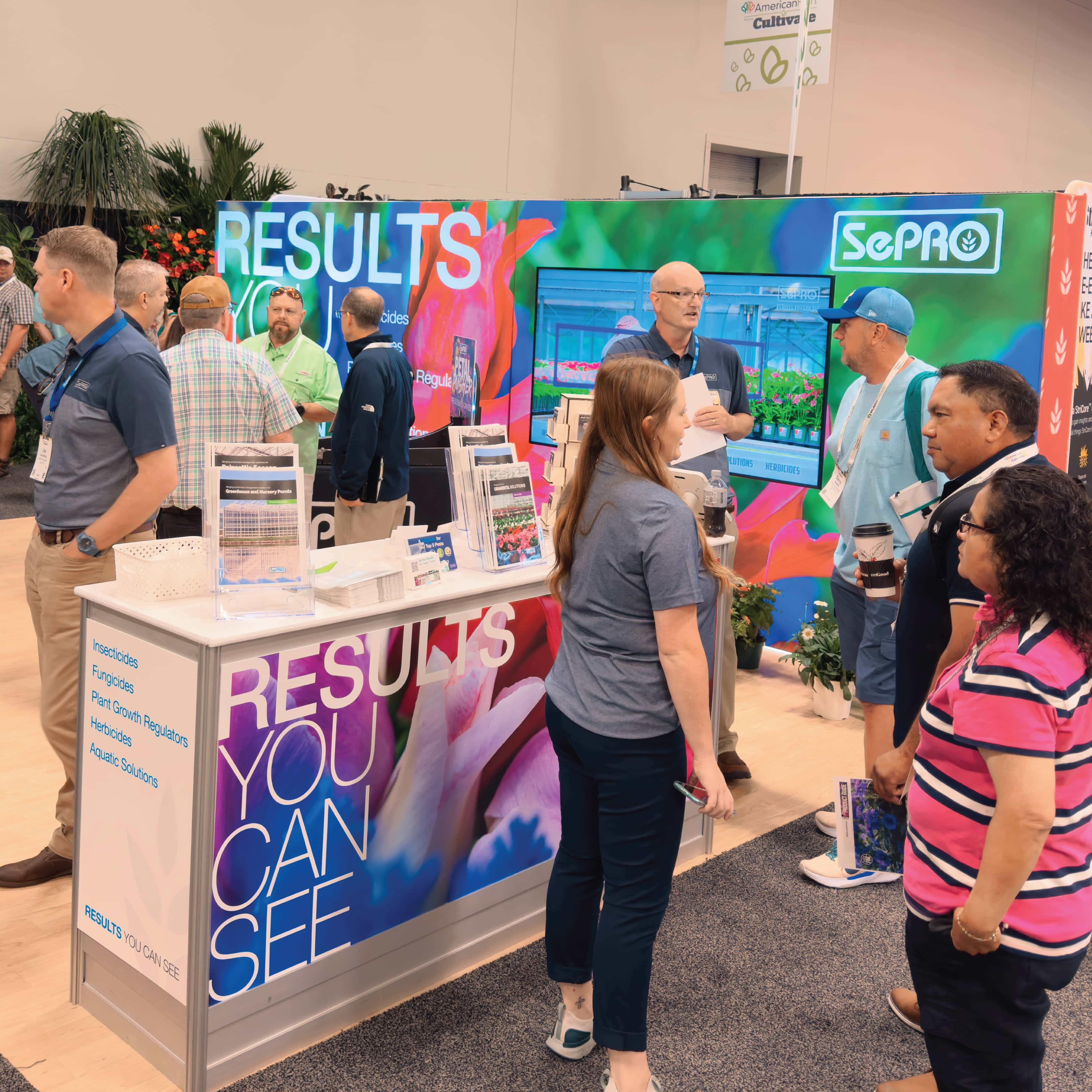
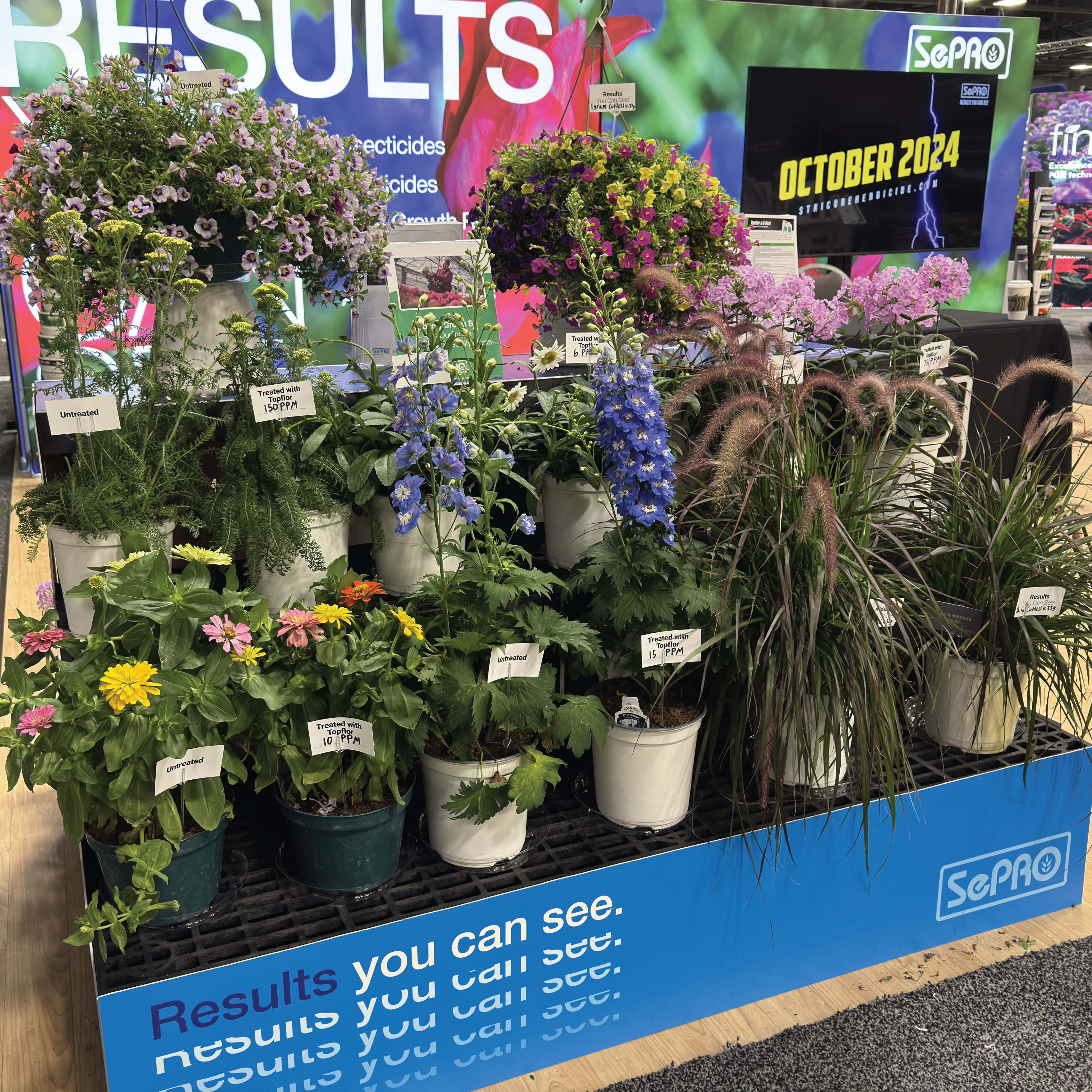
The previous year’s booth design served as a starting point for improvement. We aimed for a cleaner, more open layout. It helped people interact with potential clients. The final booth design embodied our “Modern but Nostalgic” theme perfectly. High-resolution, evocative floral imagery featuring vibrant red, white and blue flowers created a bright environment for visitors. These visuals were punctuated with clean, modern lines and pops of text.
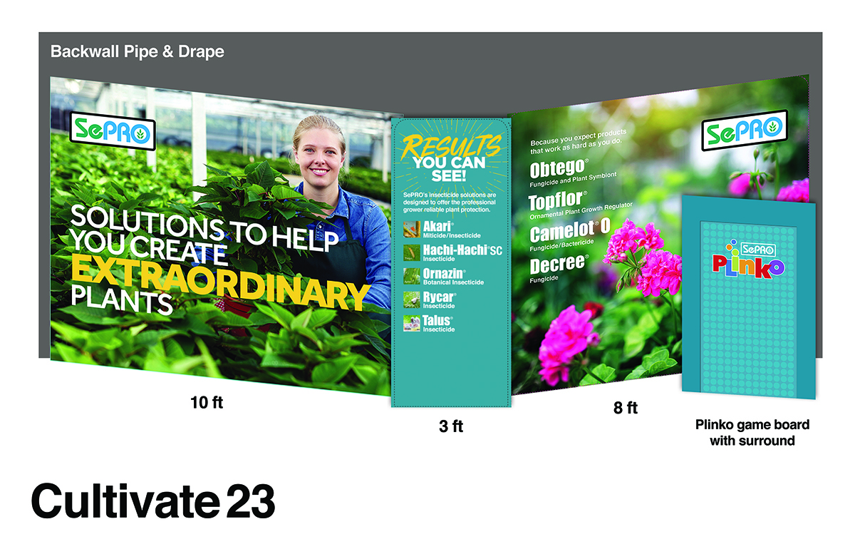
In our meetings with the team and portfolio leader, we found a big challenge. It was the huge number of products and solutions that SePRO offers. SePRO has many products to promote. Showing them all at a trade show can overwhelm attendees. To fix this, we decided to use a video solution, which also played into the modernity of the booth. It communicates the brand’s breadth without overwhelming visitors.
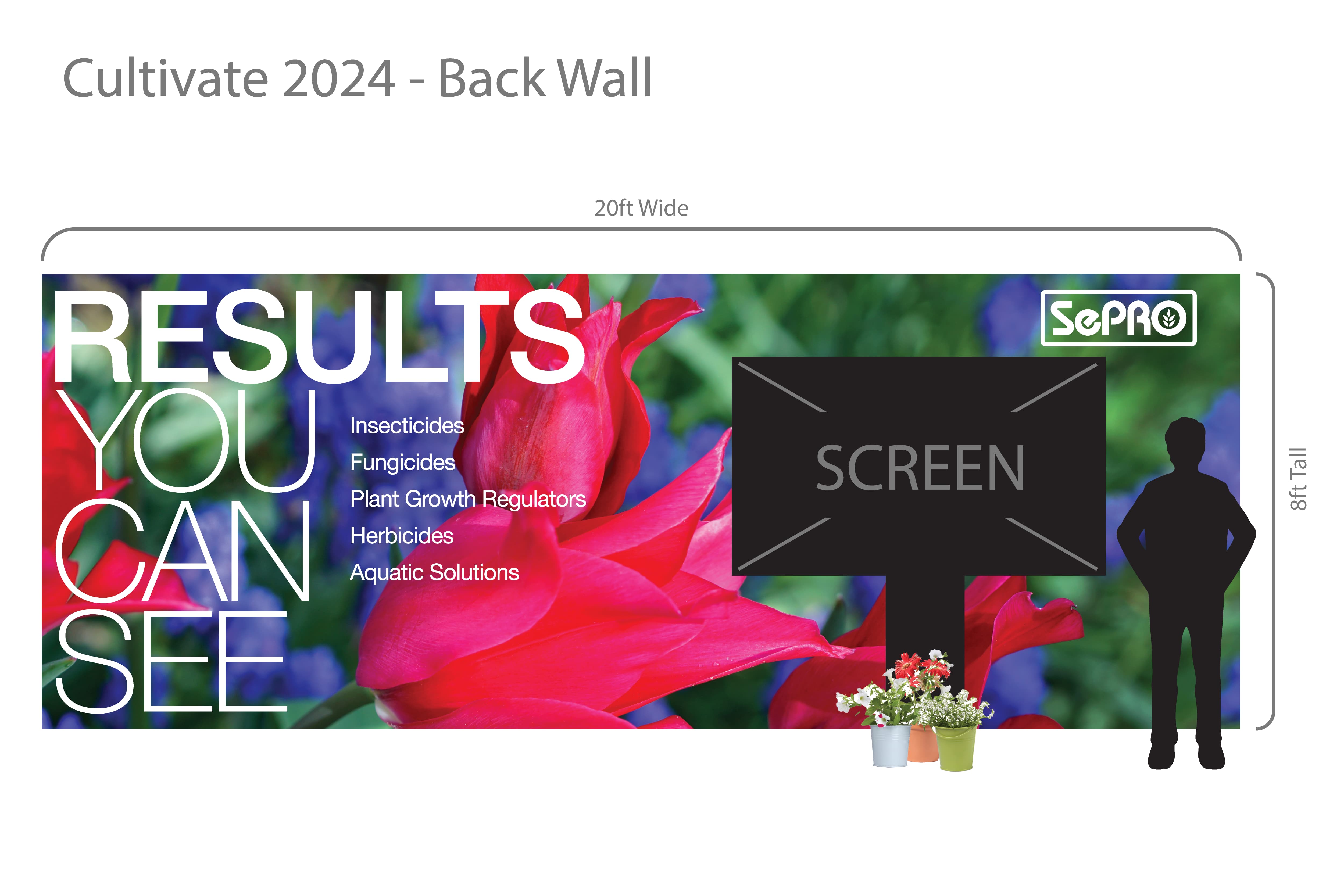
We developed a 15-minute video that played on loop within the booth. The video featured short, engaging stories. They highlighted each of the company’s relevant key products and solutions. We offered a variety of extra materials for each product to go with the video. They let attendees take away detailed info. To match the shift to online info, we also put all product details online. This let attendees access it after the show without carrying around paper the entire show.
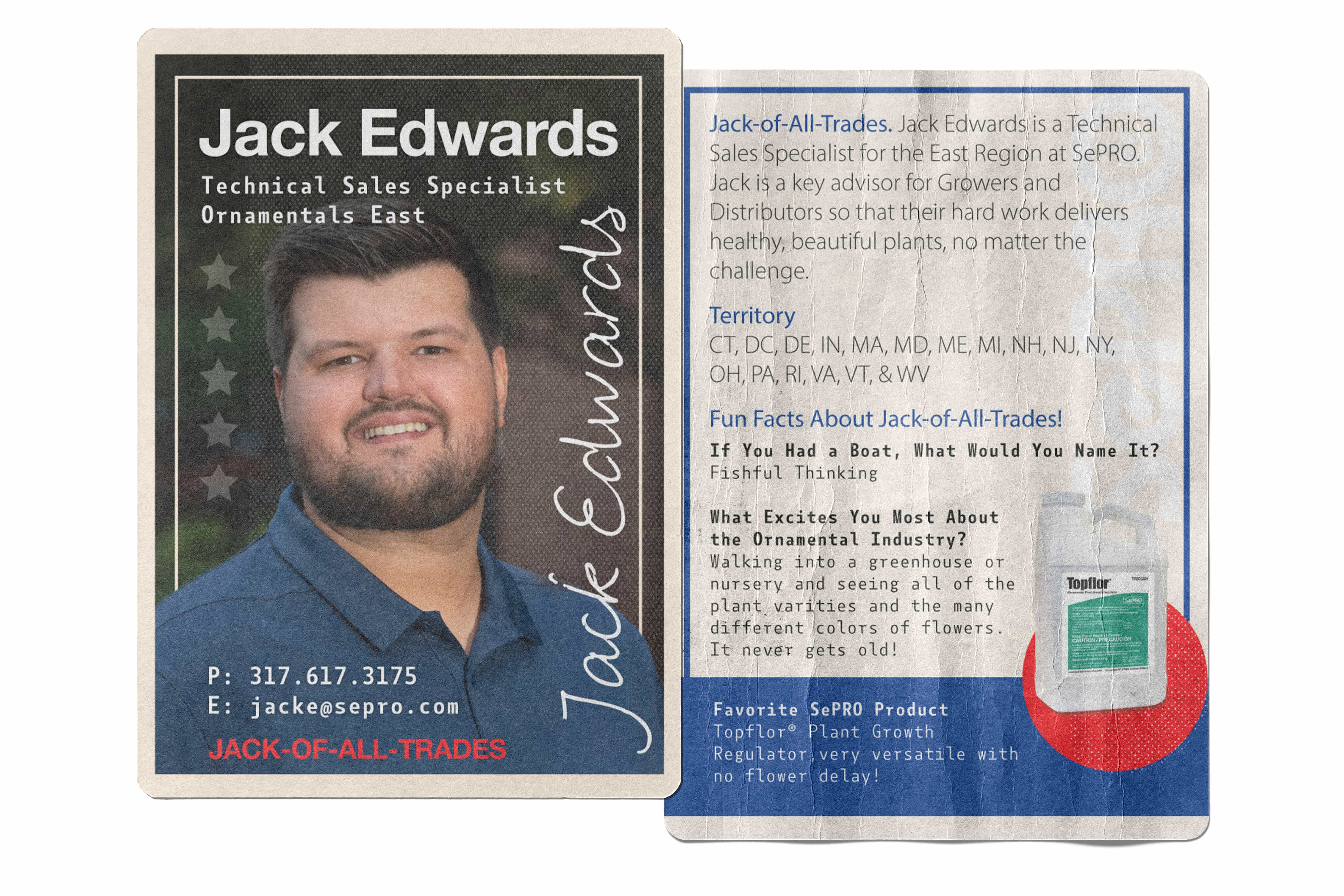
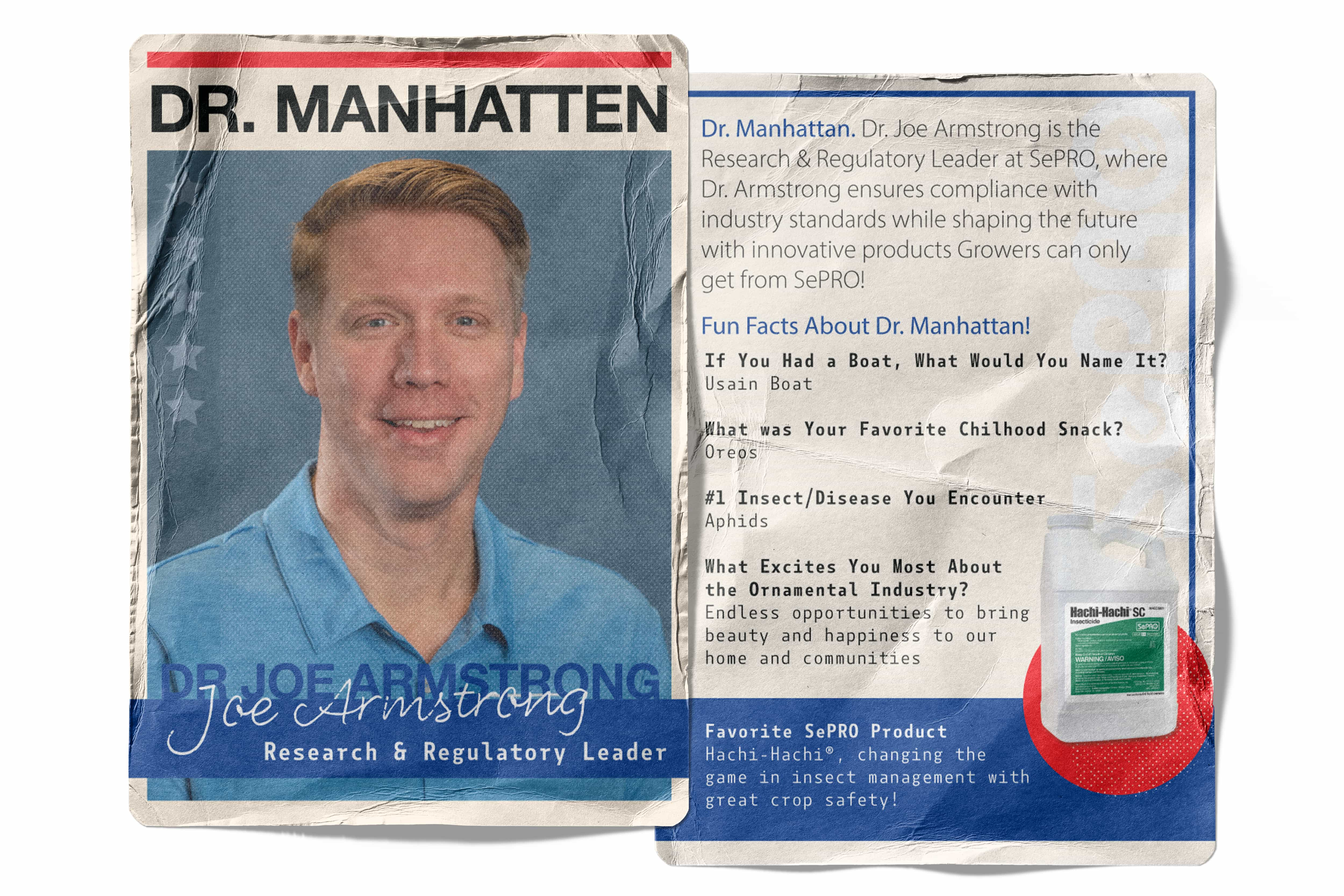
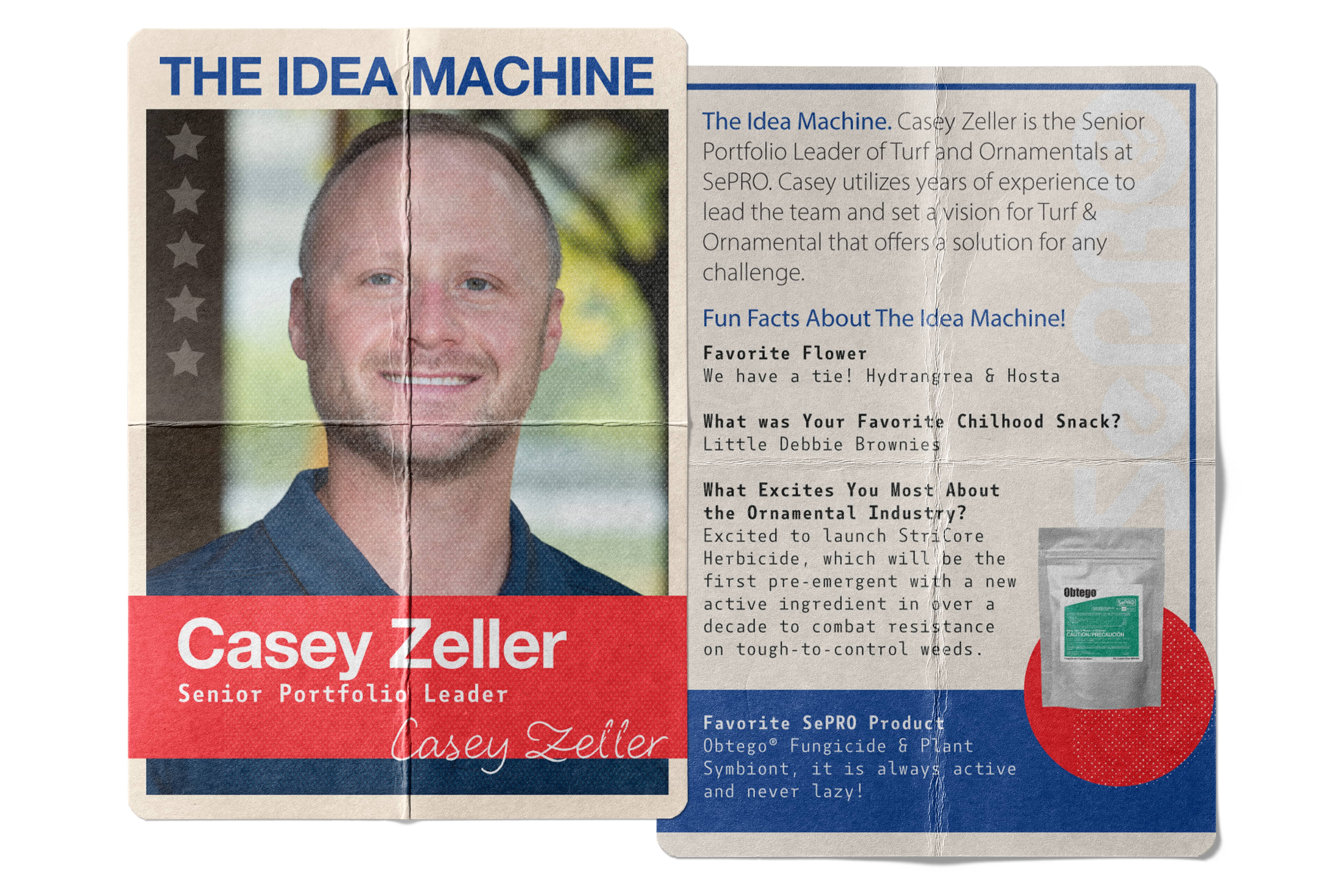
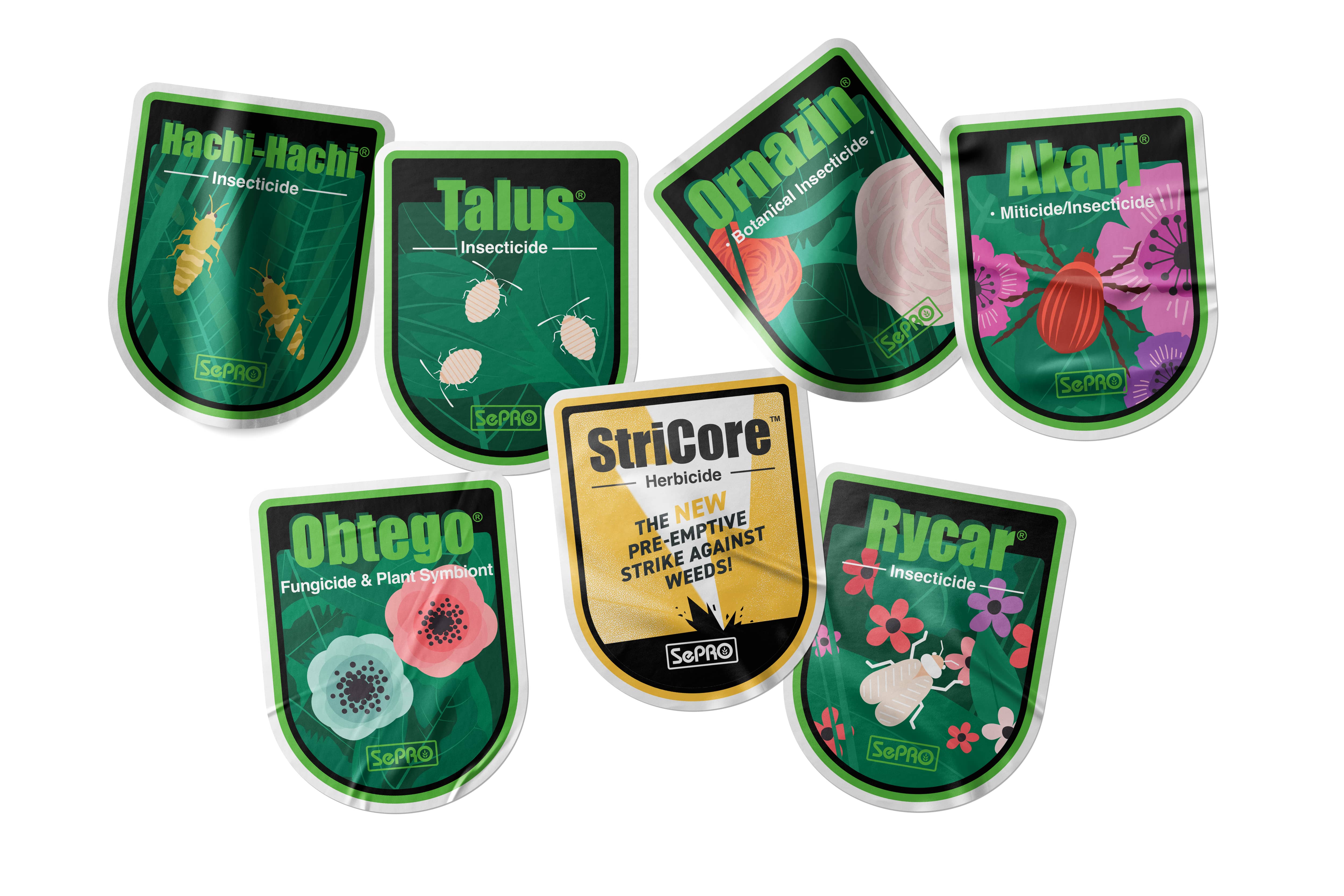
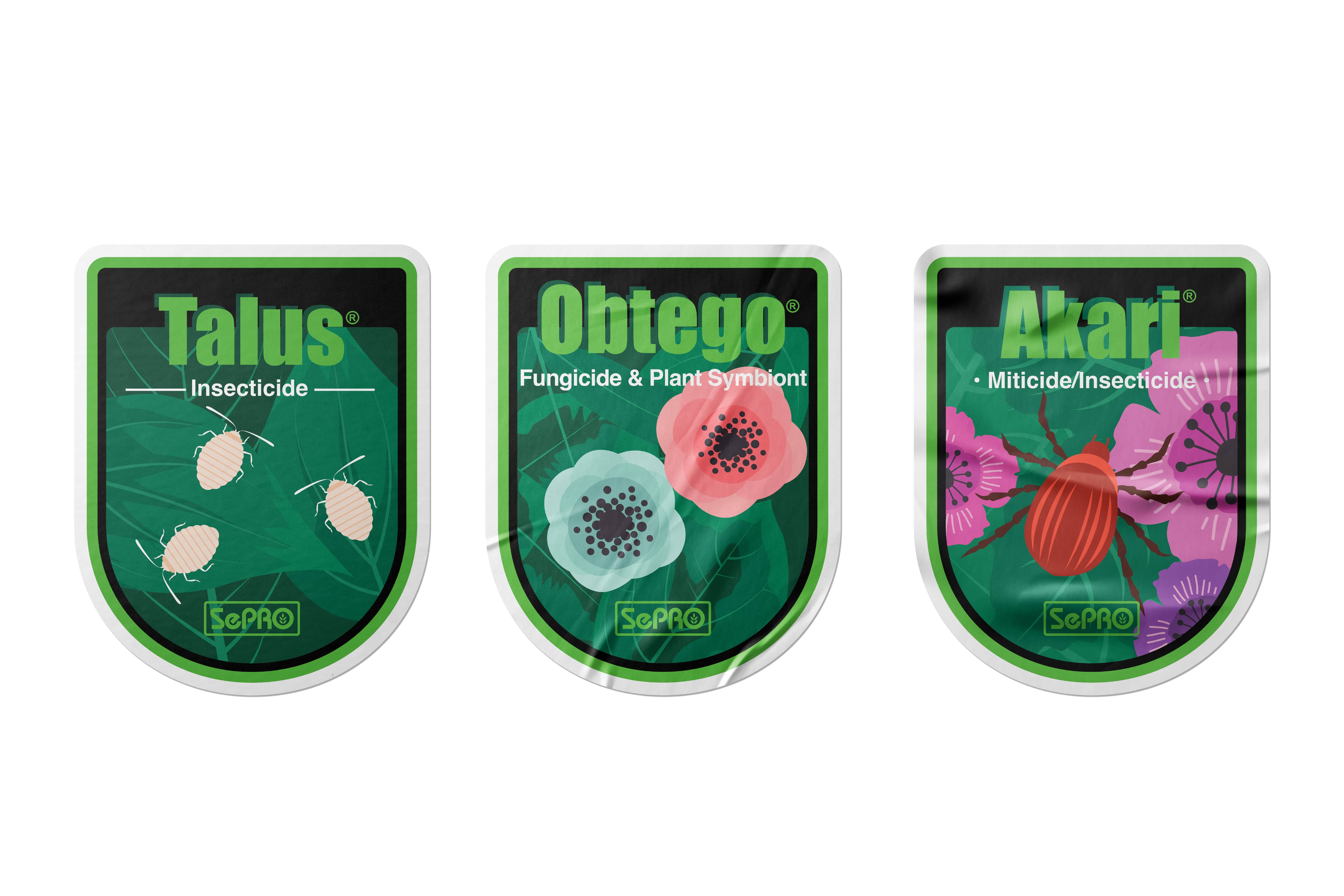
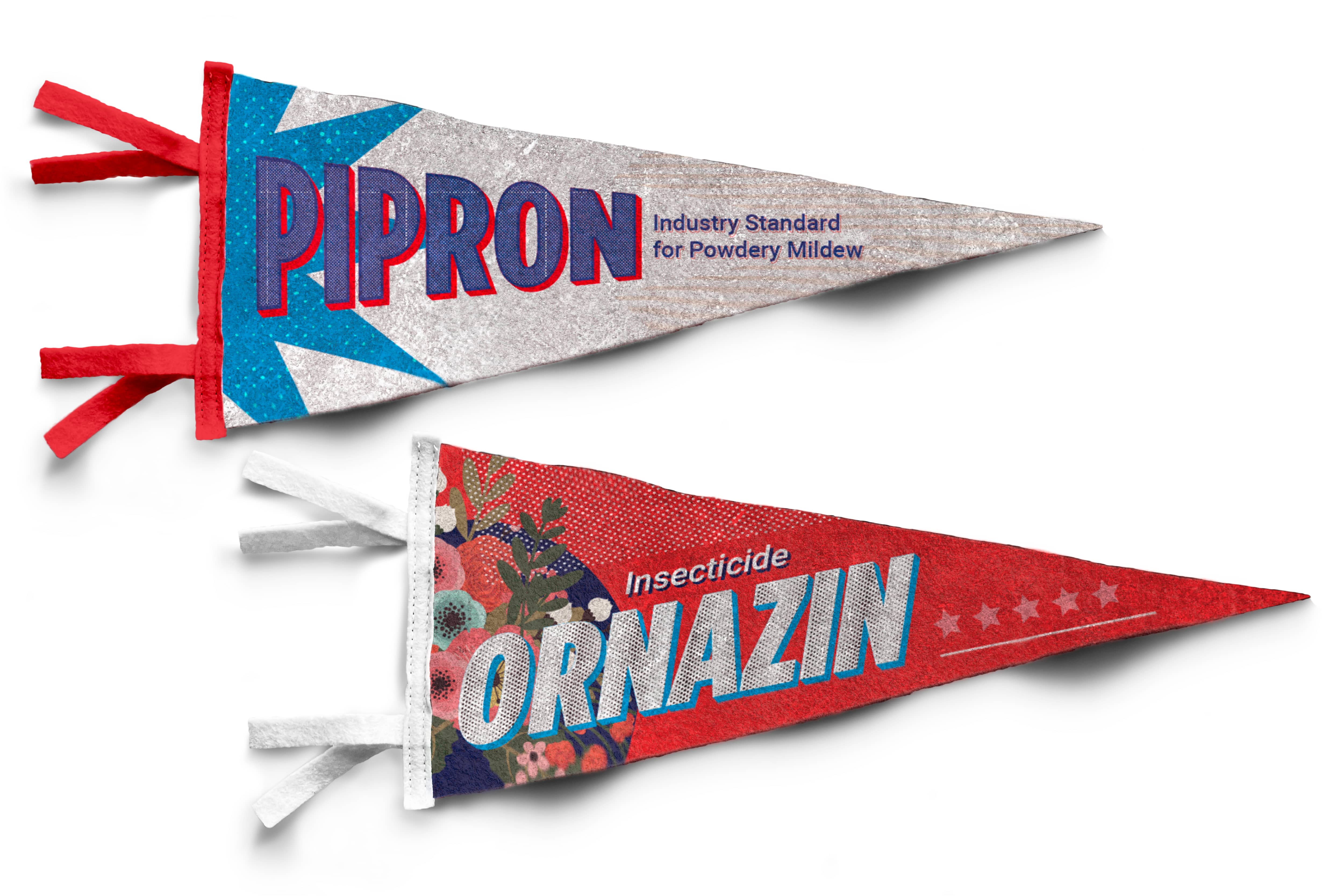
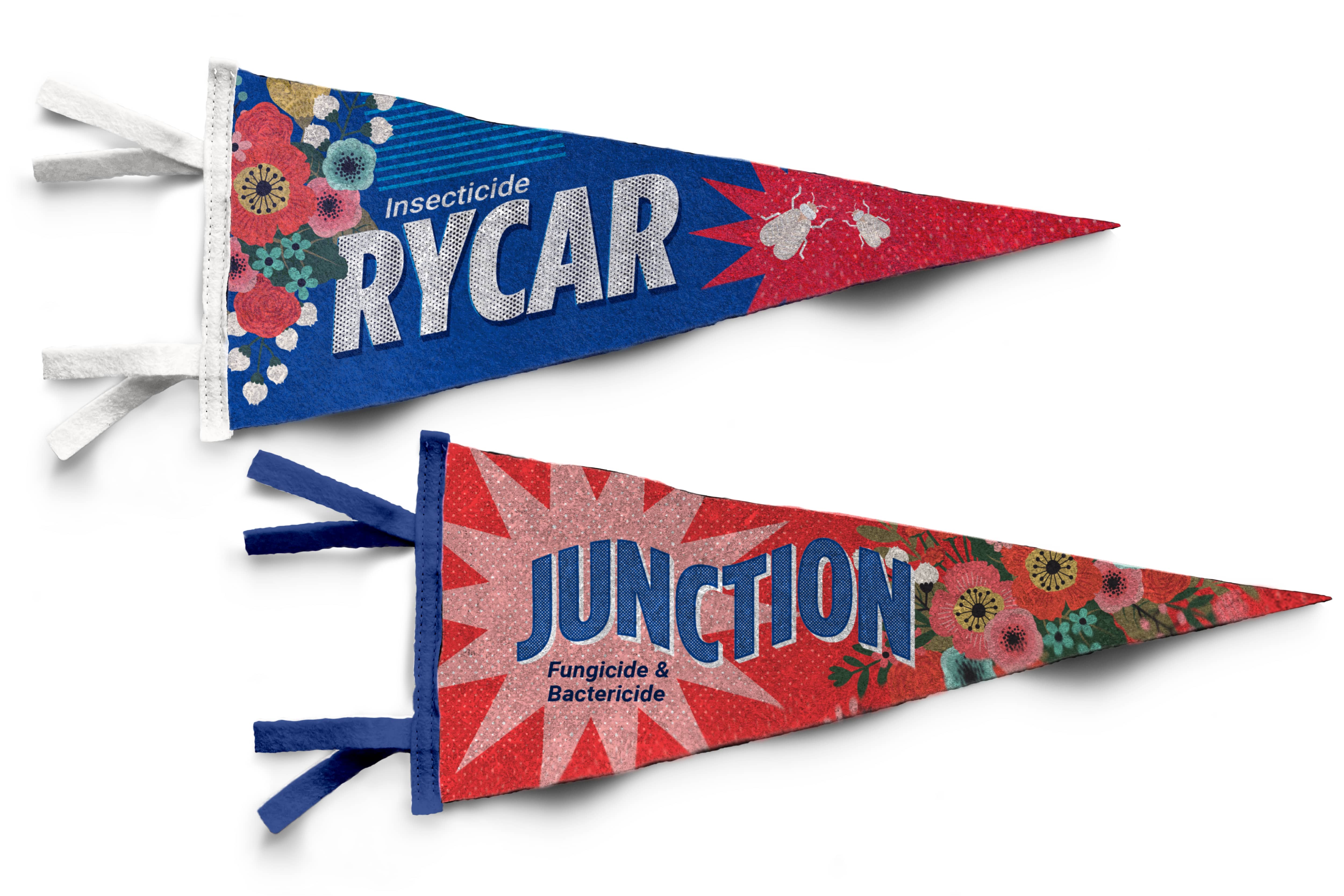
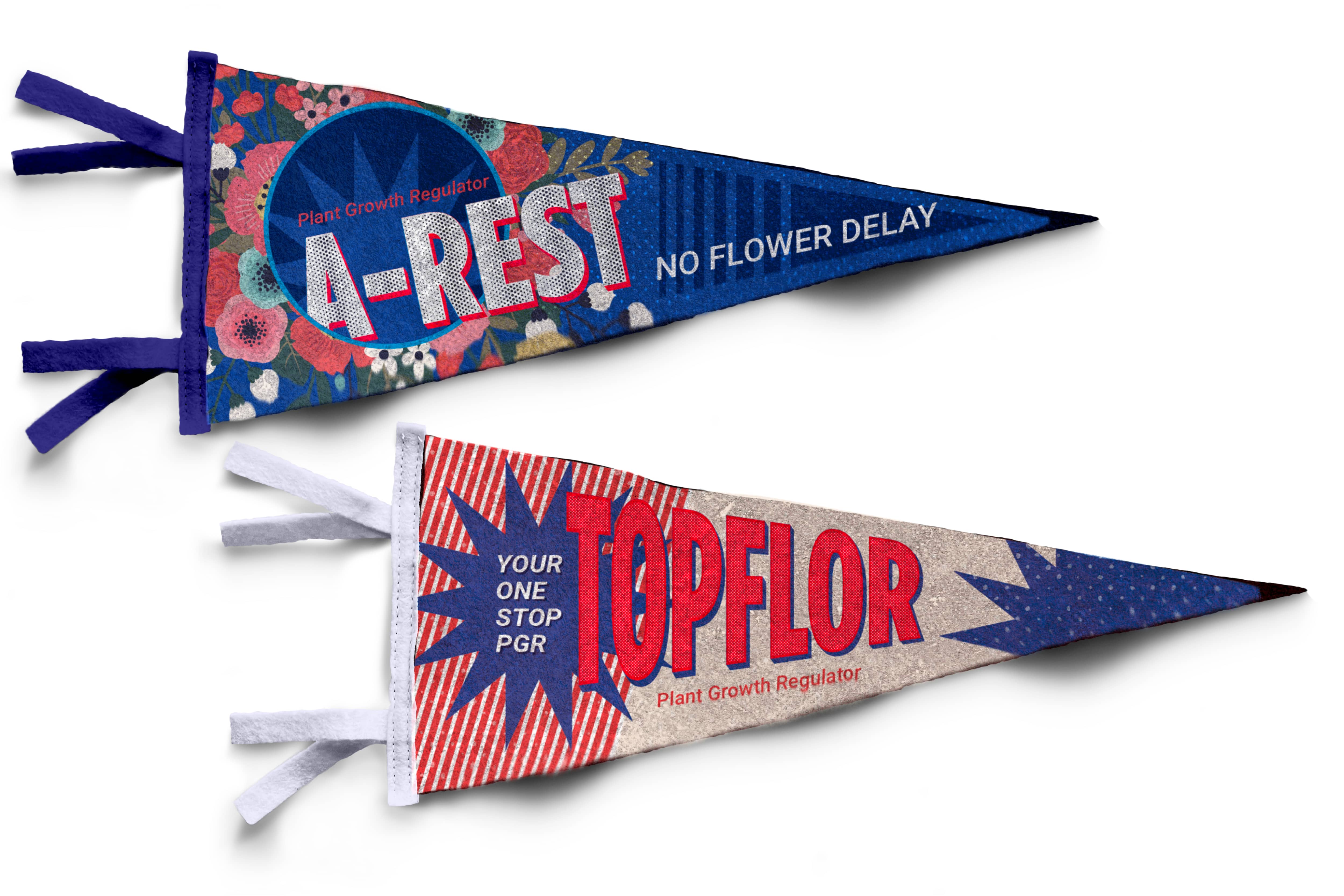
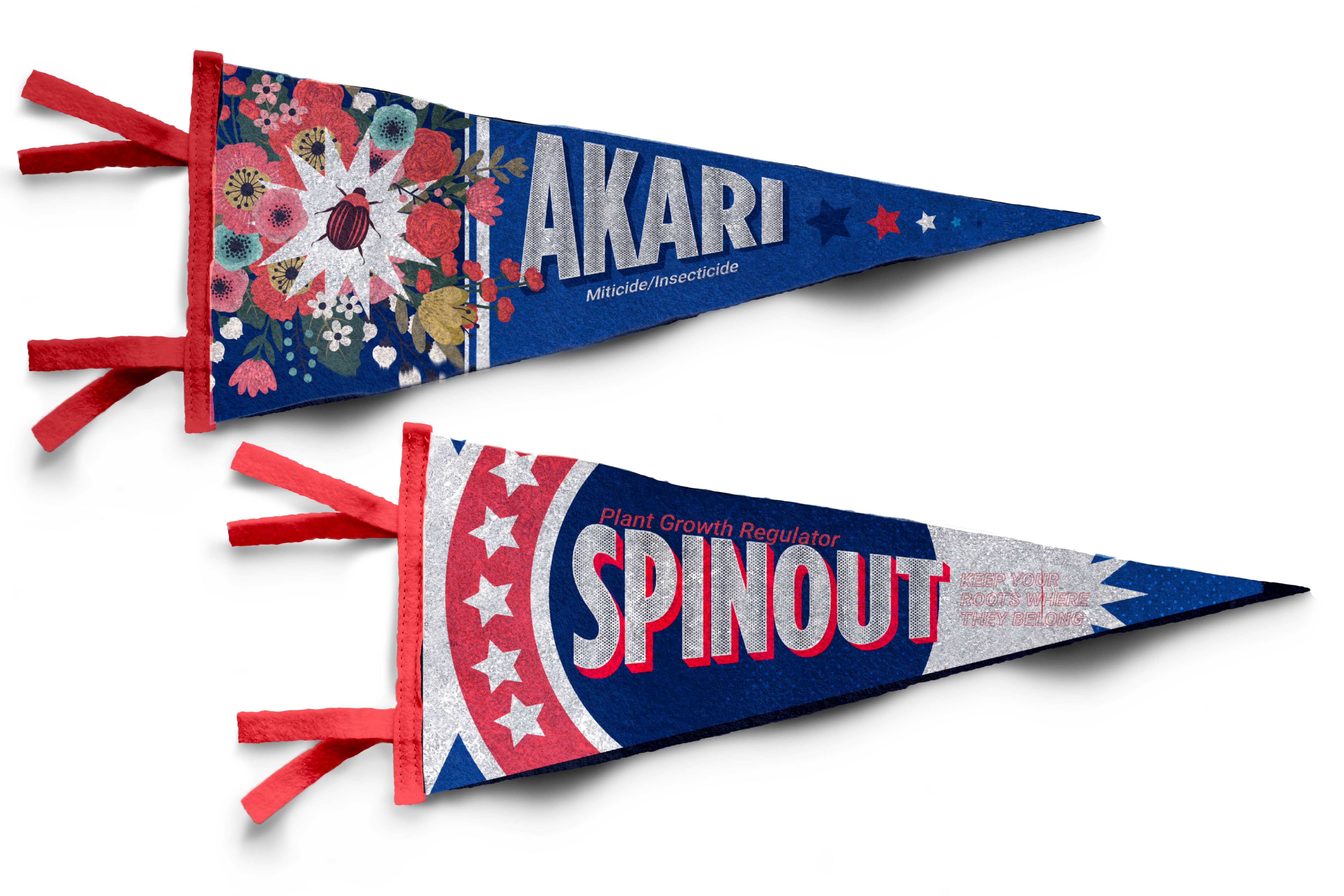
Informative and visually appealing handouts and collateral were prominently displayed throughout the booth. These materials showcased products and specials. They highlighted success stories and gave contact information for follow-up inquiries. To further enhance engagement, we incorporated fun and nostalgic memorabilia into the booth as takeaways. Pennants featured SePRO products and trading cards showcased our Technical Specialist to double as their business card for the weekend and eye-catching stickers were all available for attendees to take home.


the results
Final Takeaway
“Just wow. This is a new SePRO. Great booth!”
-Longtime partner in the greenhouse industry.
The Cultivate 2024 trade booth design proved to be a resounding success. The “Modern but Nostalgic” theme resonated with attendees, fostering positive interactions and generating a significant amount of interest in the SePRO brand and products. The repurposed carnival game not only served as a conversation starter but also demonstrated the company’s commitment to fun and engagement. By combining nostalgic elements with a modern aesthetic, we were able to capture the essence of the SePRO brand and achieve significant engagement at the Cultivate event.
By the Numbers
- Initial design spend of $15,000+ that lead to the setting up of 2 new distributors and an overall return on investment of $537,000+
- 1,100+ Unique visitors to the booth that lead to new leads and future partnerships.
- 500+ new and unique signups to the SePRO Insider Newsletter.
- Updated trade show look that led to renewed excitement for the brand and caught the attention of major distributors and greenhouse managers solidifying the company’s position in the market.
continue to next case study
As the lead designer on the Trail’s End popcorn fundraiser redesign project, my mission was to reignite the magic that had faded over time, reconnecting Scouts and customers with adventure and camaraderie at its core. Collaborating with a diverse team, we revitalized the brand with vibrant colors, modern typography, and inclusive imagery that resonated with both sellers and supporters alike. The refreshed packaging not only boosted customer engagement and sales by 37% but also transformed social media conversations, fostering a more positive space for discussing the fundraiser’s impact on Scout experiences and community involvement.