sepro diy labels
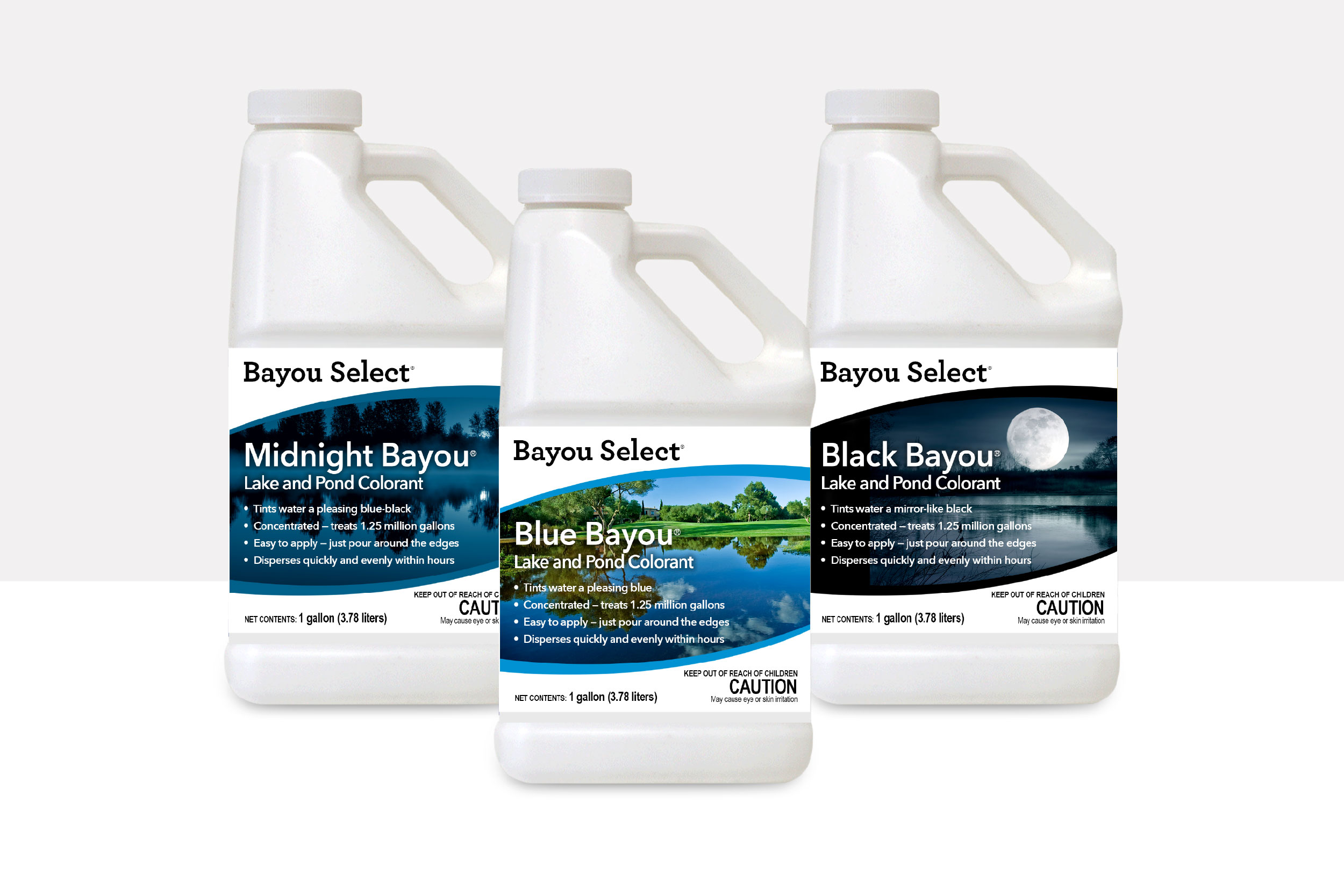
Led redesign of the SePRO DIY Label Portfolio.
overview
SePRO, a well-established company known for its professional-grade products, aimed to introduce an updated line of consumer-friendly products targeting the DIY market. The challenge was to create labels that balanced regulatory language with engaging marketing design, ensuring they adhered to SePRO’s stringent internal guidelines while appealing to a broader consumer base.
the challenge
It’s about Balance
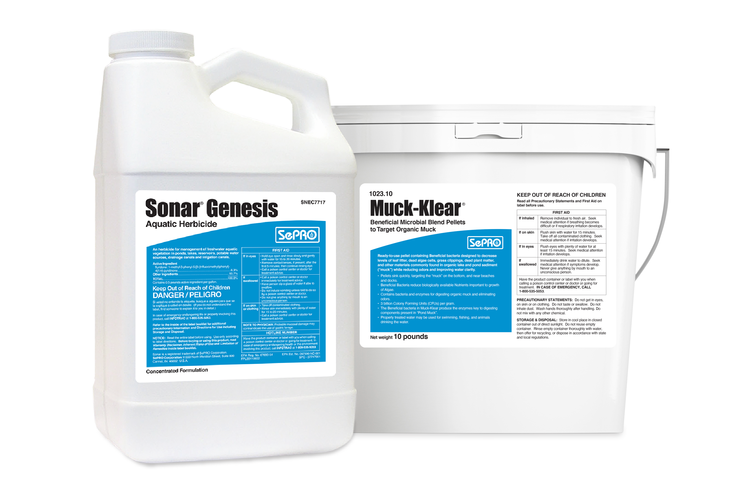
The primary issue was the need to follow the same strict guidelines as their professional products, even though these DIY products were not EPA-regulated. This required careful navigation between regulatory compliance and crafting an engaging, consumer-friendly narrative. To address this, a dual-layer approach was developed where essential regulatory information was clearly presented but supplemented with engaging, straightforward marketing language. This ensured compliance while enhancing readability and appeal for DIY customers.
Aligning with Established Brand Identity
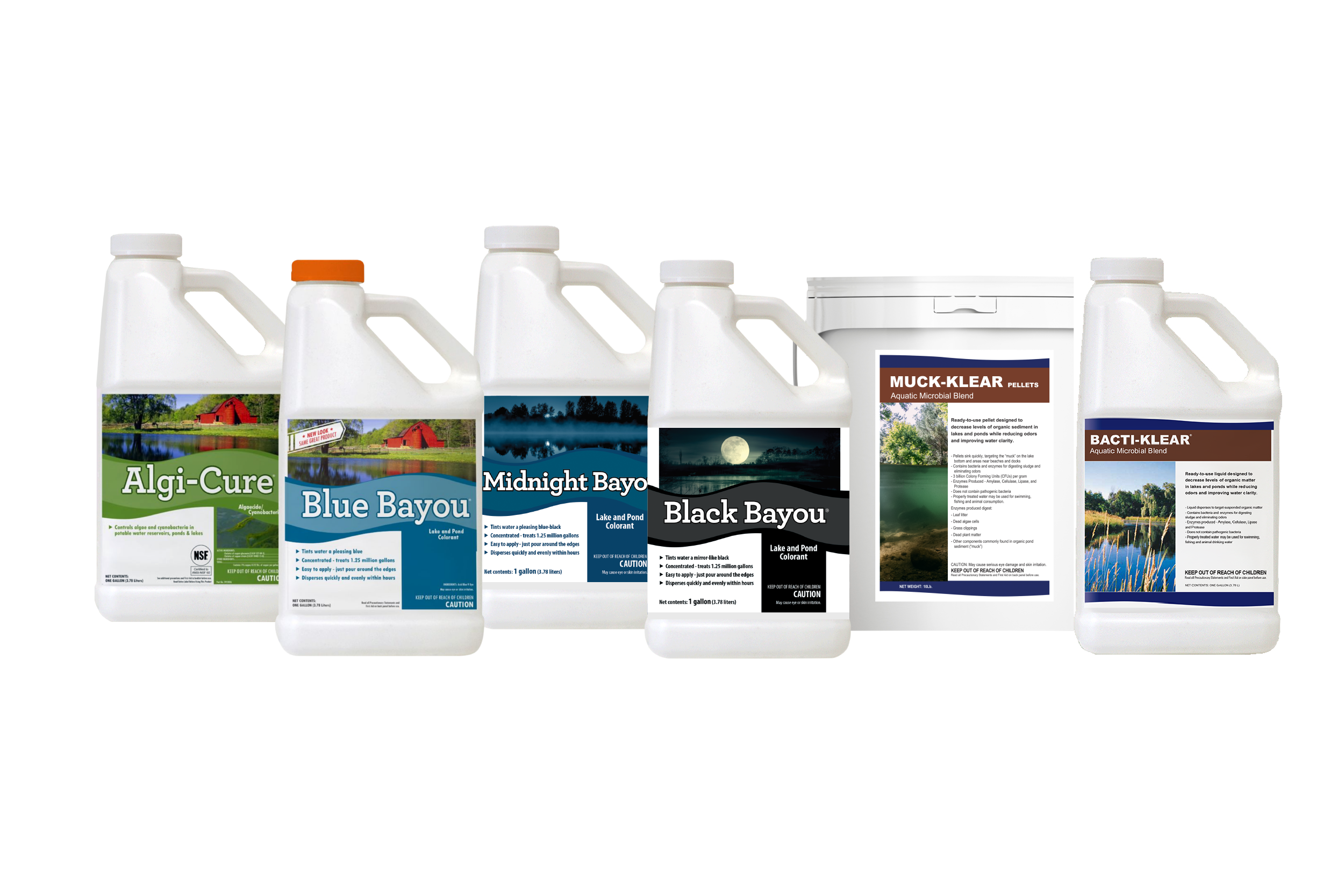
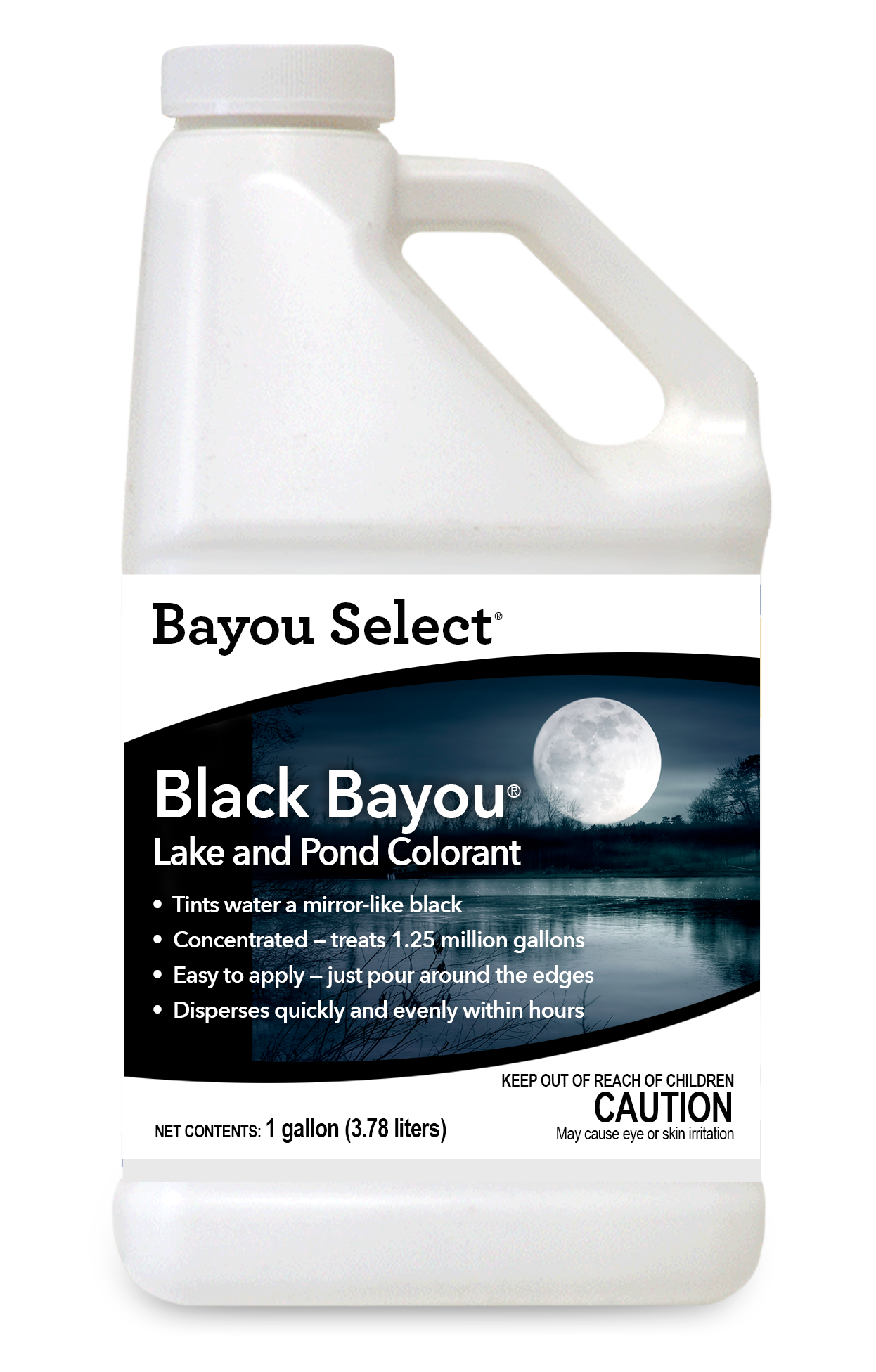
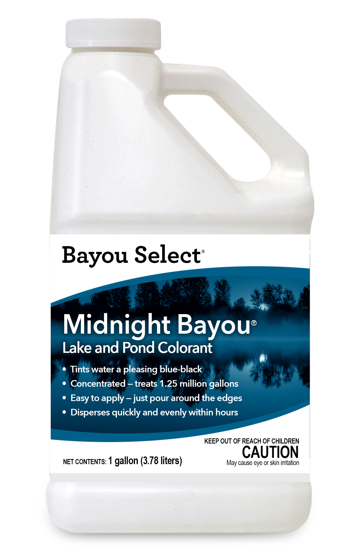
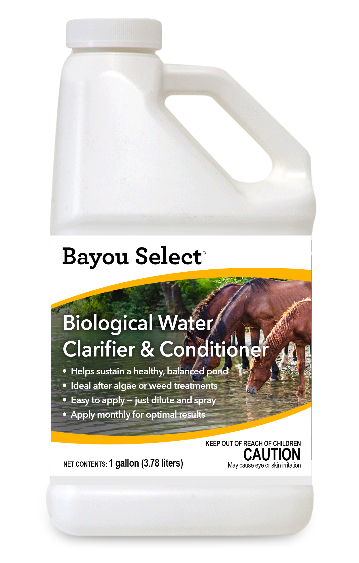
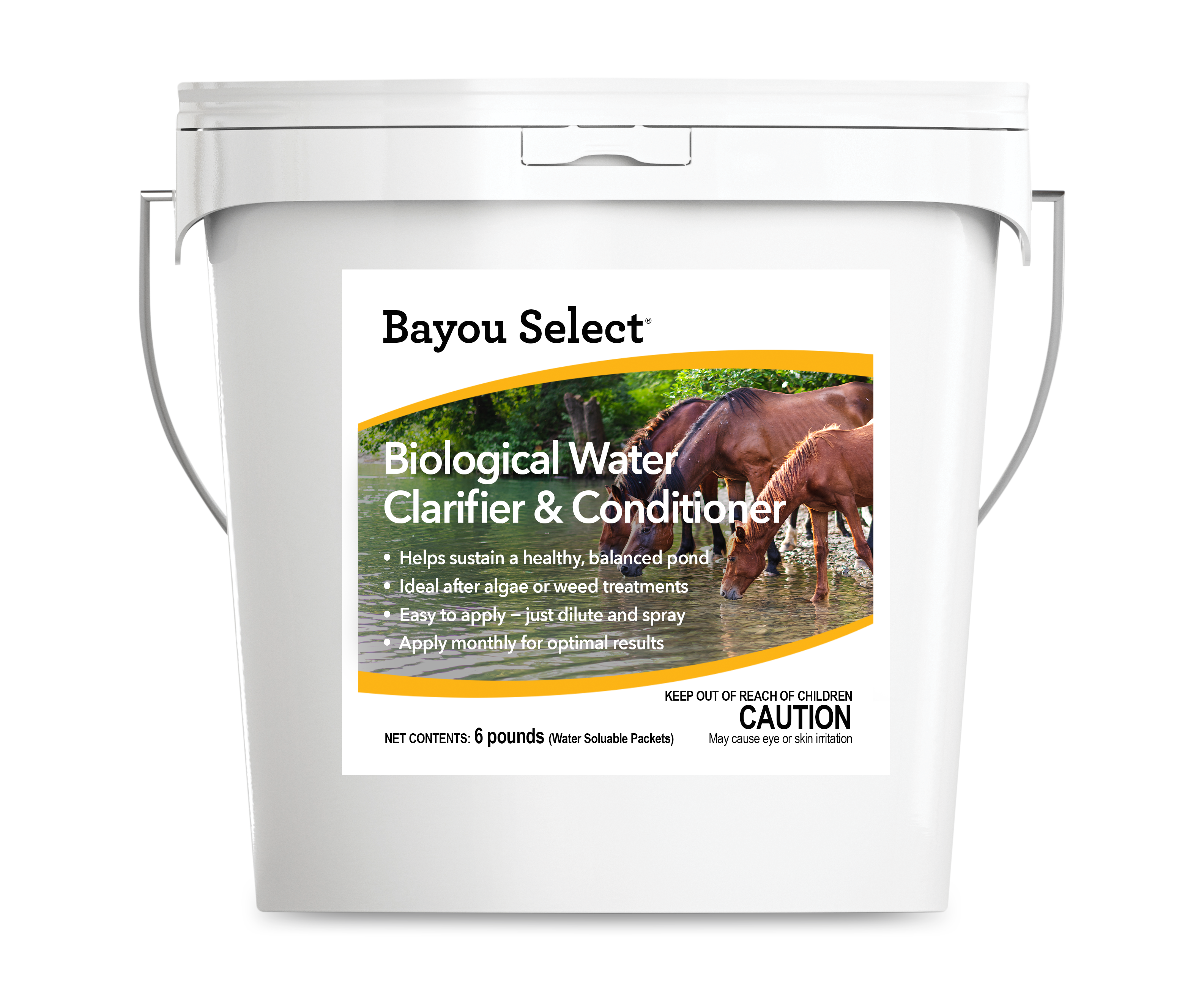
SePRO wanted the new DIY labels to reflect the look and feel of their professional line while being more visually engaging for the average consumer. To address this, a thorough analysis of SePRO’s existing professional product designs was conducted to identify core visual elements and themes. These elements were then integrated into the new designs with adjustments in color schemes, typography, and layout to make them more approachable and attractive to DIY customers. One strong element utilized was the SePRO wave/arch which is a staple for SePRO’s professional brand and also recognizable by SePRO professional consumers. As you will see below, the wave/arch was utilized in the creation of the front of the DIY product labels.
the process
The design process began with an analysis of SePRO’s professional product labels to understand the established visual identity. Additionally, feedback from focus groups consisting of DIY enthusiasts was gathered to identify elements that would resonate most with this demographic. Several design mock-ups were created incorporating SePRO’s professional elements but with a more consumer-friendly twist. Vibrant colors, simplified icons, and a clear, concise language style were used to make the labels more engaging.
Close collaboration with SePRO’s regulatory team ensured all required information was included without overwhelming the consumer. Regulatory information was placed in clearly defined sections, and bullet points and icons were used to enhance readability. Prominent marketing language, written in a direct and engaging style, was included to highlight the product’s benefits. Initial designs were presented to SePRO and a selected group of DIY customers for feedback. Based on this feedback, the designs were iterated upon to ensure both regulatory compliance and consumer appeal were maximized.
Final Design
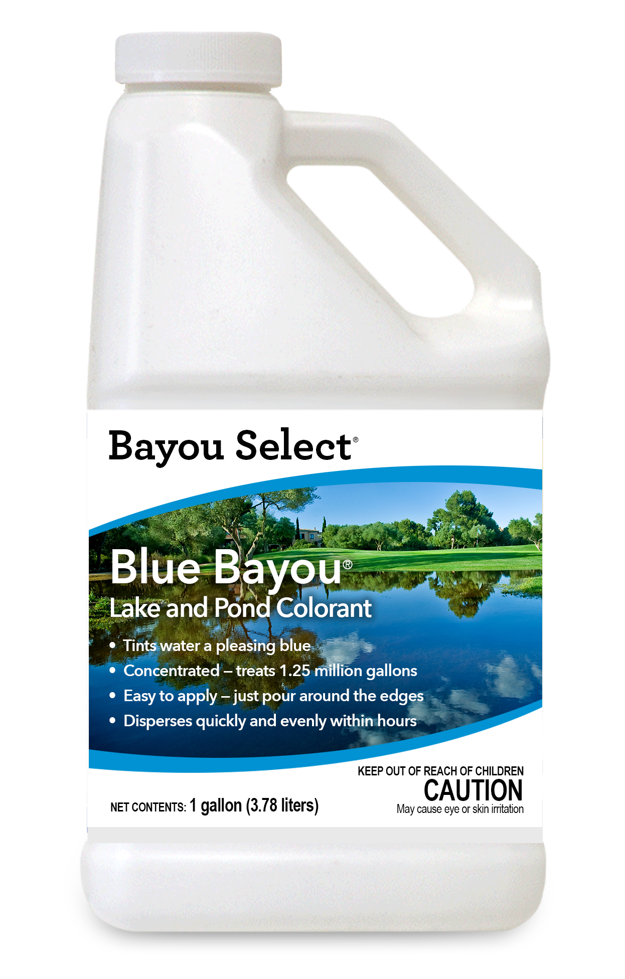
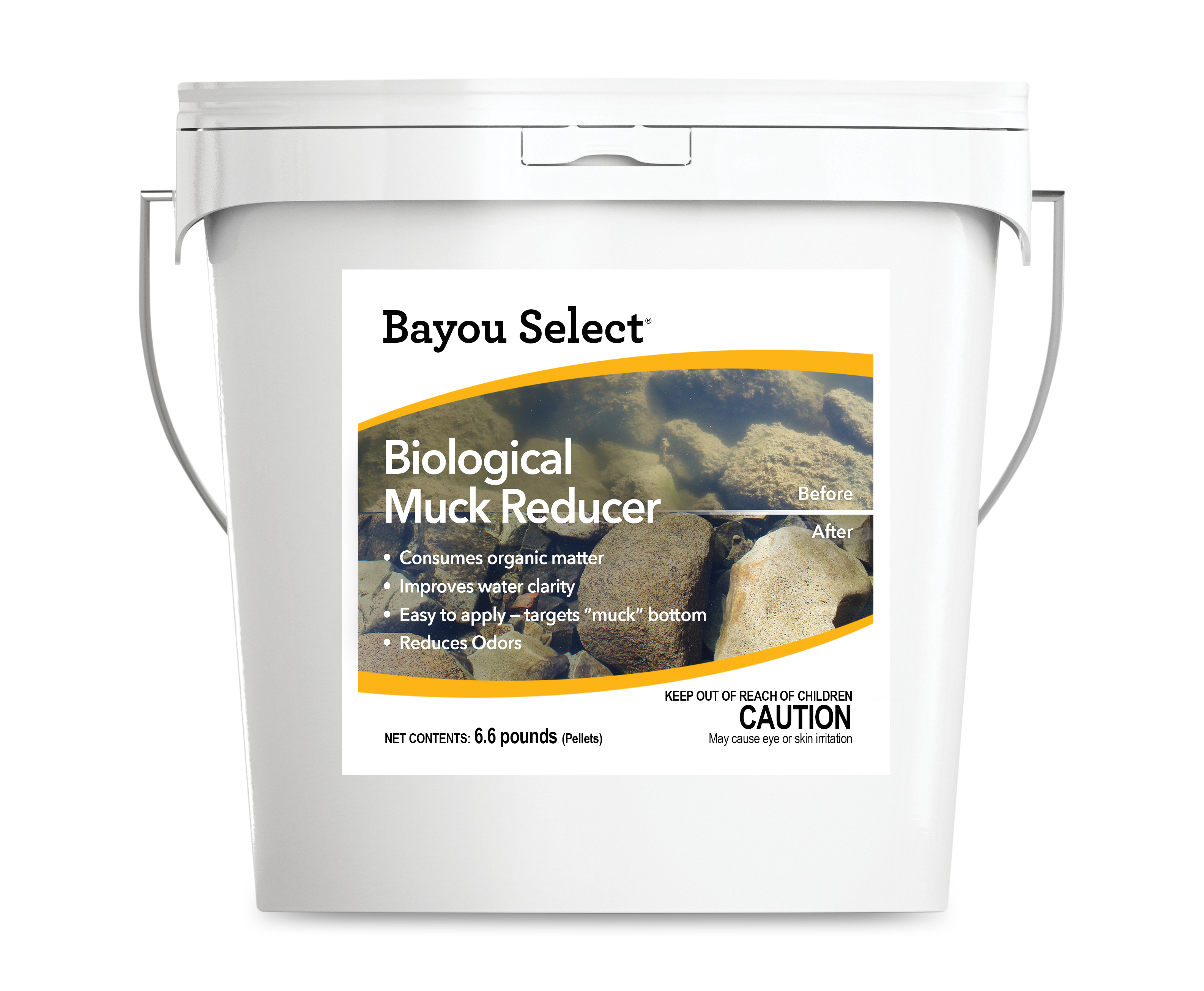
The final labels featured a balanced mix of SePRO’s professional design elements and consumer-friendly aesthetics. The use of vibrant colors and clear typography made the labels stand out on shelves. Regulatory information was neatly organized, making it easy for consumers to find necessary details without detracting from the overall appeal. Direct and engaging marketing messages were prominently displayed, effectively communicating the benefits and uses of the products to DIY customers.

the results
Strides Forward
The project resulted in positive feedback from the DIY market, with customers appreciating the clarity and attractiveness of the new labels. The new designs successfully maintained SePRO’s brand identity while making the product line more accessible and appealing to consumers. Additionally, all internal guidelines were met, ensuring regulatory information was clear and concise without compromising on design. Furthermore, these new labels helped secure an exclusive partnership with a major retail partner, marking a significant and exciting gain for SePRO’s DIY portfolio. This project exemplifies the balance between regulatory requirements and consumer-friendly design, demonstrating how thoughtful design can bridge the gap between professional standards and market engagement.
continue to next case study
Led the transformation of SePRO’s trade booth for Cultivate 2024, I set out to blend nostalgia with modernity, creating an inviting space that would captivate attendees. Inspired by classic Americana and guided by phrases like ‘clean and simple,’ our booth design not only showcased SePRO’s products but also conveyed a strong message of American pride and innovation. The incorporation of high-resolution floral imagery and interactive video presentations effectively communicated the breadth of SePRO offerings while minimizing attendee overwhelm. This approach not only sparked significant interest and engagement but also solidified SePRO’s position as a leader in the industry, resulting in new distributor partnerships and a substantial return on investment.