aquatic product catalog
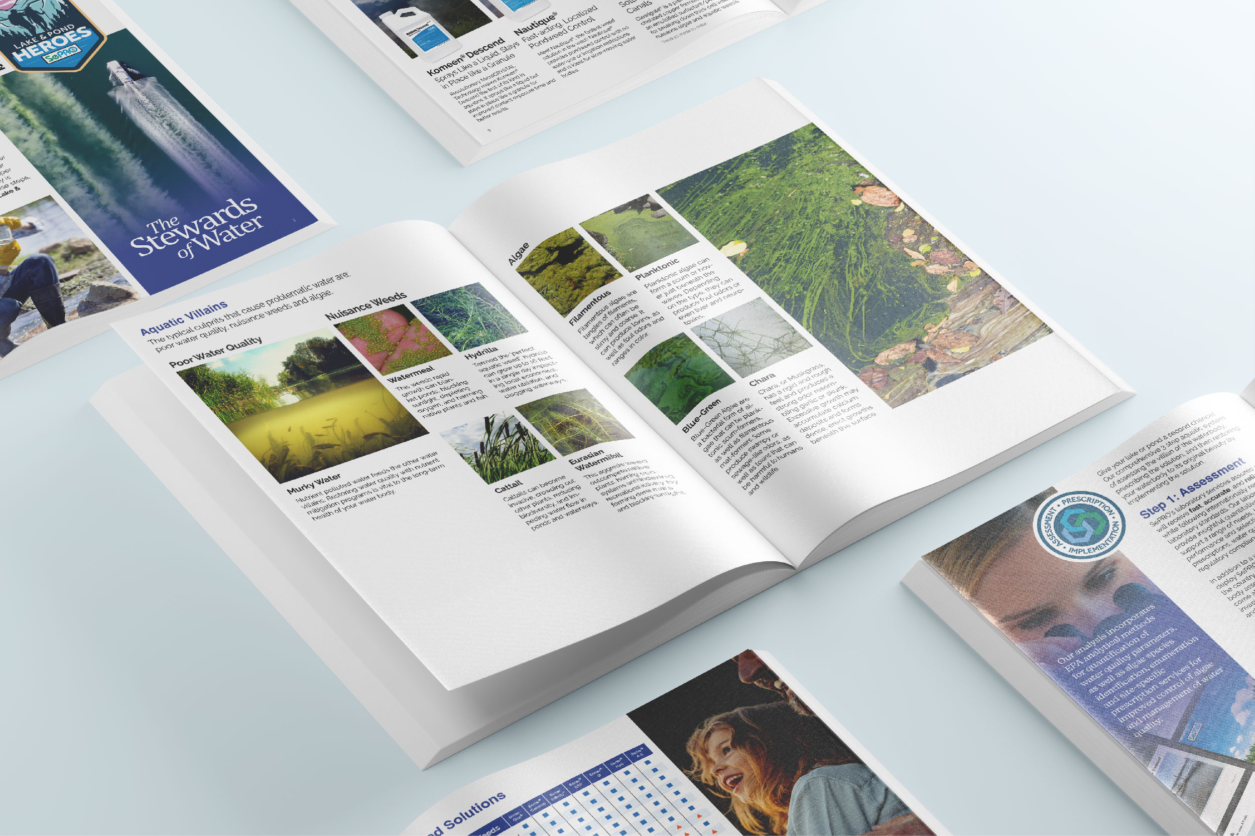
Revamped the Aquatic Product Catalog with a story & purpose.
“Was just clicking around the SePRO web site (for no particular reason). Came across the new aquatic brochure. Great job. Well organized, clean. Just wanted to say how much I appreciate your hard work. SePRO looks good.”
-Steve Miller, Retired Foundational SePRO Designer

the problem
A Lost Cause in Cloudy Waters
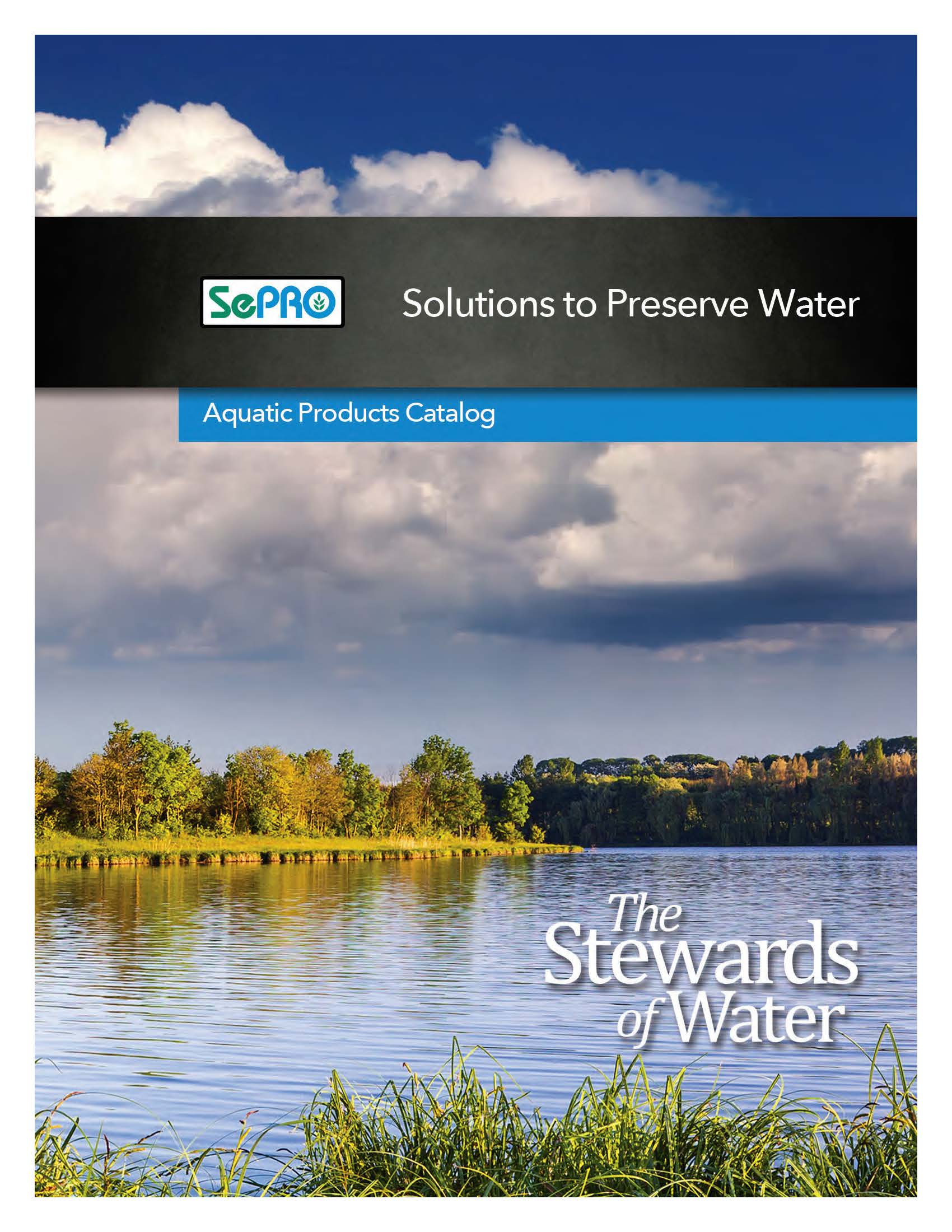
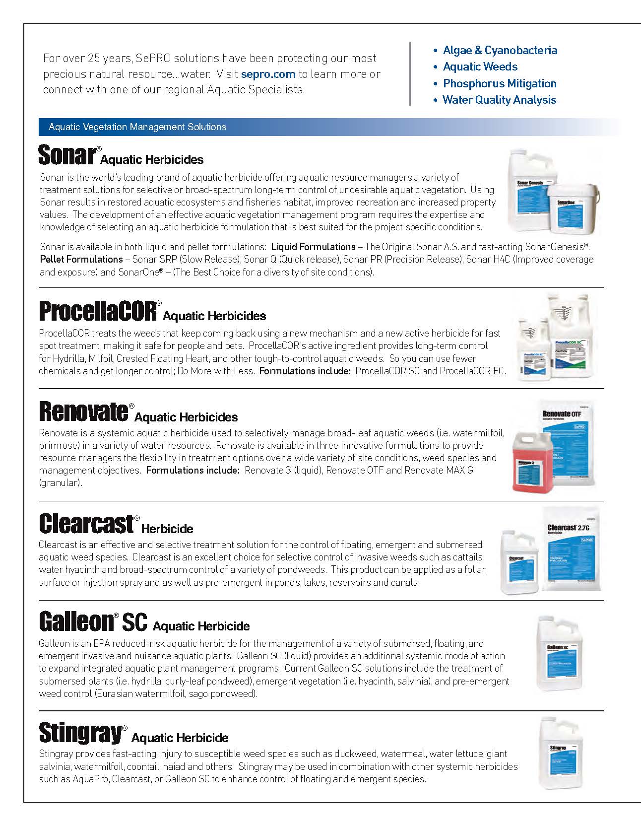
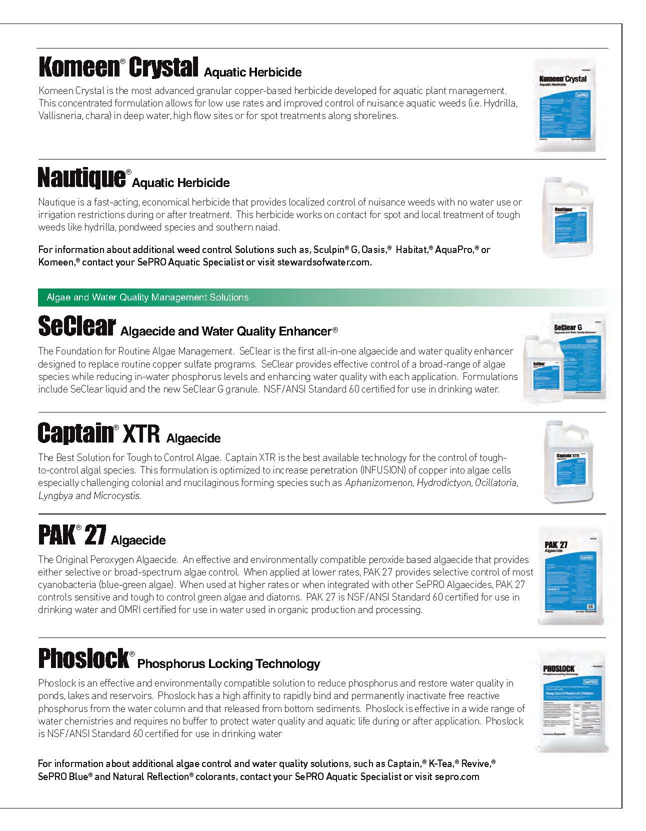
The old aquatic product brochure was like a neglected pond. It was murky and stagnant. It was trying to say too much and ultimately failed to say anything. Confusing information overwhelmed potential customers. It left them unsure of which product to choose for their needs.
the process
Charting a Course for Clarity: Understanding Our Audience
The journey to this revamped brochure began with collaborative planning sessions. We delved into customer needs and identified keywords that would guide our design process. One of these core words was “story.” We saw that the booklet shouldn’t just list products. It should tell a story – your story. It’s a story of frustration with murky, polluted water, followed by the change SePRO can bring. This approach became the foundation. It ensures the brochure guides readers from worries about water quality to a safe, enjoyable water body.
To navigate these waters, we began with a complete overhaul of the booklet. Focusing on the specific needs of our audience, we identified two key groups:
- Homeowners or Do-It-Yourselfers: Individuals frustrated with unsightly algae growth in their waterbodies.
- Aquatic Professionals: Experts seeking effective and reliable solutions for their clients’ aquatic environments and large-scale projects.
A Message for Every Need
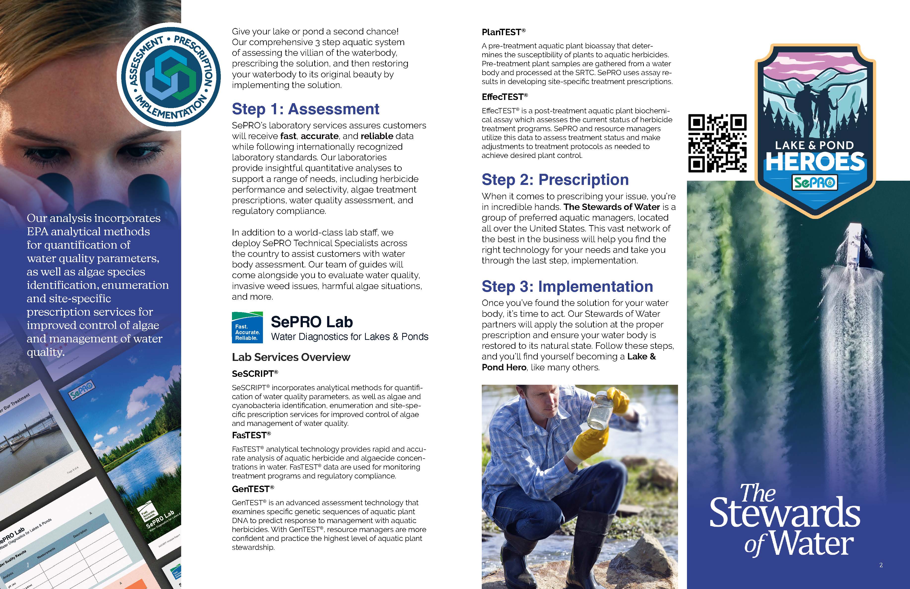
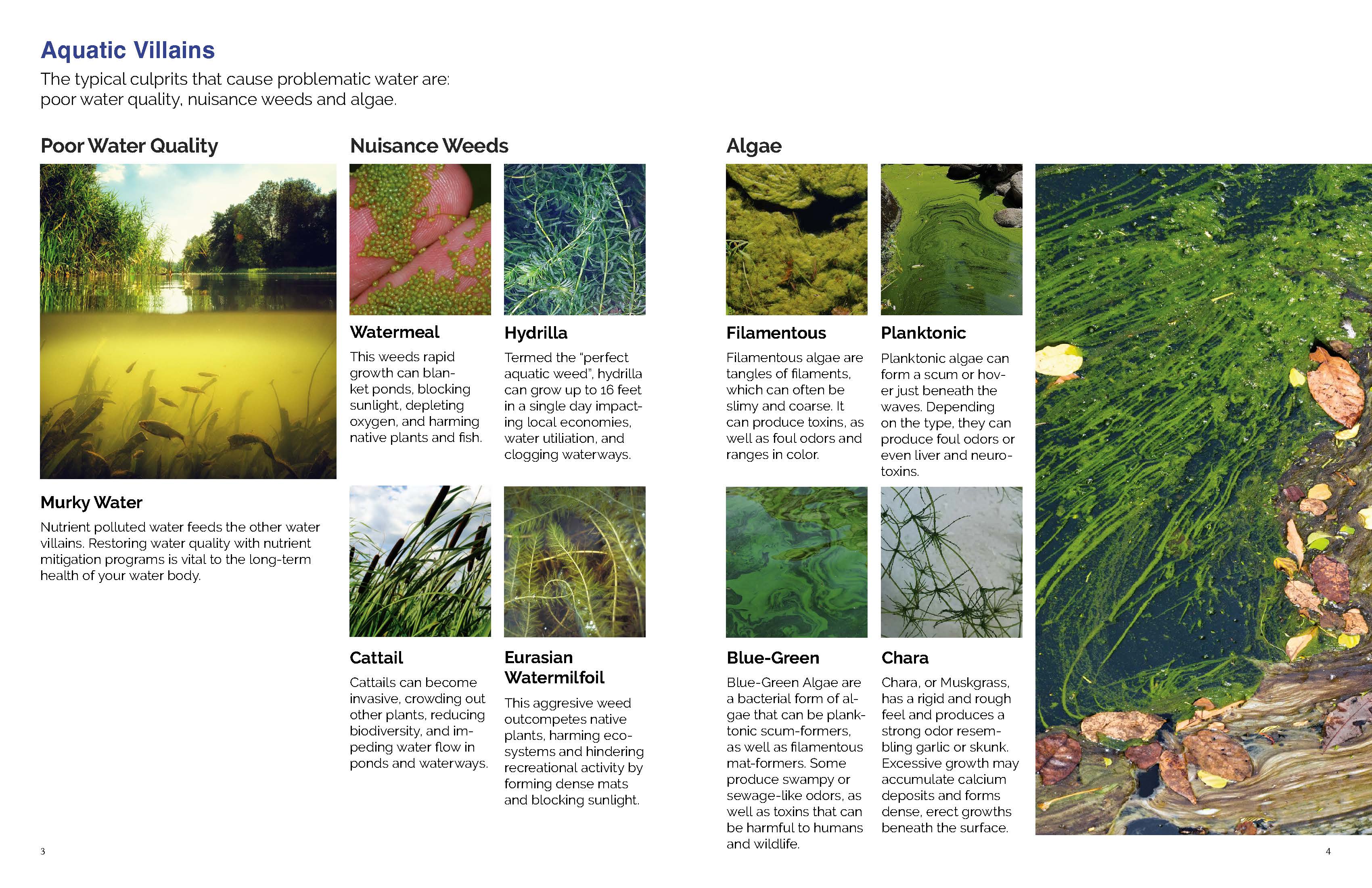
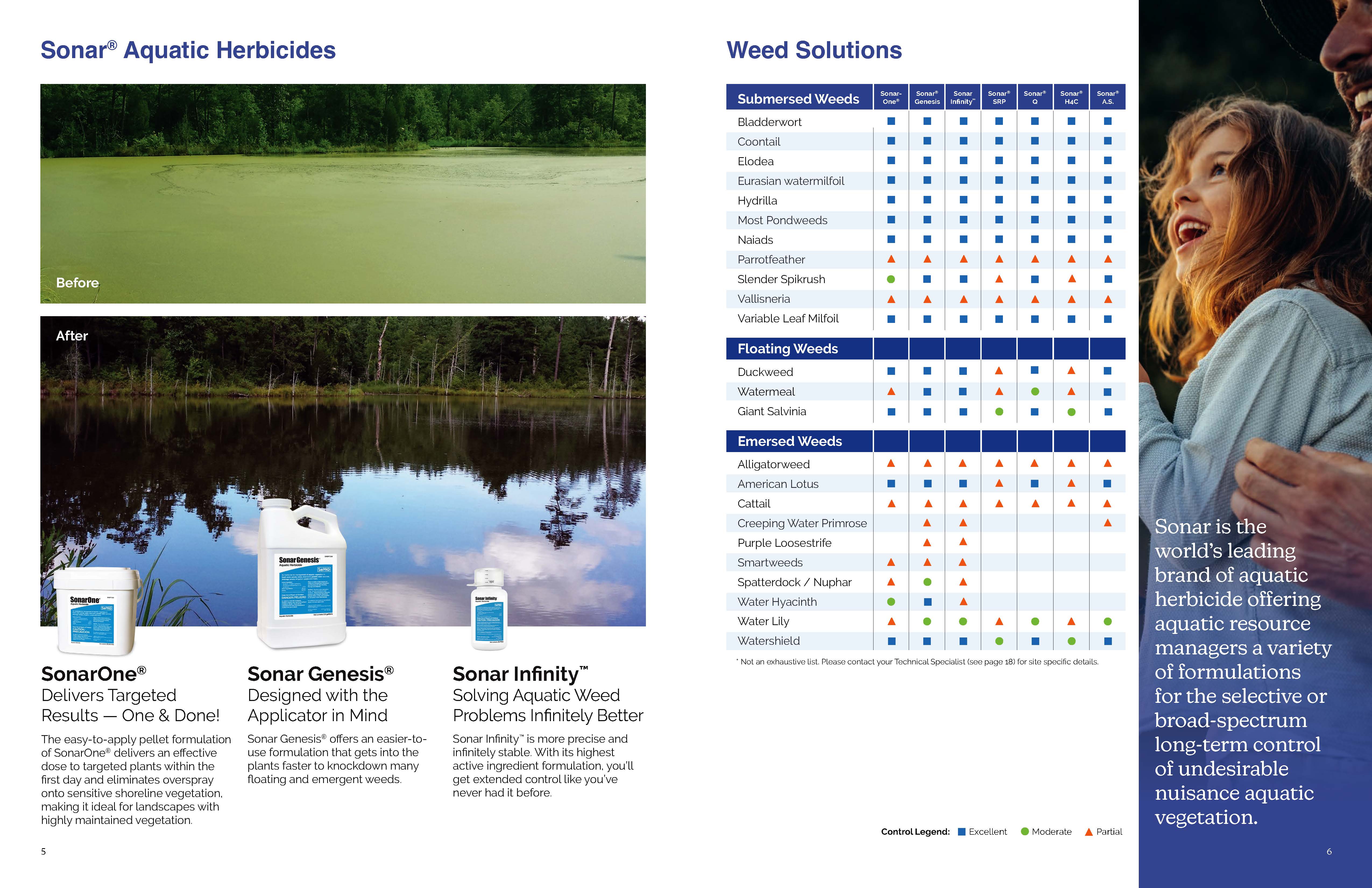
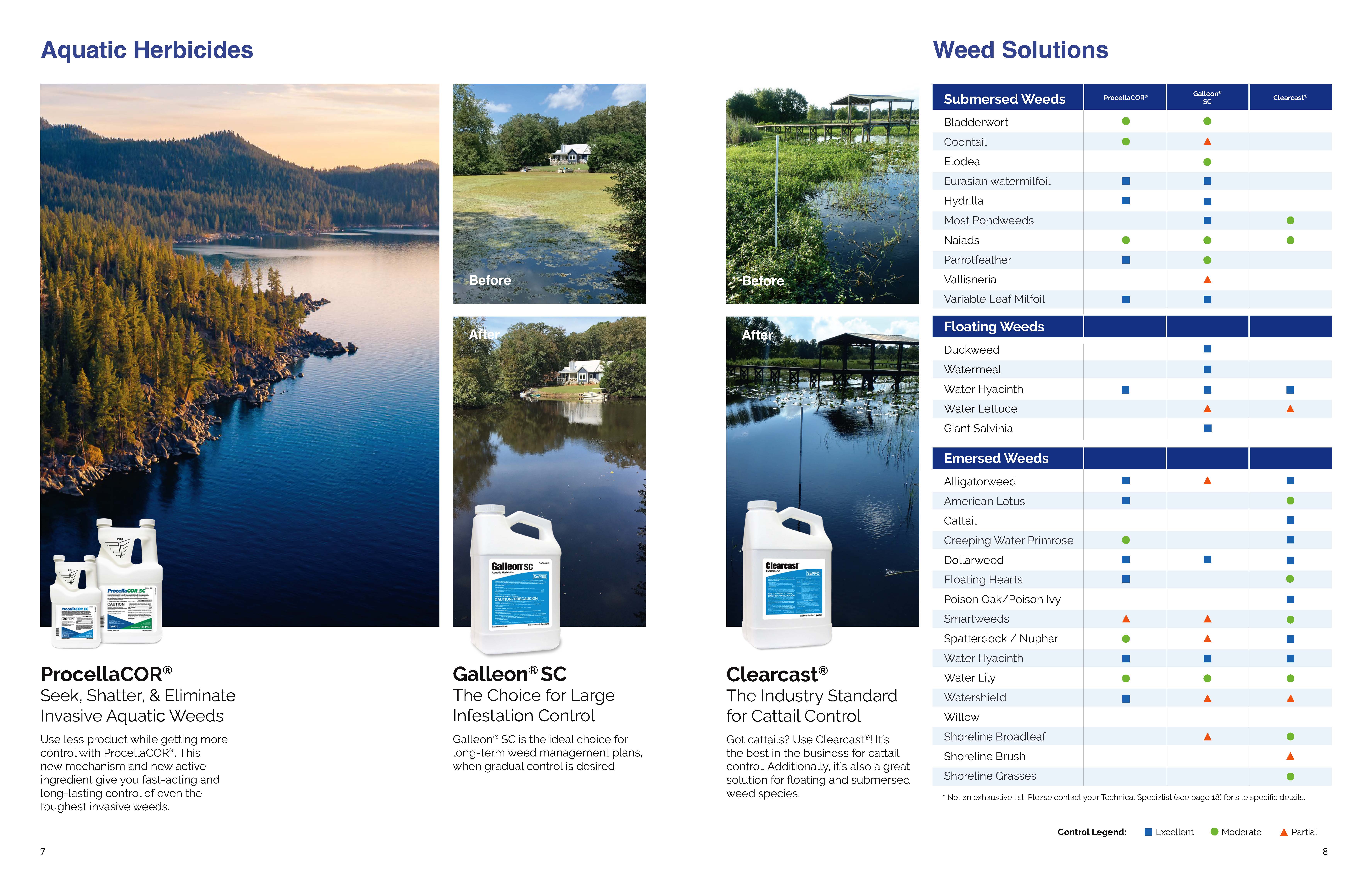
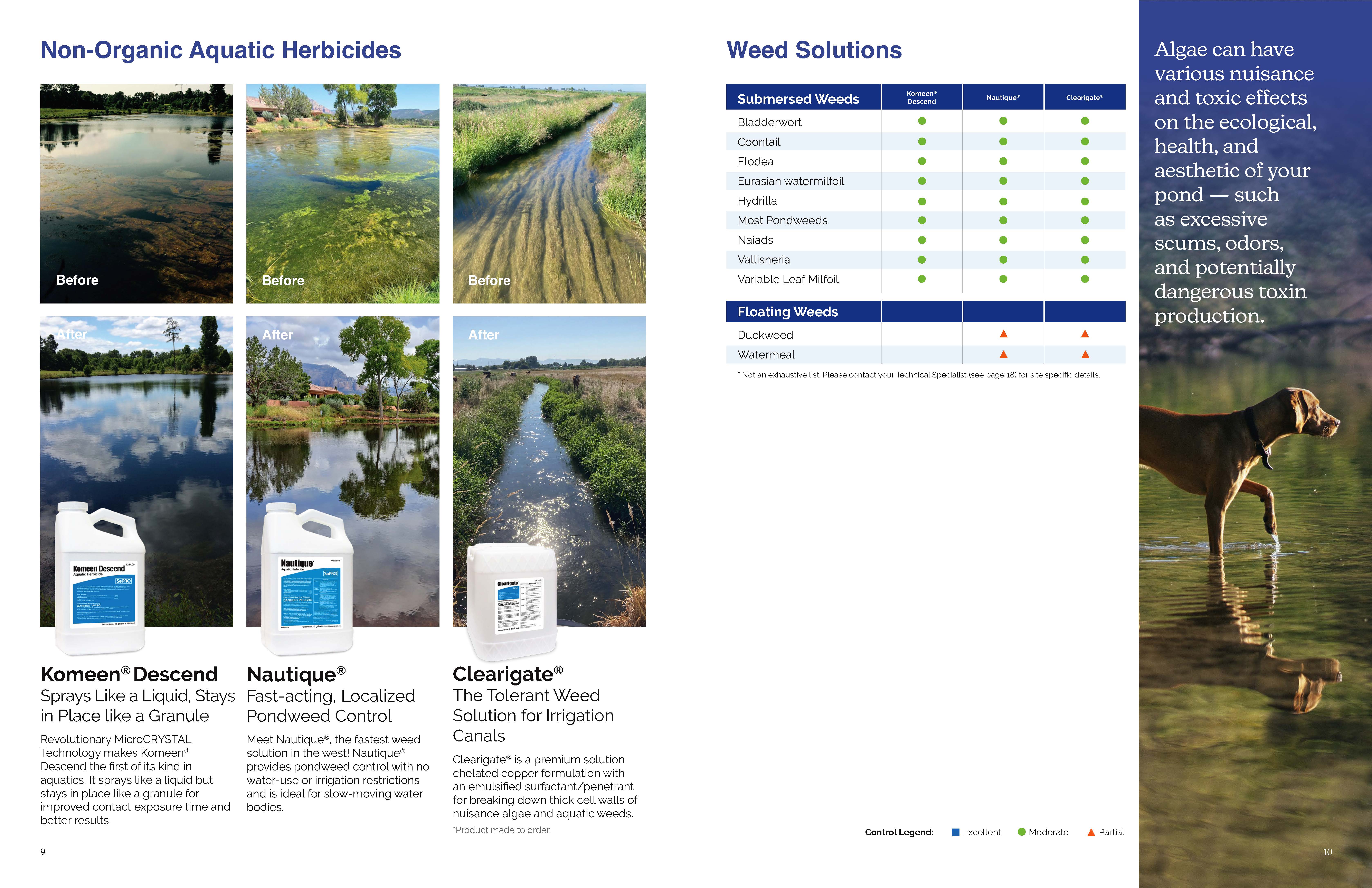
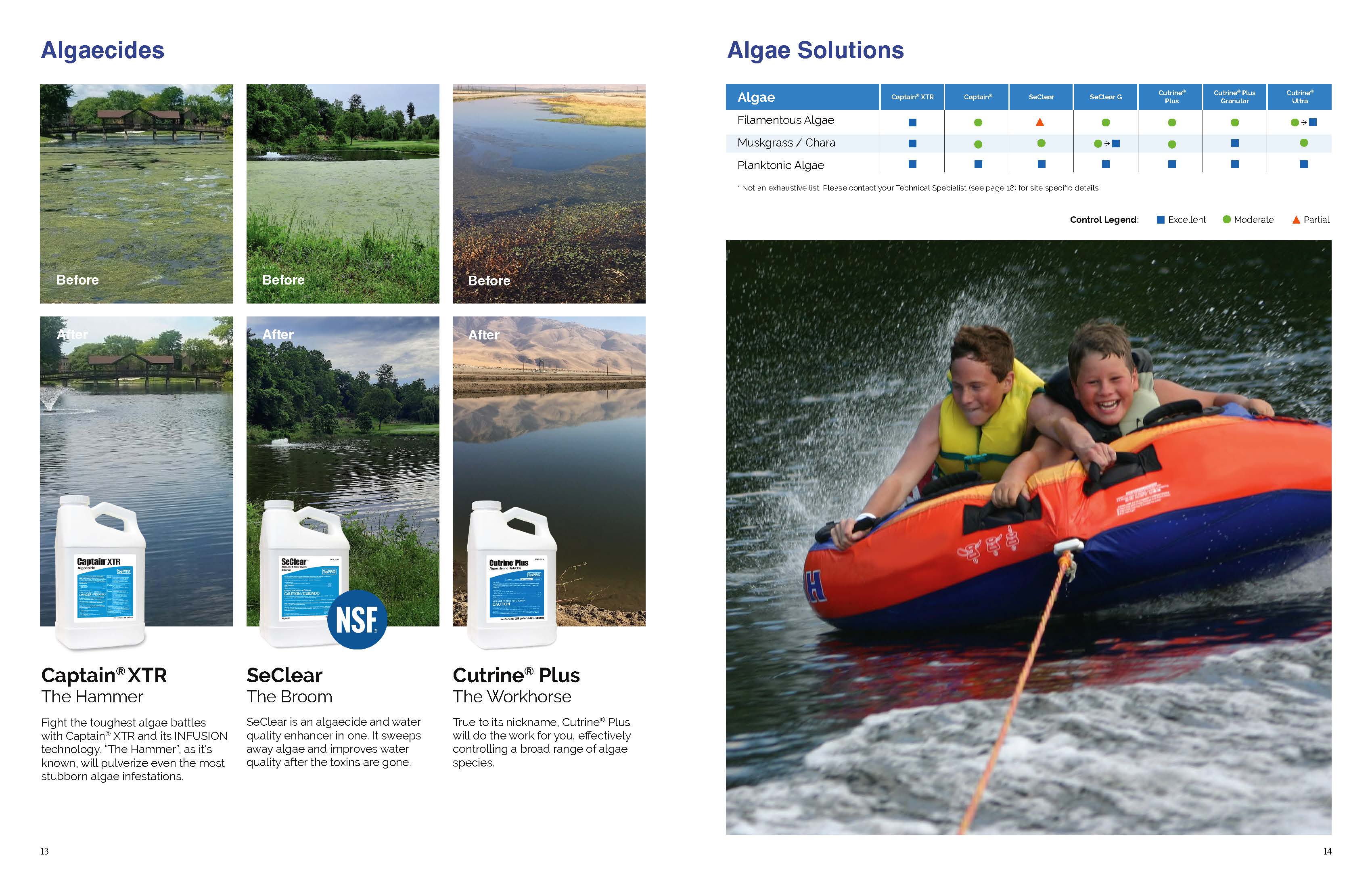
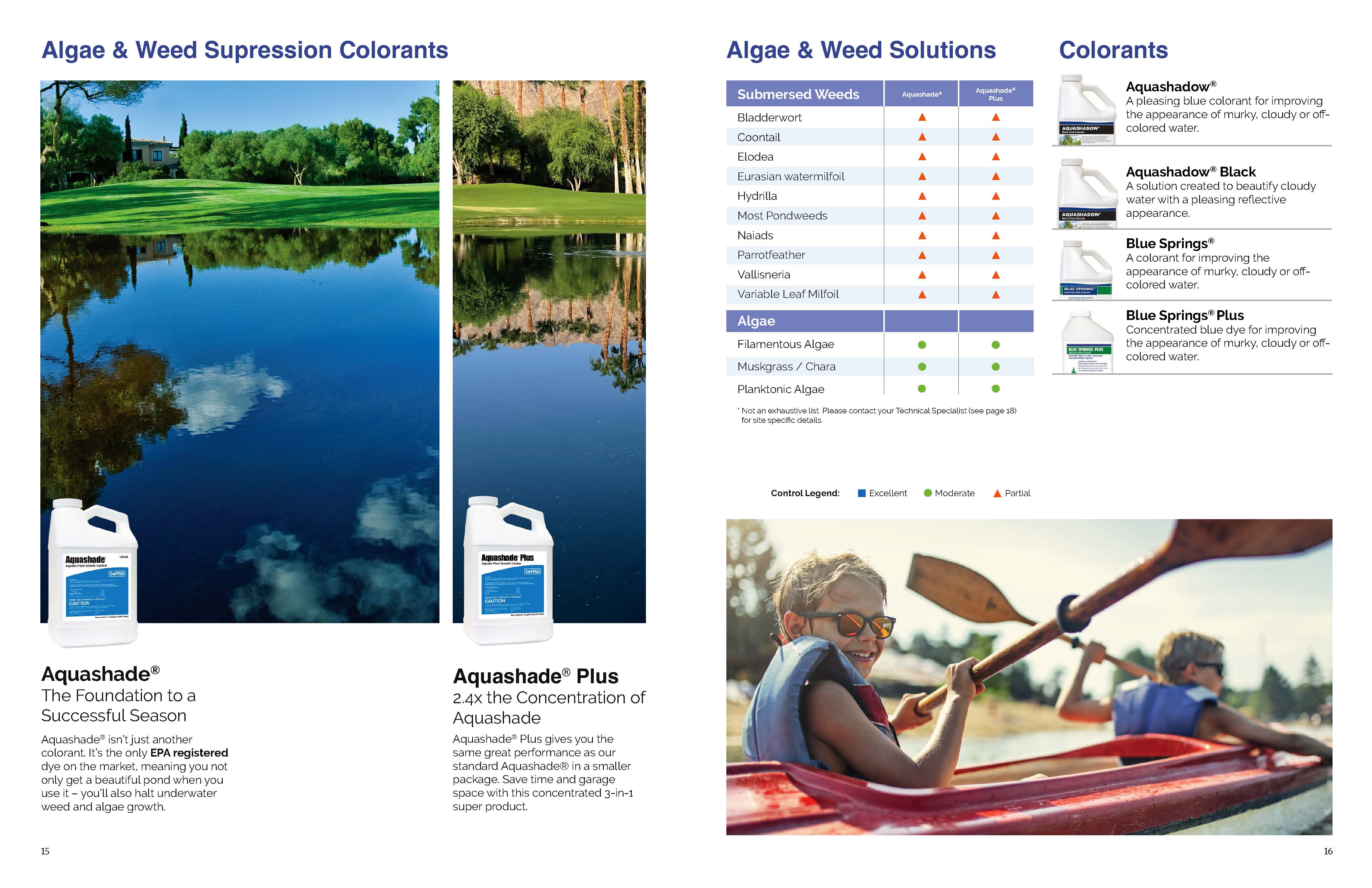
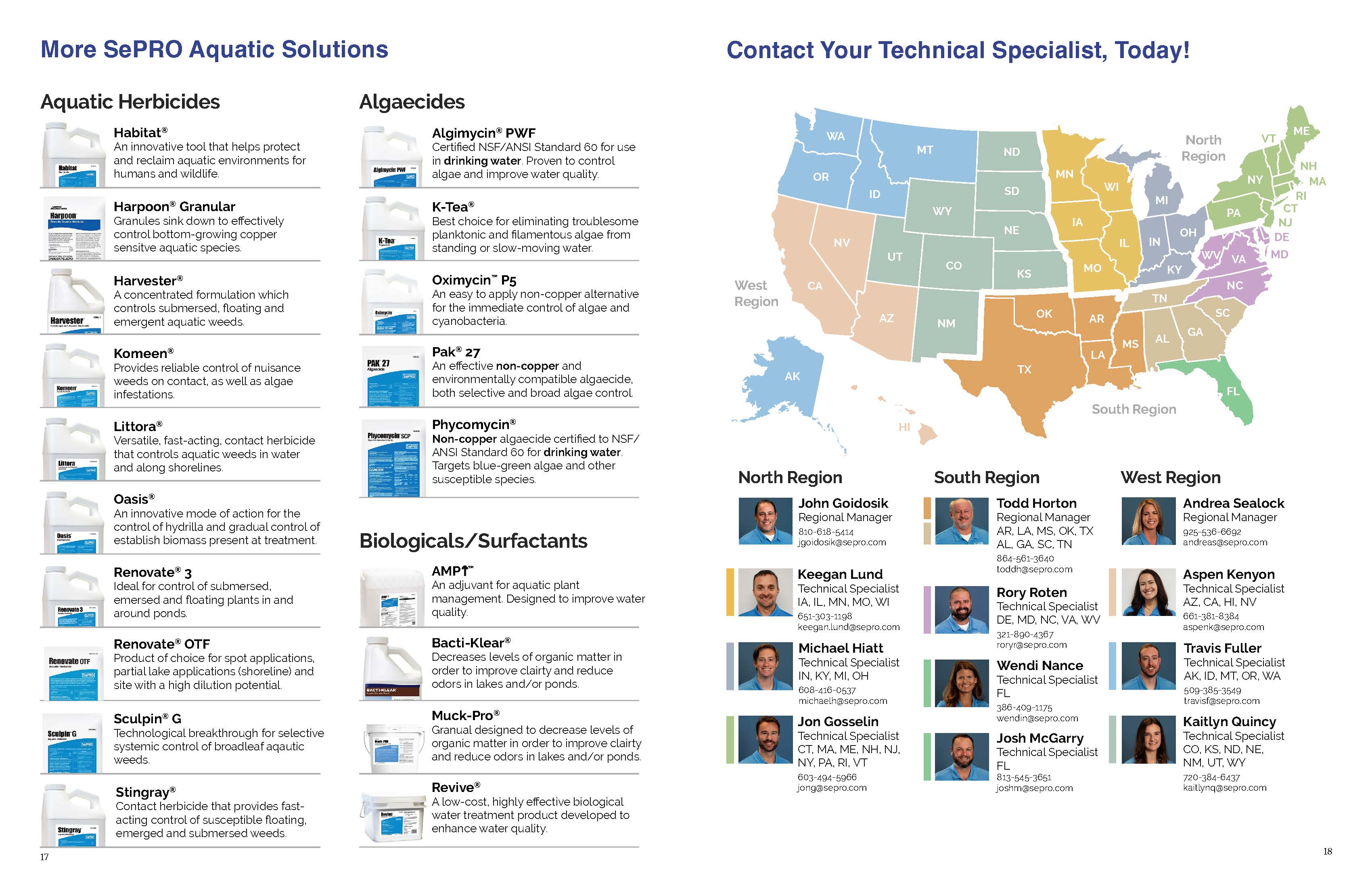
Our communication strategy catered to each audience segment. For homeowners and the DIY crowd, we replaced complex terminology with clear language and helpful tables. Striking before-and-after visuals showcased the dramatic transformation possible with our products. Easy-to-understand product descriptions empowered them to make informed choices. To address any lingering questions, a dedicated section at the booklet’s end provided homeowners, and even professionals, with a one-stop shop to connect with SePRO’s technical specialists. For aquatic professionals, we delved into the science behind our solutions, demonstrating their effectiveness against various algae and weed types. We addressed their specific concerns by providing information on product safety for fish and plant life.
The Three-Step Story of Transformation
The redesigned brochure weaves a powerful story into the very fabric of SePRO’s 3-step process. This narrative guides readers on a journey from murky frustration to achieving a crystal-clear aquatic paradise.
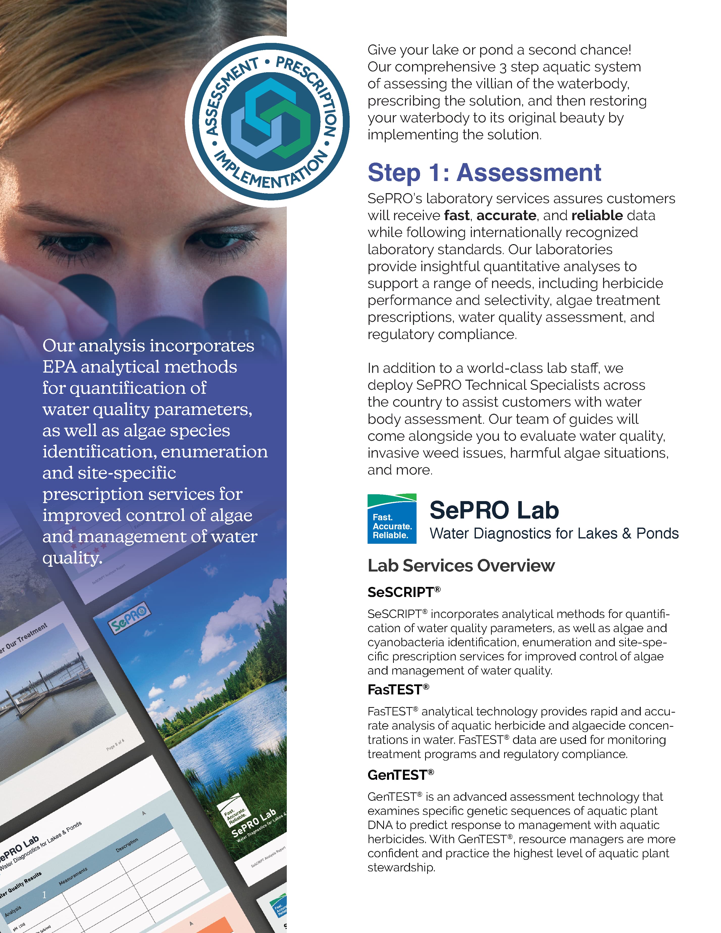
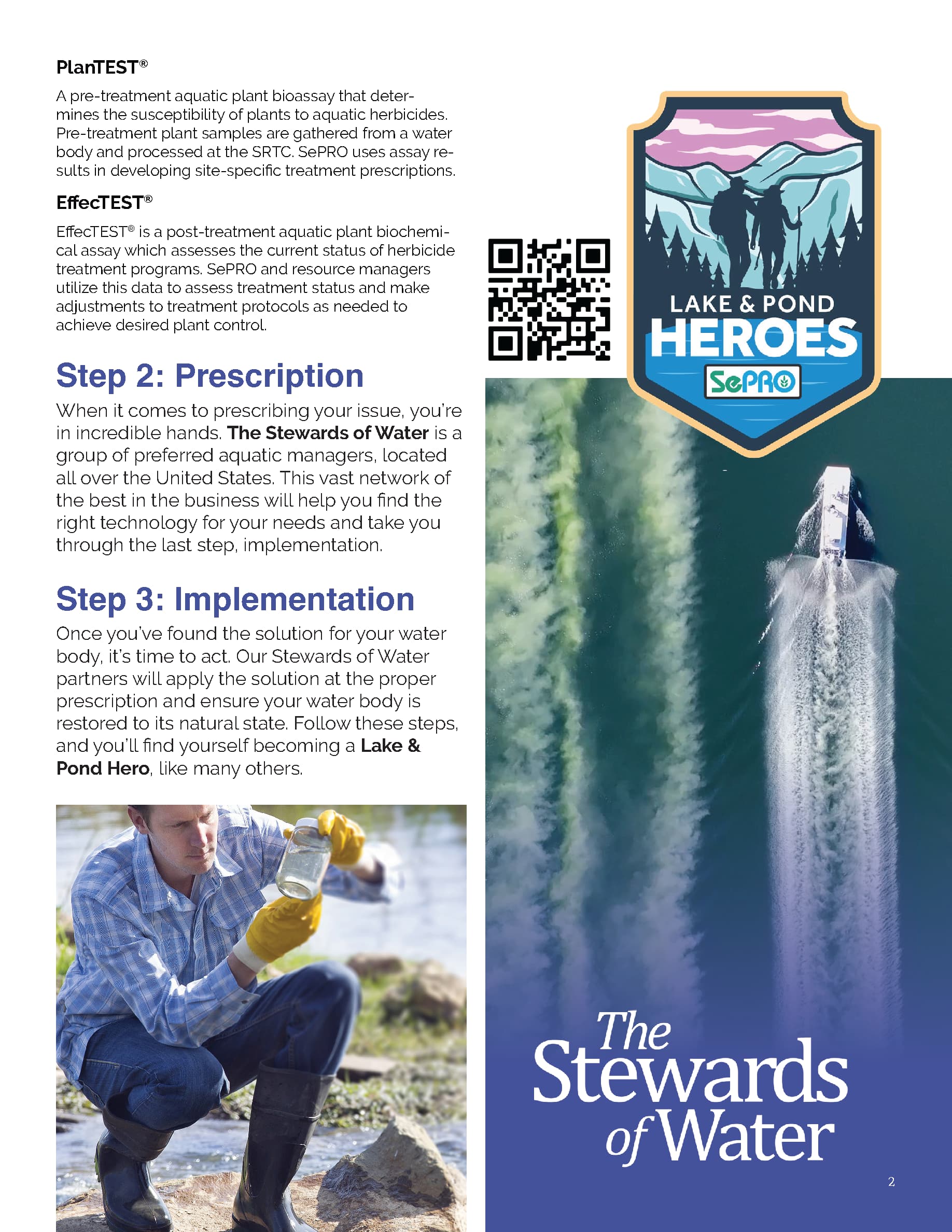
Step one, Assess Your Waterbody, represents the initial realization of a problem. The brochure highlights the importance of understanding your water’s condition. It mirrors the homeowner’s recognition of their algae woes. This step also educates the user on the most common “villains” (weeds and algae) of their water quality. Step two, Prescription for Success, becomes the turning point. SePRO’s personalized “prescription” reflects the moment of hope and solution. Finally, step three is Implementation. It represents a successful resolution. It achieves a clear and healthy aquatic environment. Adding this story arc to the 3-step process makes the brochure resonate with both homeowners and professionals. It gives them a clear roadmap to achieve their aquatic goals.
the results
Crystal Clear
The revamped brochure yielded a wave of positive results. Customers, both homeowners and professionals, found the information they needed to choose the perfect product for their aquatic needs. Targeted communication led to increased sales across both segments. The guide has also proven invaluable for SePRO’s own technical specialist. It is a resource for them to stay up to date on SePRO aquatic products capabilities in a quick and easy-to-read resource. By focusing on clear communication and showcasing the transformative power of SePRO’s products, we fostered a stronger brand identity.


continue to next case study
In designing SePRO’s new DIY product labels, I tackled the challenge of merging strict regulatory requirements with engaging consumer design. By balancing professional branding elements with vibrant, user-friendly aesthetics, the final labels not only adhered to internal guidelines but also attracted a broader DIY audience, leading to increased market appeal and a successful retail partnership.