sescript
Refreshed the SeSCRIPT Platform that hadn't been touched in over 30 years.
the problem
Confusing Technical Jargon
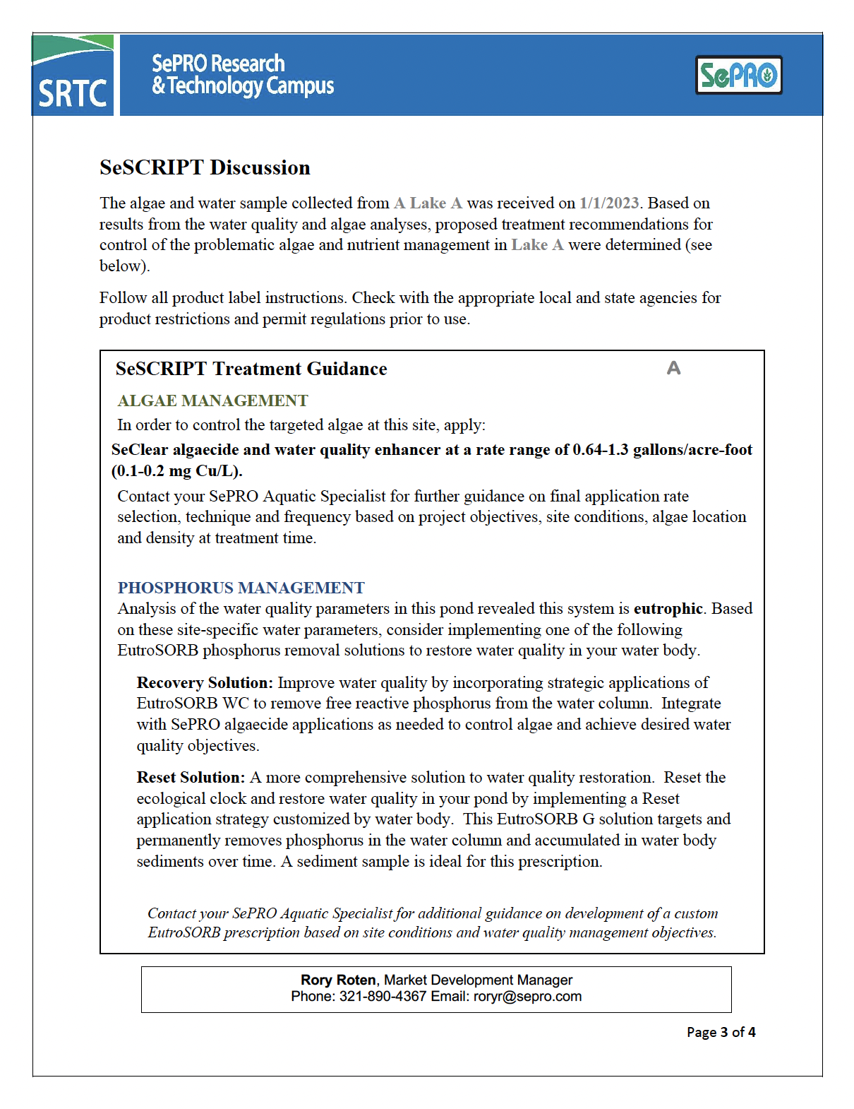
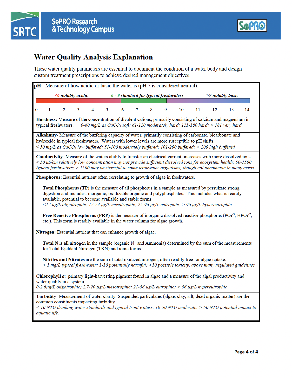
The old report was decades old. It was hard for customers to grasp the key information for their water bodies. This was due to its dense and out-of-date design. A lack of visual hierarchy made it difficult to understand the most important findings. One of the biggest challenges for this design task was it also needed to be editable for scientists to input results and data for end users.
the solution
A Collaborative Process
The project began with a collaborative effort. SEPRO’s water quality scientists, portfolio leaders, and our design team all participated in this evolving process. Scientists provided valuable insights into the data they studied. They also pointed out the key info customers need to know. Portfolio leaders offered their views on what info would be most valuable to customers. They also discussed how best to present it in the context of water quality.
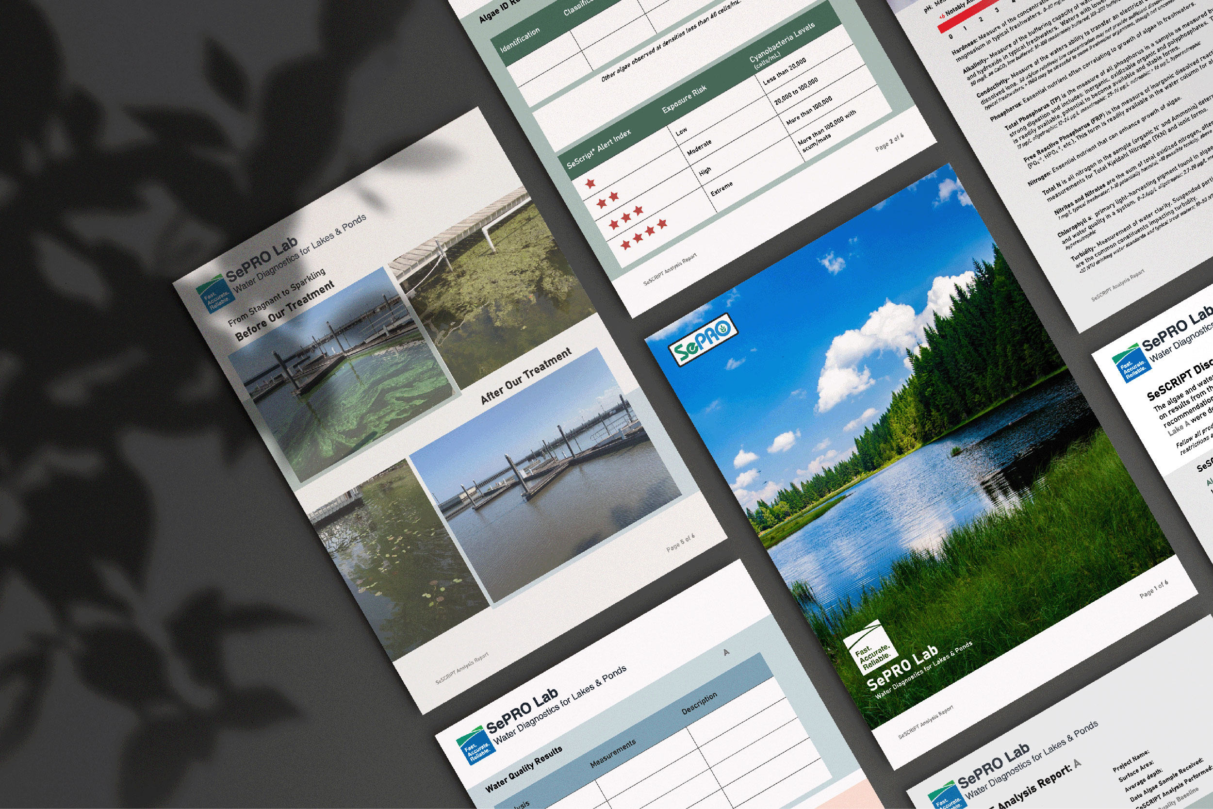
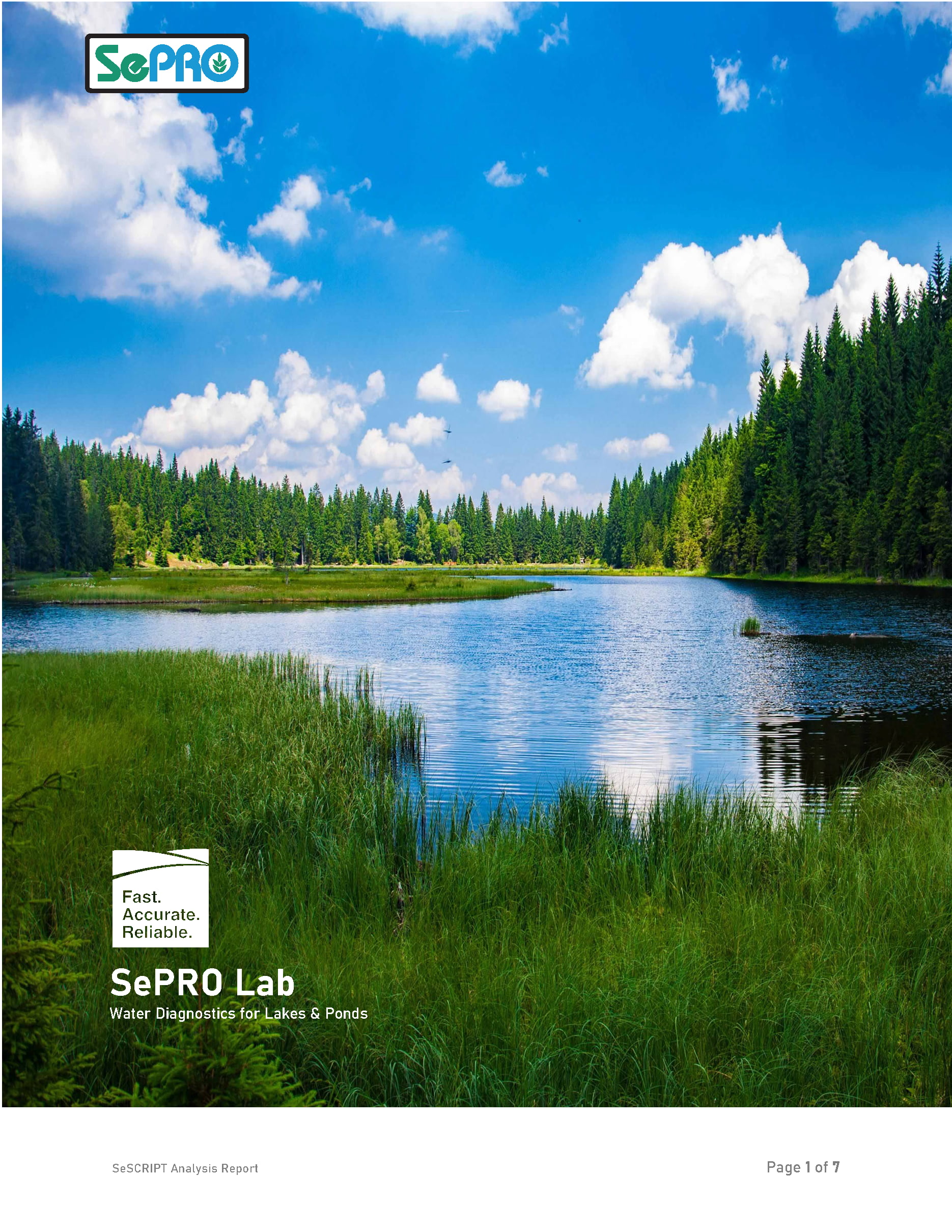
As part of this project, the SeSCRIPT logo received a modern refresh to reflect a more approachable and trustworthy image. This extended to the report itself, with the inclusion of a captivating cover page. The cover page showcased a serene and inviting waterbody, serving a dual purpose. It gave a quick visual link to the customer’s water quality concerns. It also sparked hope. They could imagine a future where their waterbody could be or continue to be as clear and calm. This subtle approach aimed to excite and motivate the customer to take action based on the water analysis report’s findings.
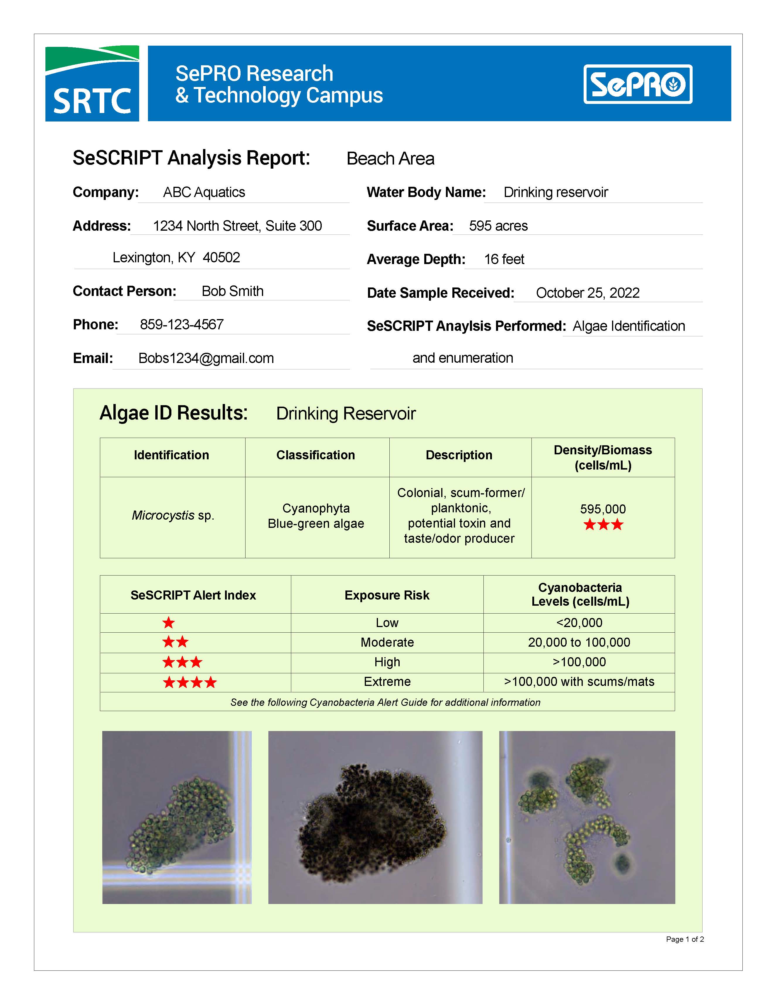
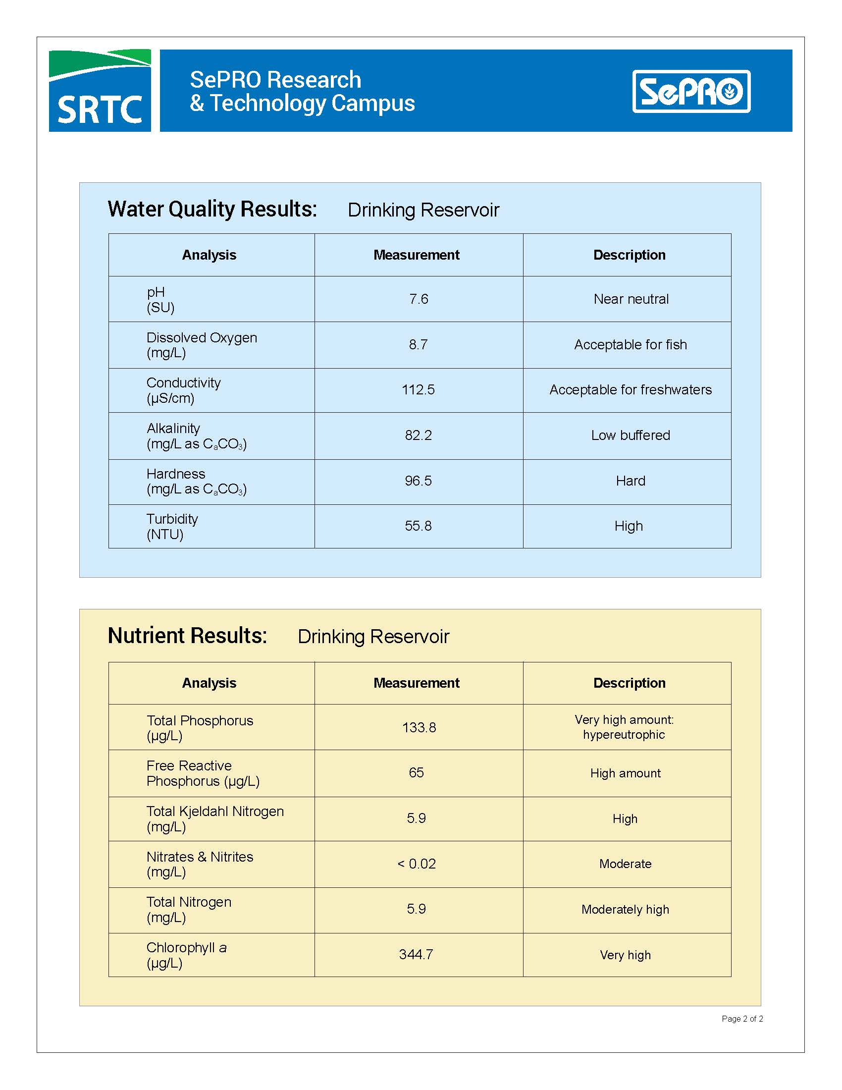
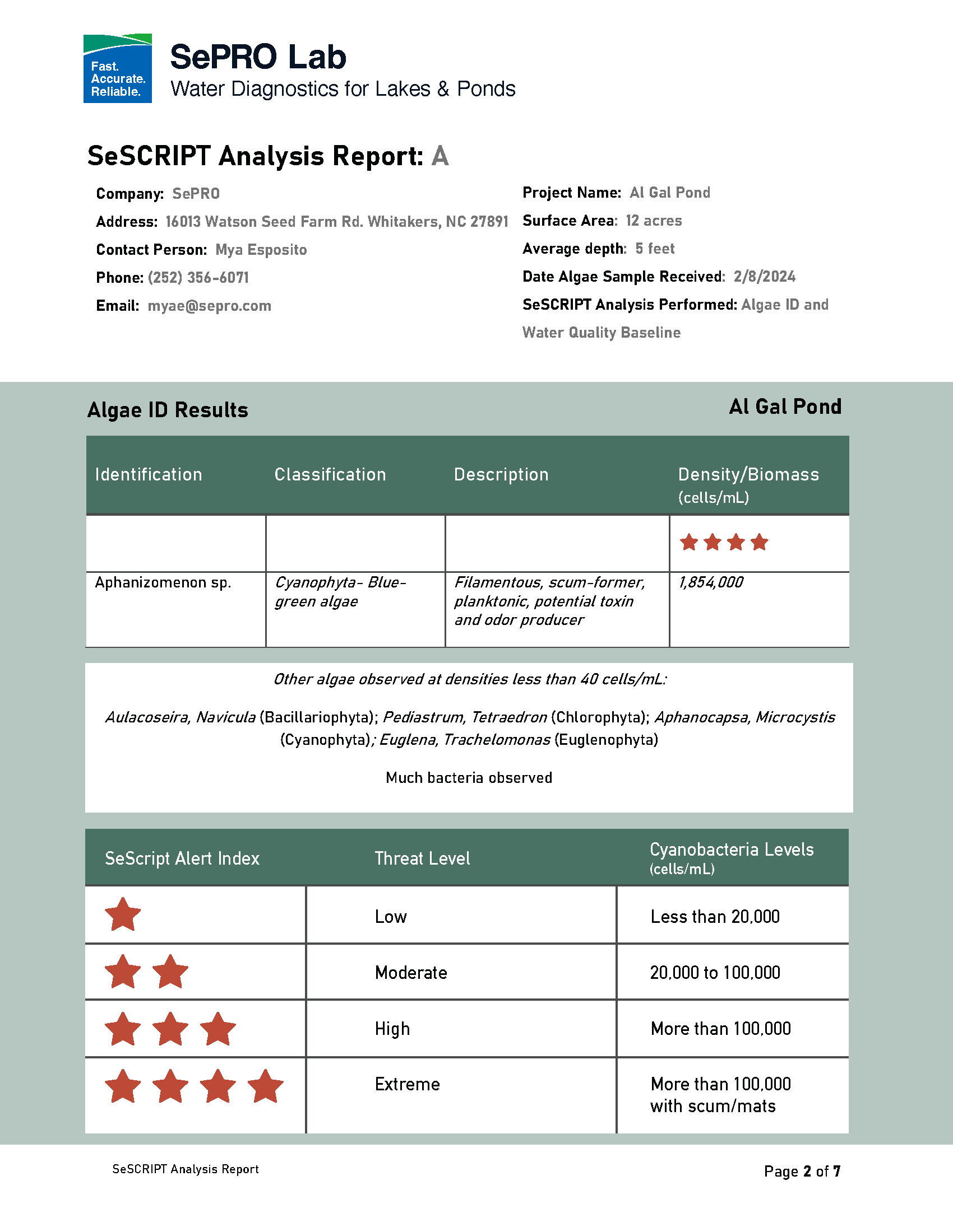
A modern design and brand refresh with a clean layout, easy-to-read fonts, and a consistent color scheme enhanced readability. Headings, subheadings, and bolded text create a clear order. They guide the customer through the analysis in a logical way. Whenever possible, the text is concise and avoids technical jargon. Simple explanations accompany data to ensure clear understanding. Charts and tables are placed to show data, such as contaminant levels. They allow for easy spotting of trends and any elevated numbers needing monitoring. The report utilizes a Word document format, enabling scientists to easily and quickly fill out and/or edit the document for the customer.
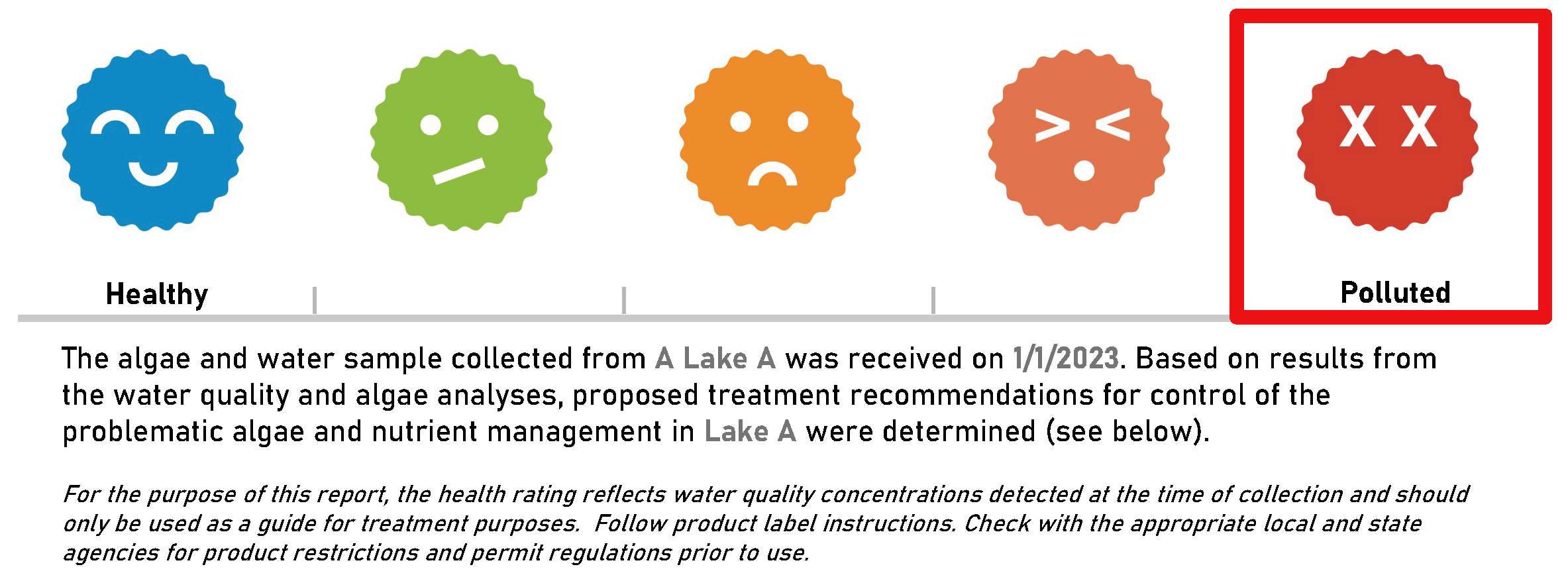
A key addition to the report was the introduction of an easy-to-understand waterbody health graph. This infographic presents a quick visual representation of the overall toxicity of the customer’s water sample, allowing for an immediate grasp of potential problems.
results
Customers, both new and old, reported a significant improvement in comprehending their water analysis results. Increased customer satisfaction is evident with the SePRO SeSCRIPT water analysis service. Sharing reports with customers becomes effortless. Reduced customer inquiries for clarification lead to improved efficiency and trust for SePRO.
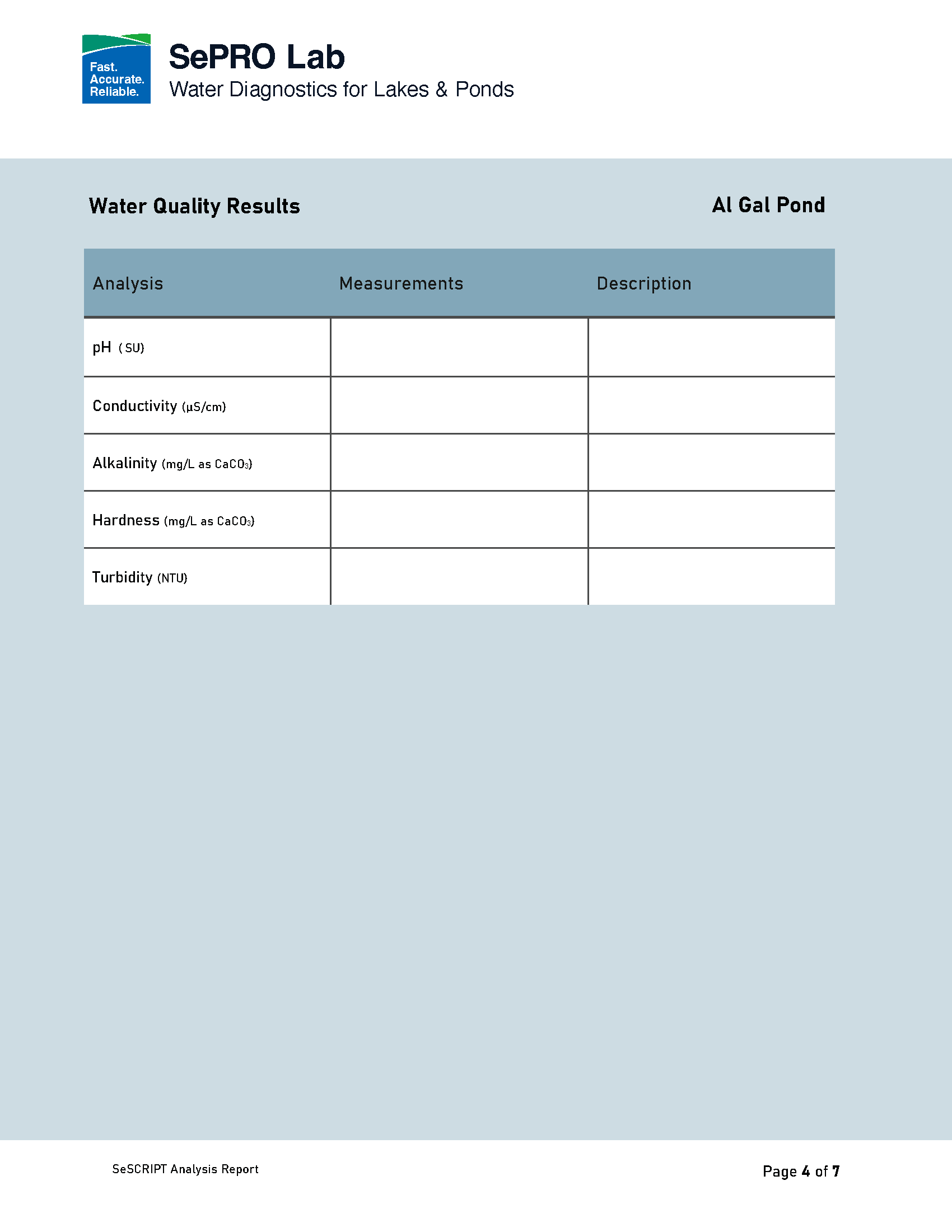
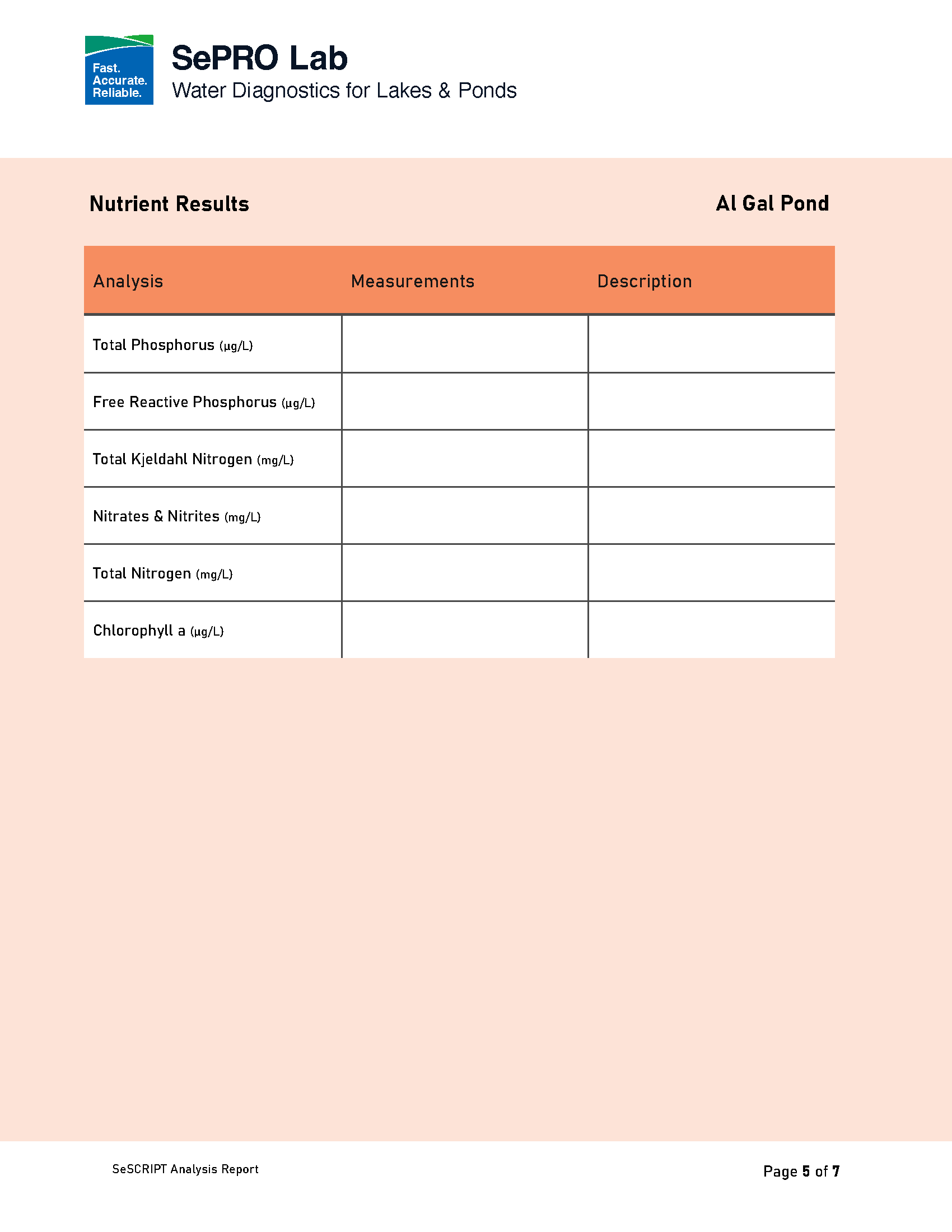
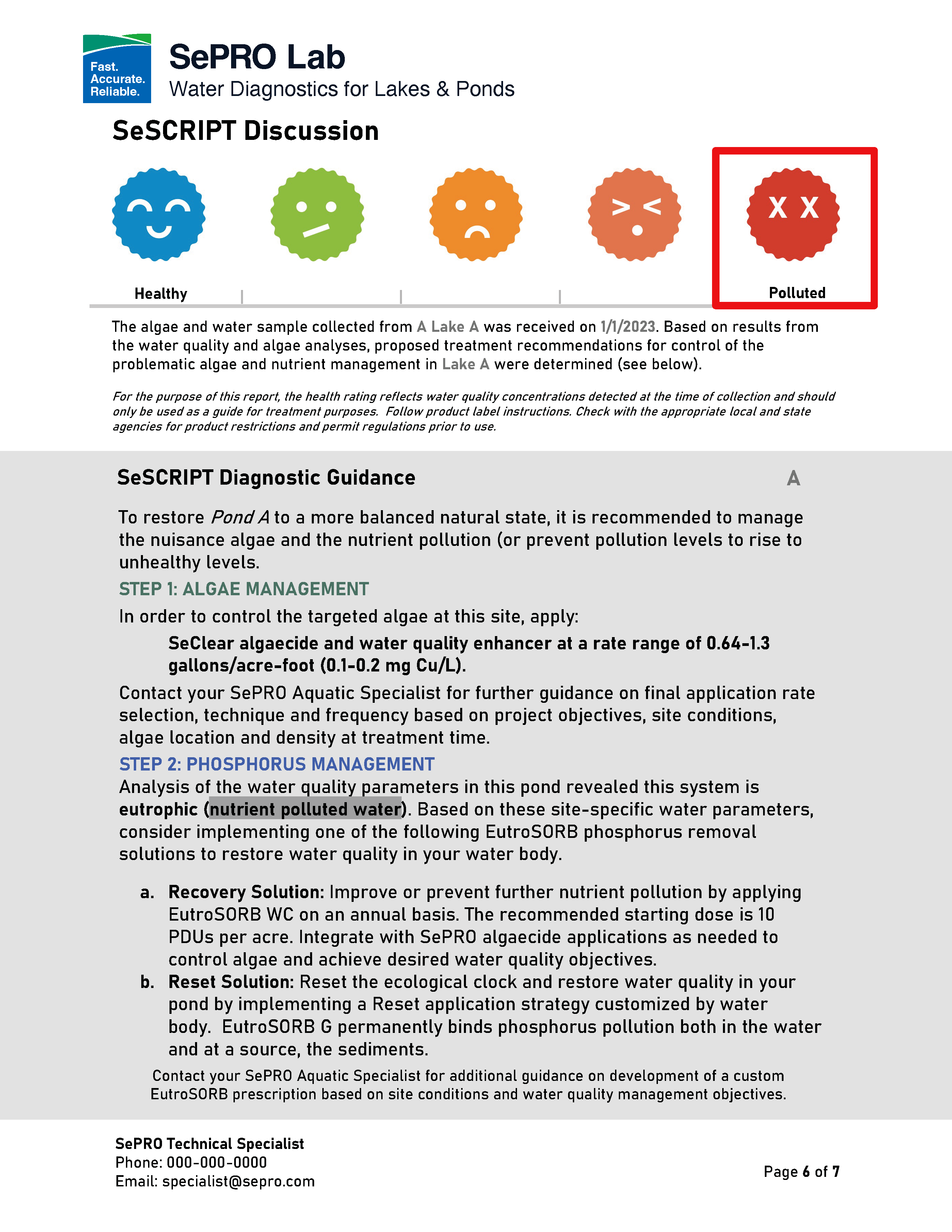
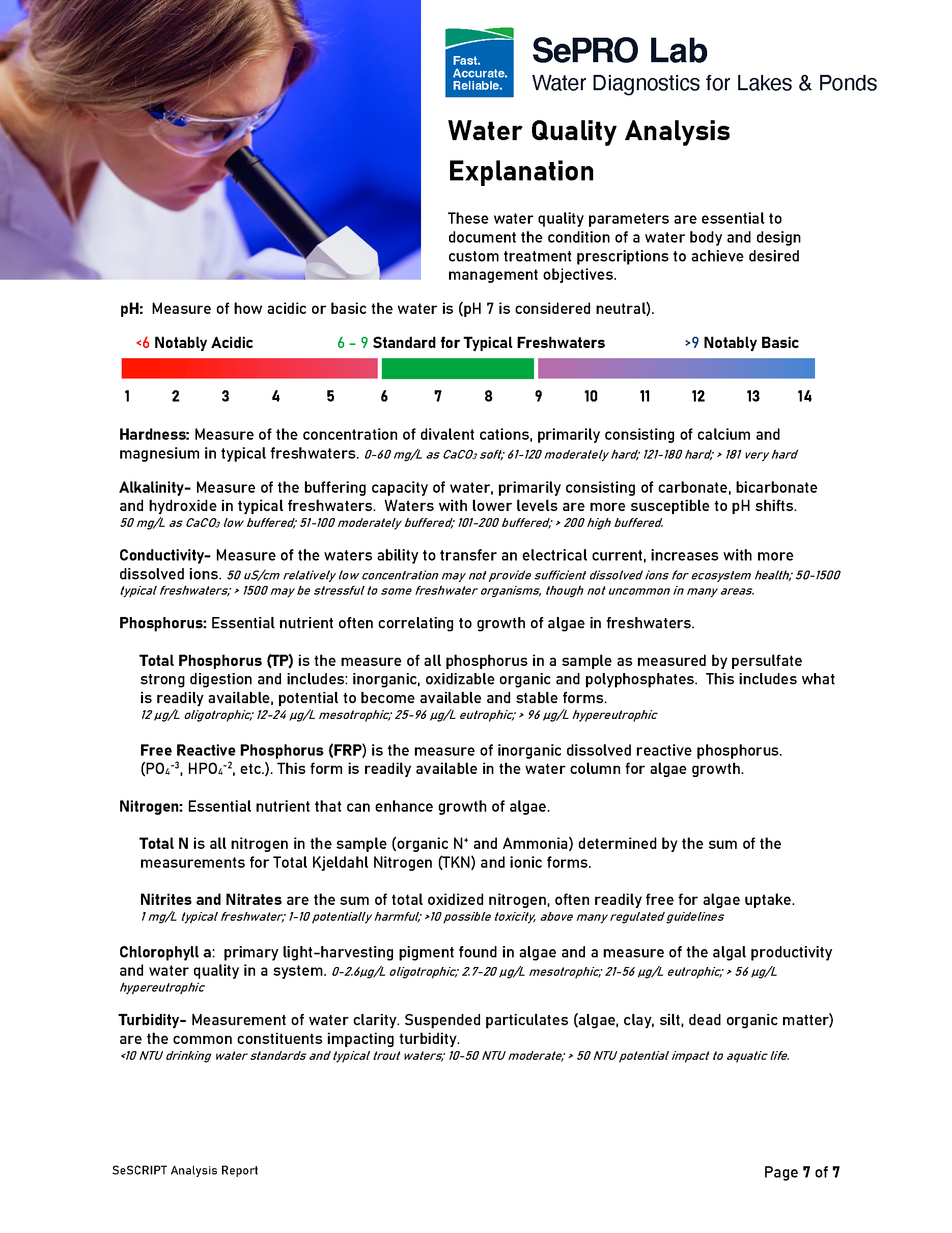
The new SePRO SeSCRIPT Water Analysis Report shows the value of clear and short writing in technical documents. SePRO prioritizes user experience. It does so through design, format, and clear language. This empowers customers to make informed decisions about their water quality.
continue to next case study
I led the overhaul of SePRO’s aquatic product brochure. By weaving a narrative that resonates with both homeowners and aquatic professionals alike, our redesigned brochure not only simplifies complex information but also guides readers through a journey of understanding and empowerment. This approach not only led to positive customer feedback but also reinforced SePRO’s commitment to excellence in aquatic solutions, ensuring the brand shines brightly in a crowded market.
