ultimate applicator event
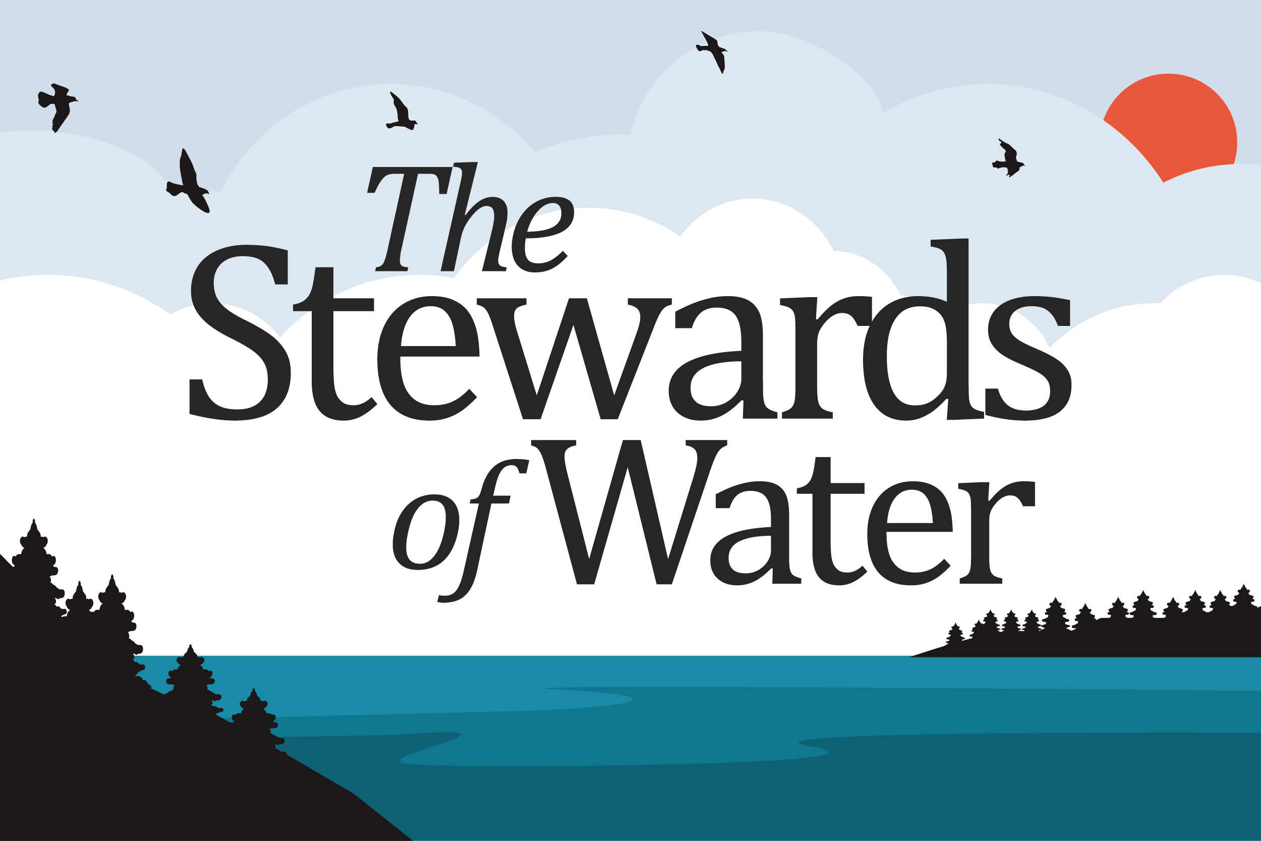
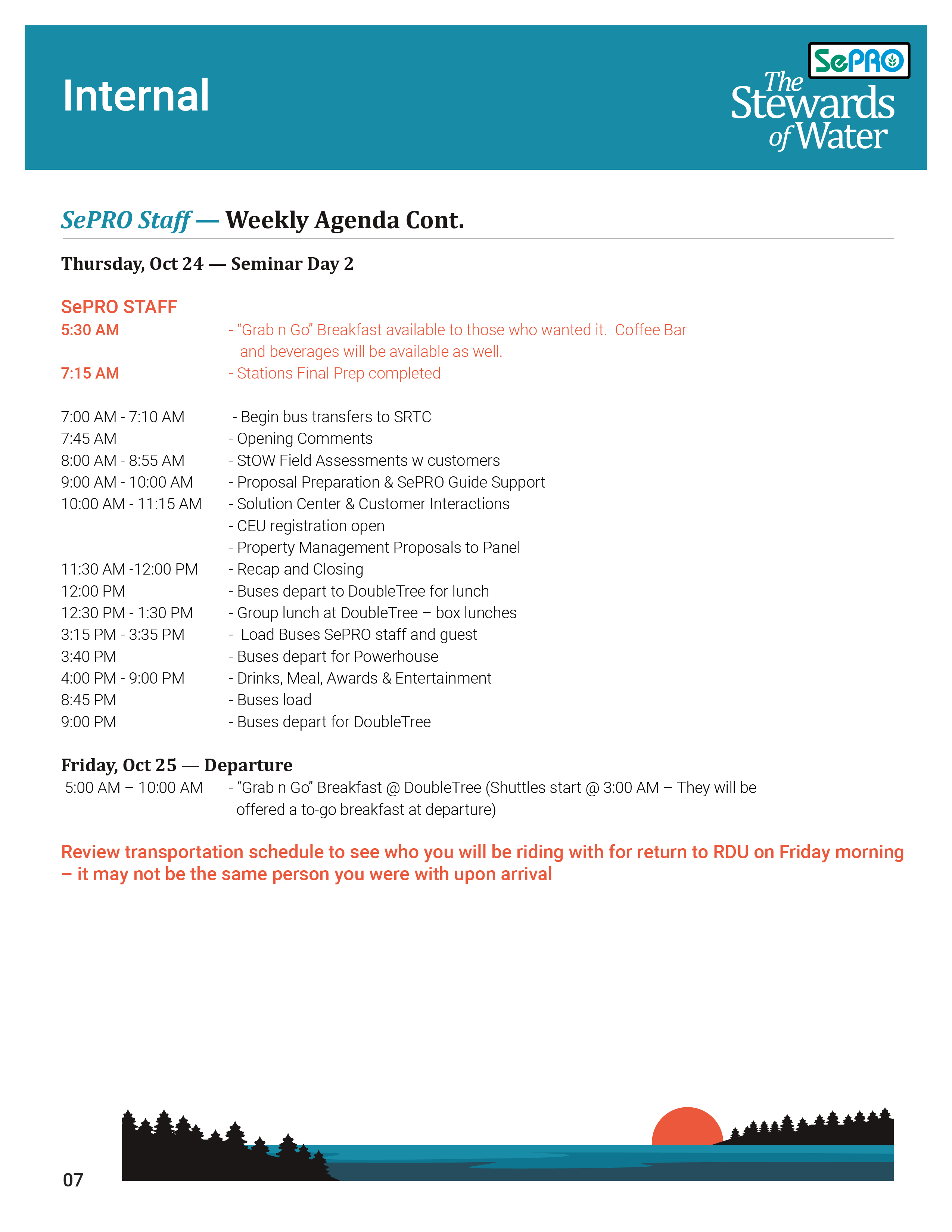
Created the brand identity for the Stewards of Water

the problem
In Need of an Identity.
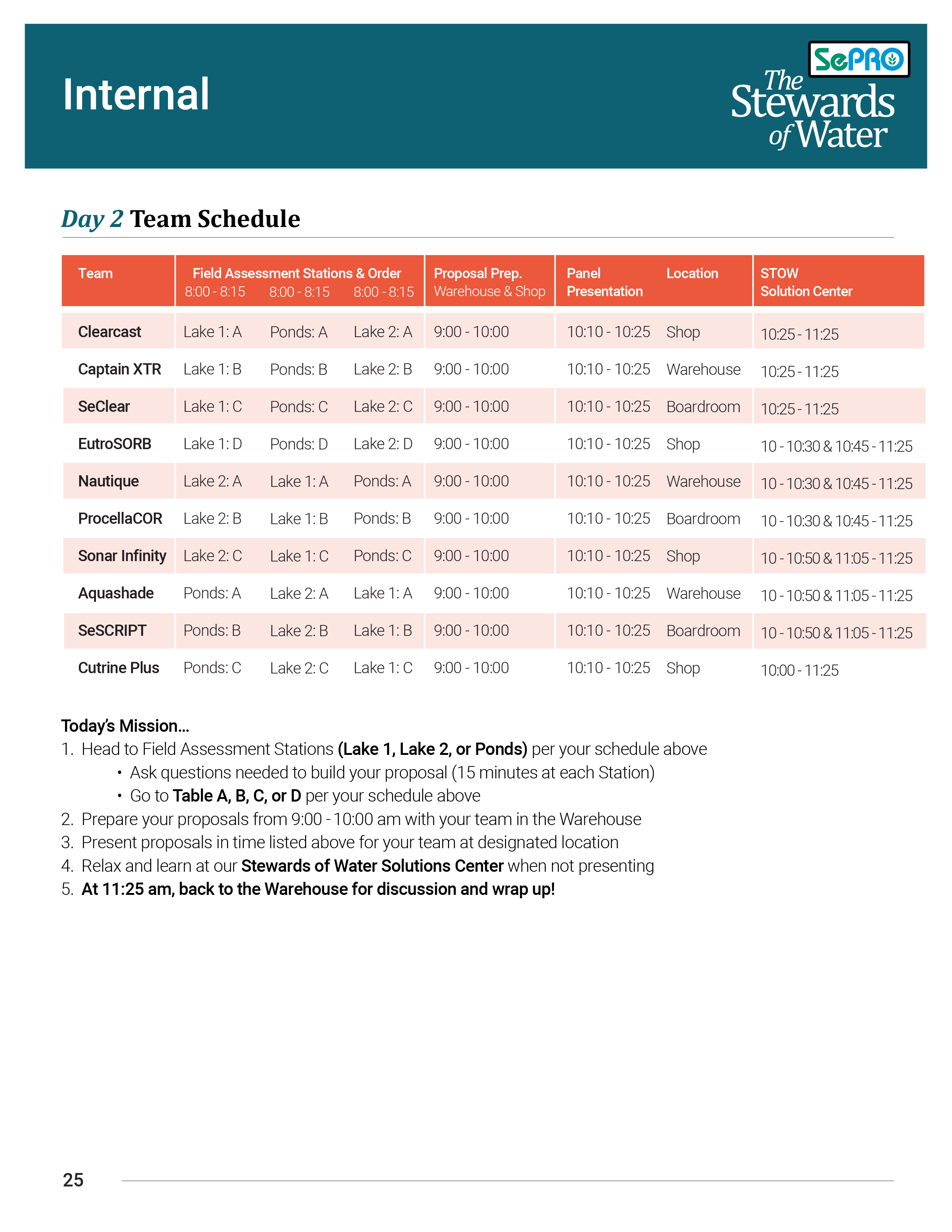
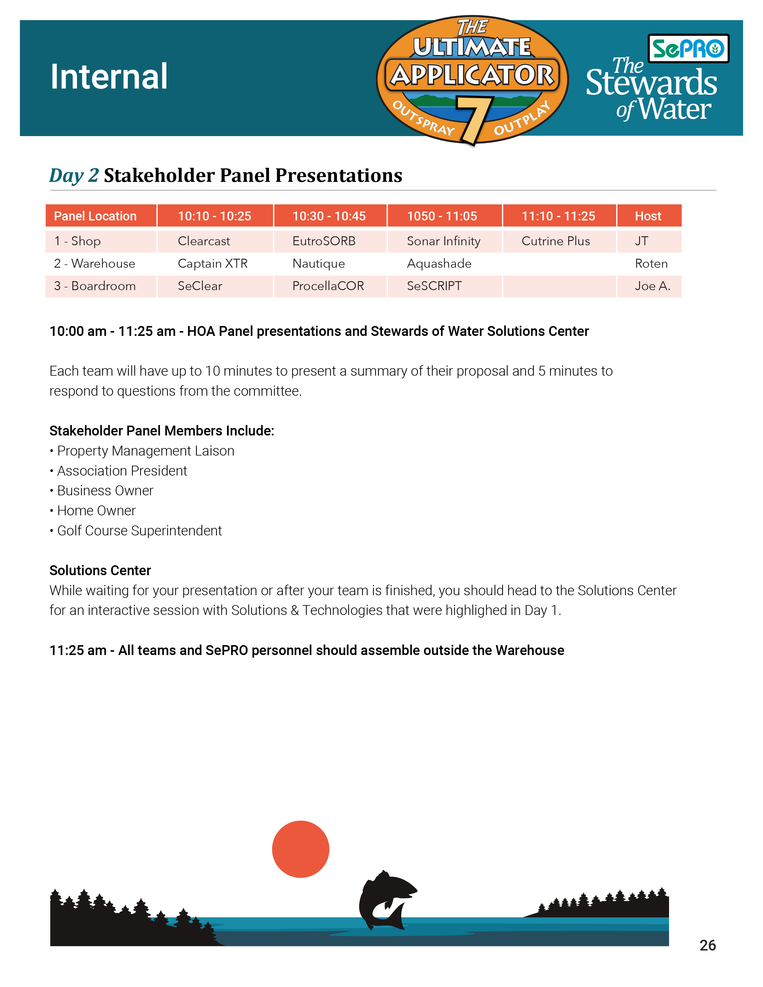
The Ultimate Applicator Event is a critical, bi-yearly business operation for SEPRO’s Stewards of Water program. It had seen big growth over two decades. However, it lacked a cohesive brand identity and engaging features to maximize the attendee experience.
Collaborative Thinking
Roughly ten months before the event, a meticulous planning process began. We held meetings every two weeks to brainstorm. We wanted to create a strong, unique voice for the Ultimate Applicator Event. It would set the event apart from other parts of SePRO’s business. The main goal was to create a new brand identity. It would match SePRO’s minimalist and simple brand, but also be a bit different. They also wanted to add interactive elements to boost attendee participation and excitement. Additionally, they wanted to establish a central hub for all event info and activities.
In the initial planning stages, understanding our audience was paramount. To do this, we developed user personas for two key kinds of attendees: first-timers and veterans of the Ultimate Applicator Event. The personas focused on aquatic professionals. They specialize in treating waterbodies for algae and weeds. They rely on SePRO products in their daily work. Through this process, we gained valuable insights into their needs and expectations. For instance, newcomers might need more about the event format and networking. Veterans might want advanced product training or industry updates.
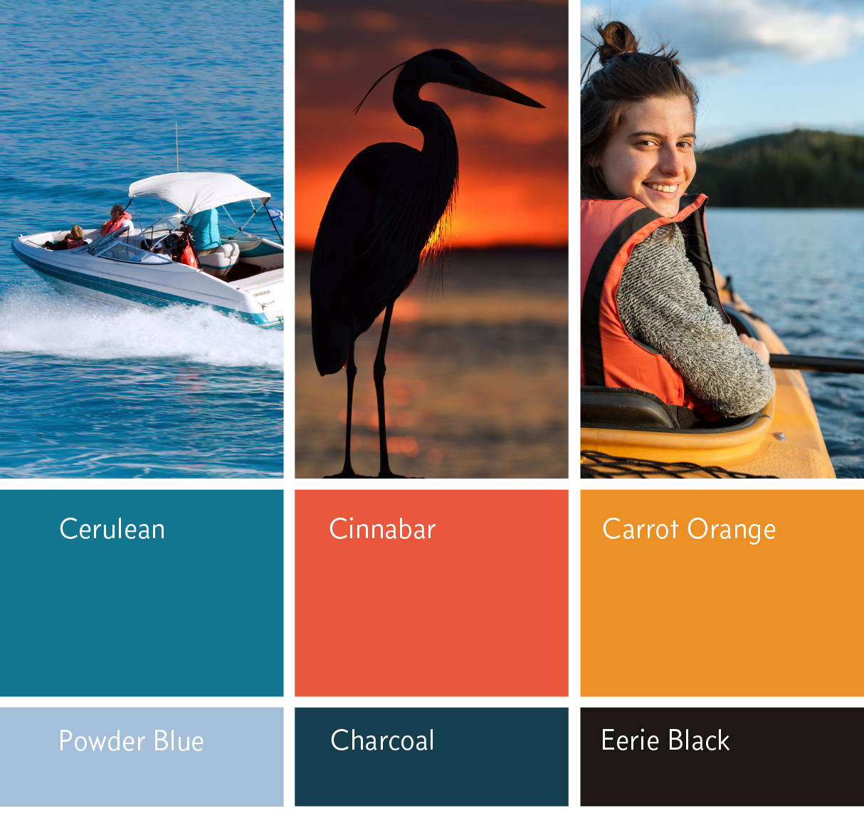
In tandem with persona development, mood boards were created to visually explore the new brand identity. These boards incorporated stock imagery and color palettes that resonated with the target audience and desired messaging of the event. We combined user research with creative exploration. We did this to make sure the new branding would not only look good but also resonate with the aquatic professionals at the Ultimate Applicator Event.

the process
Diverse and Simple
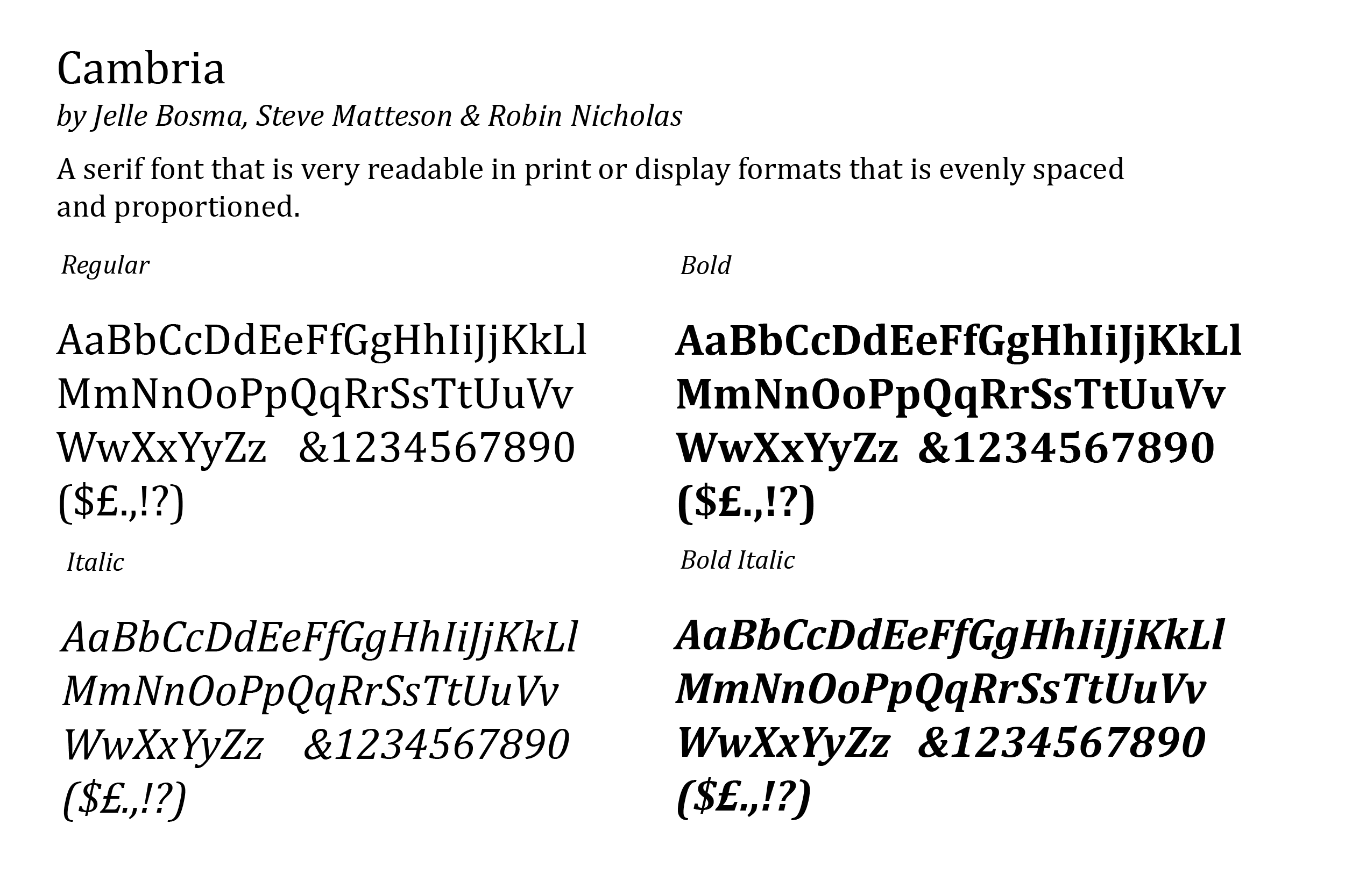
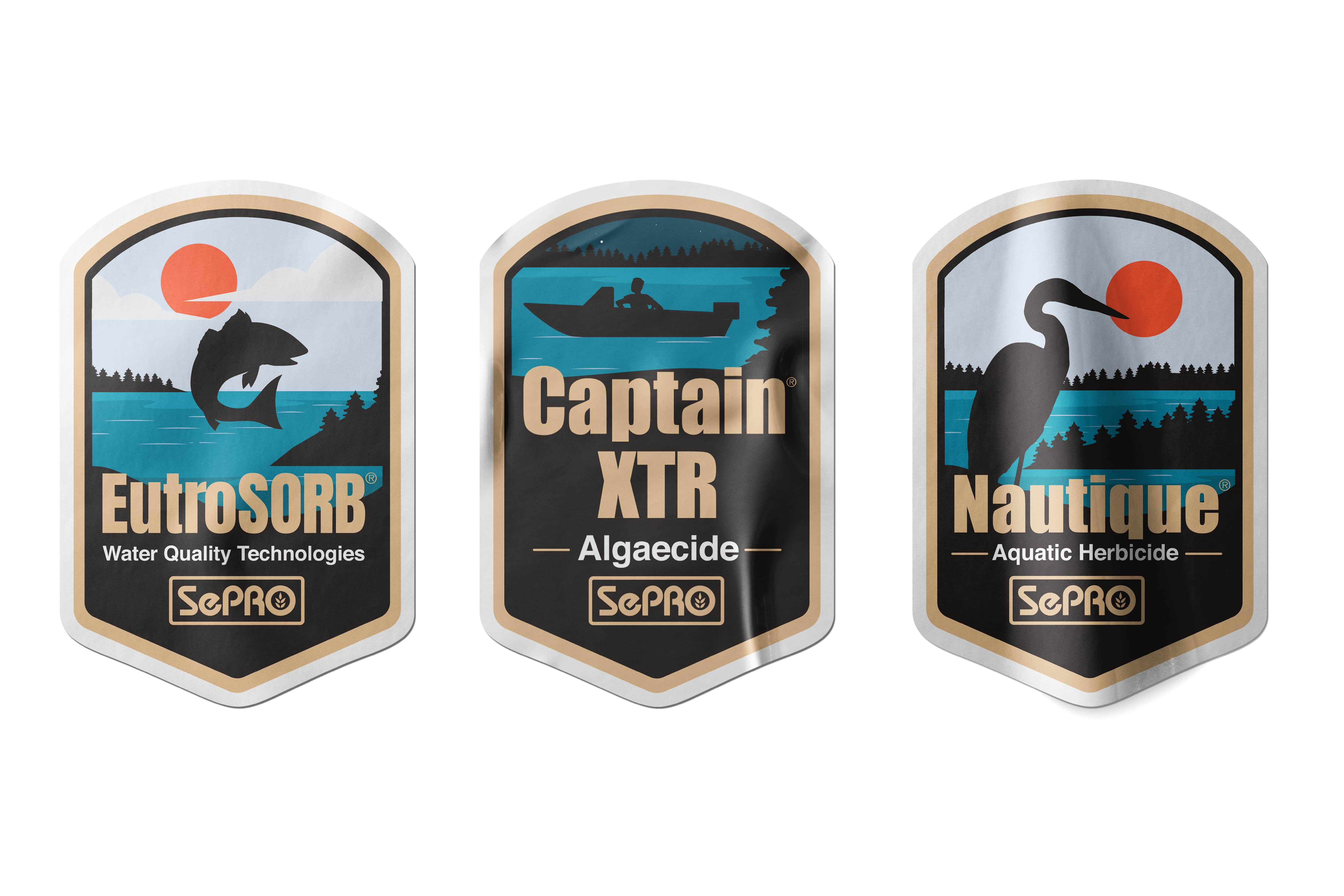
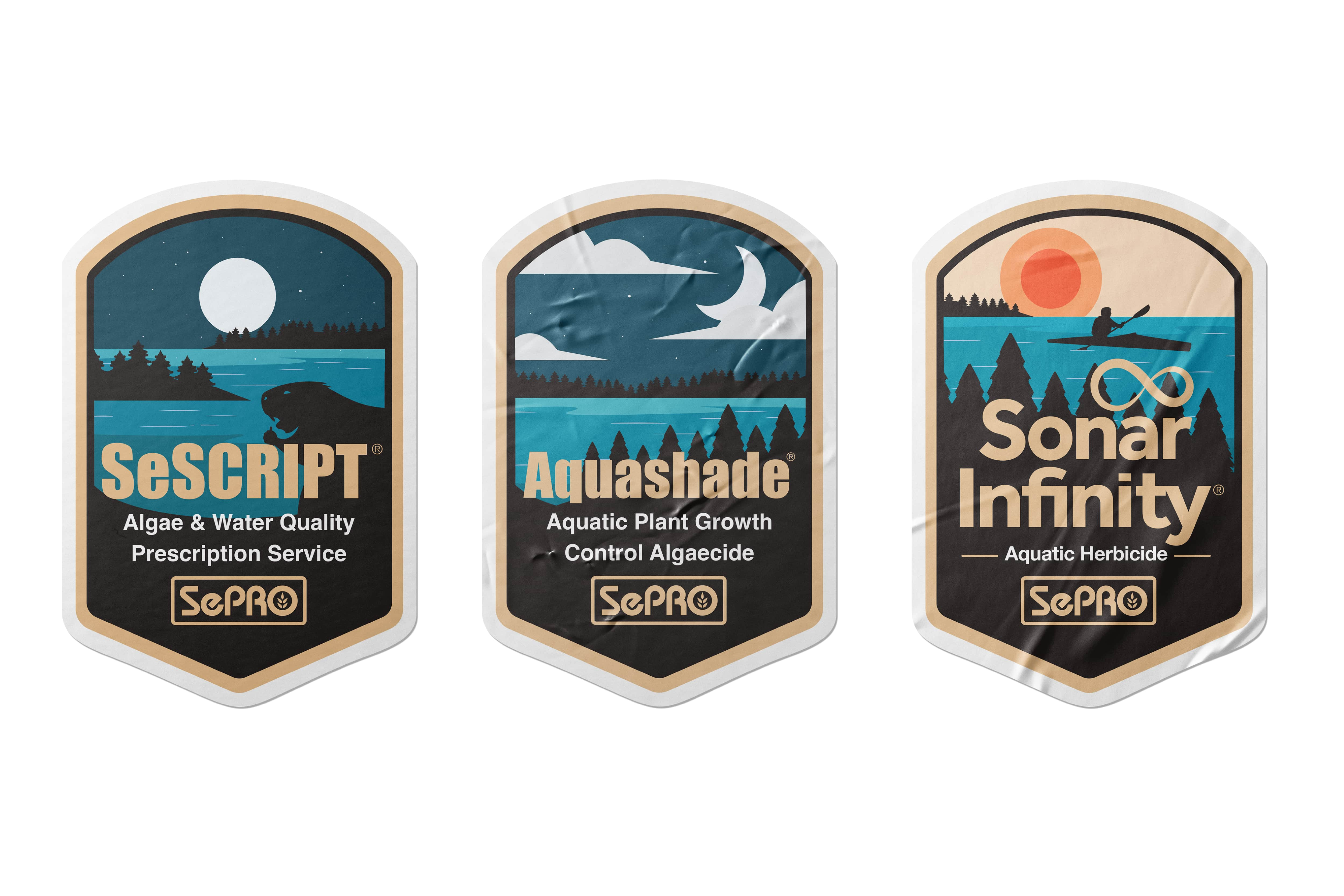
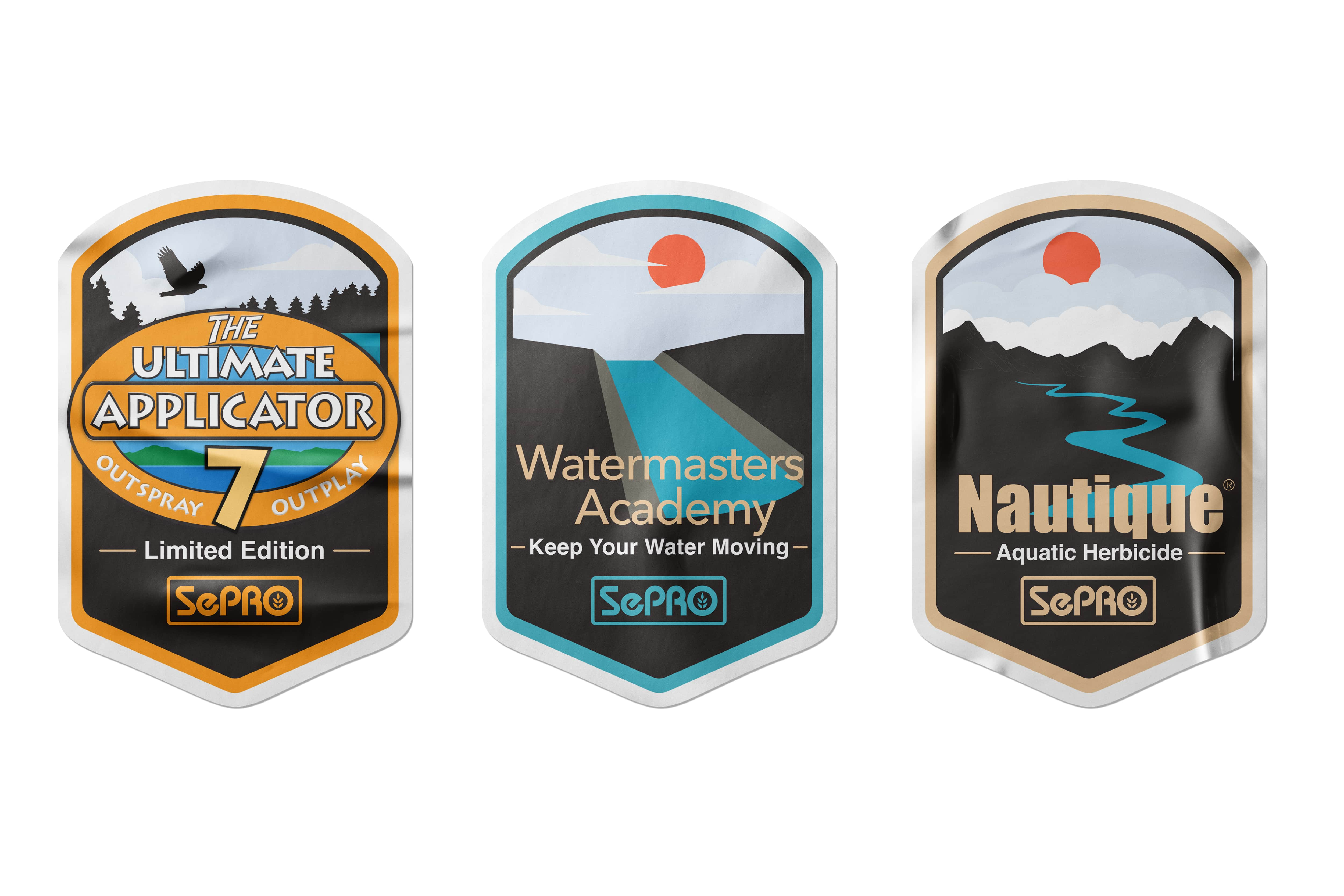
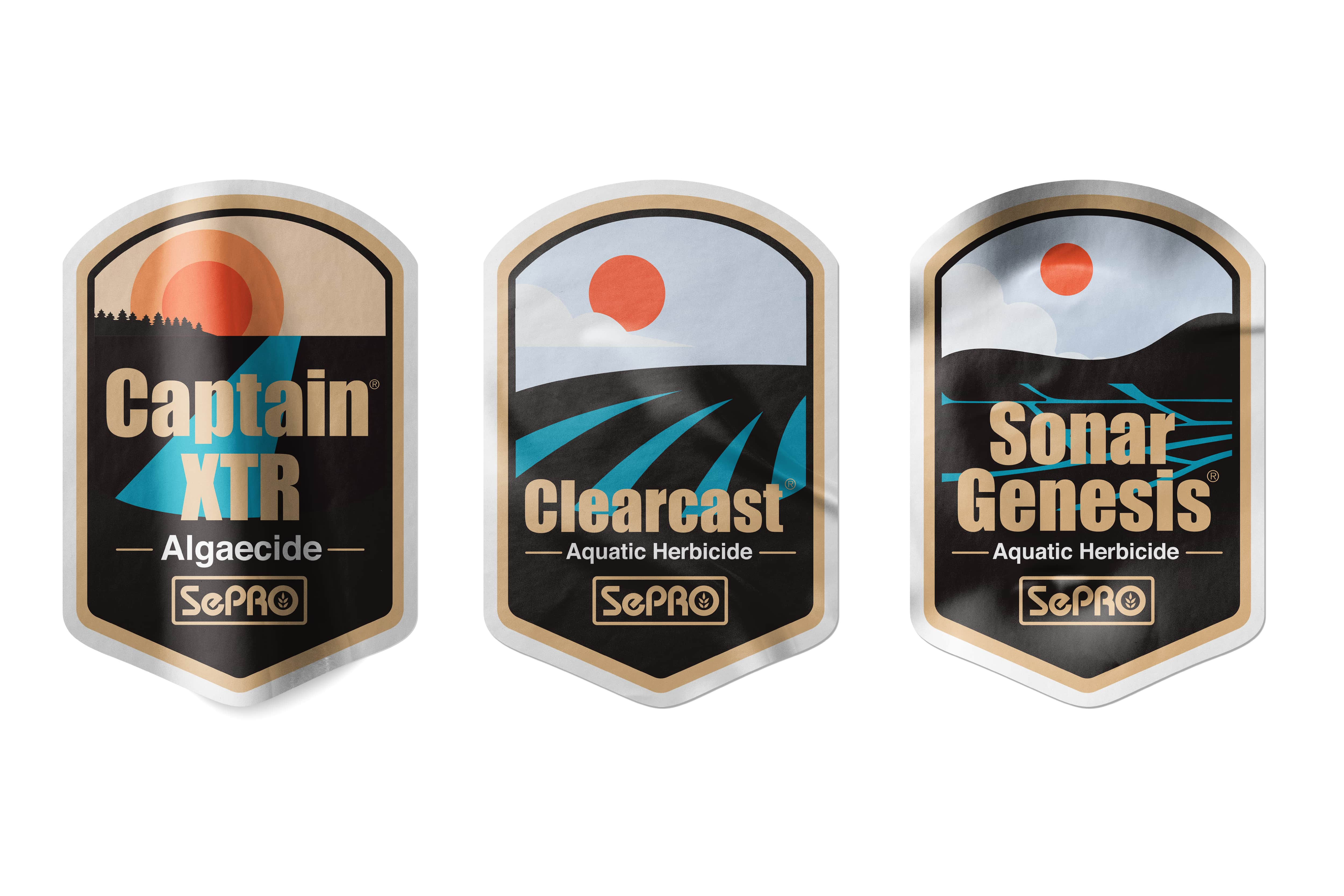
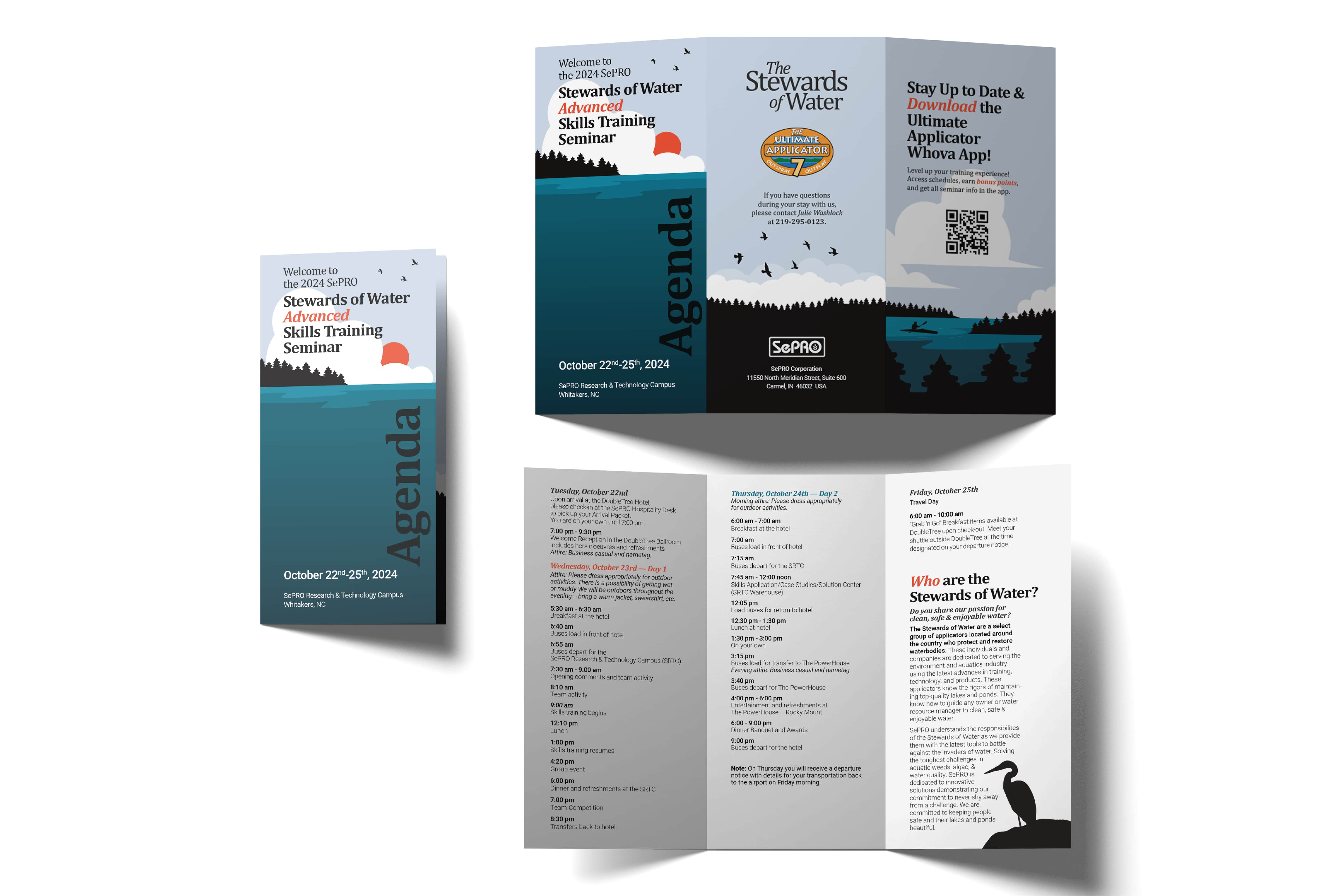
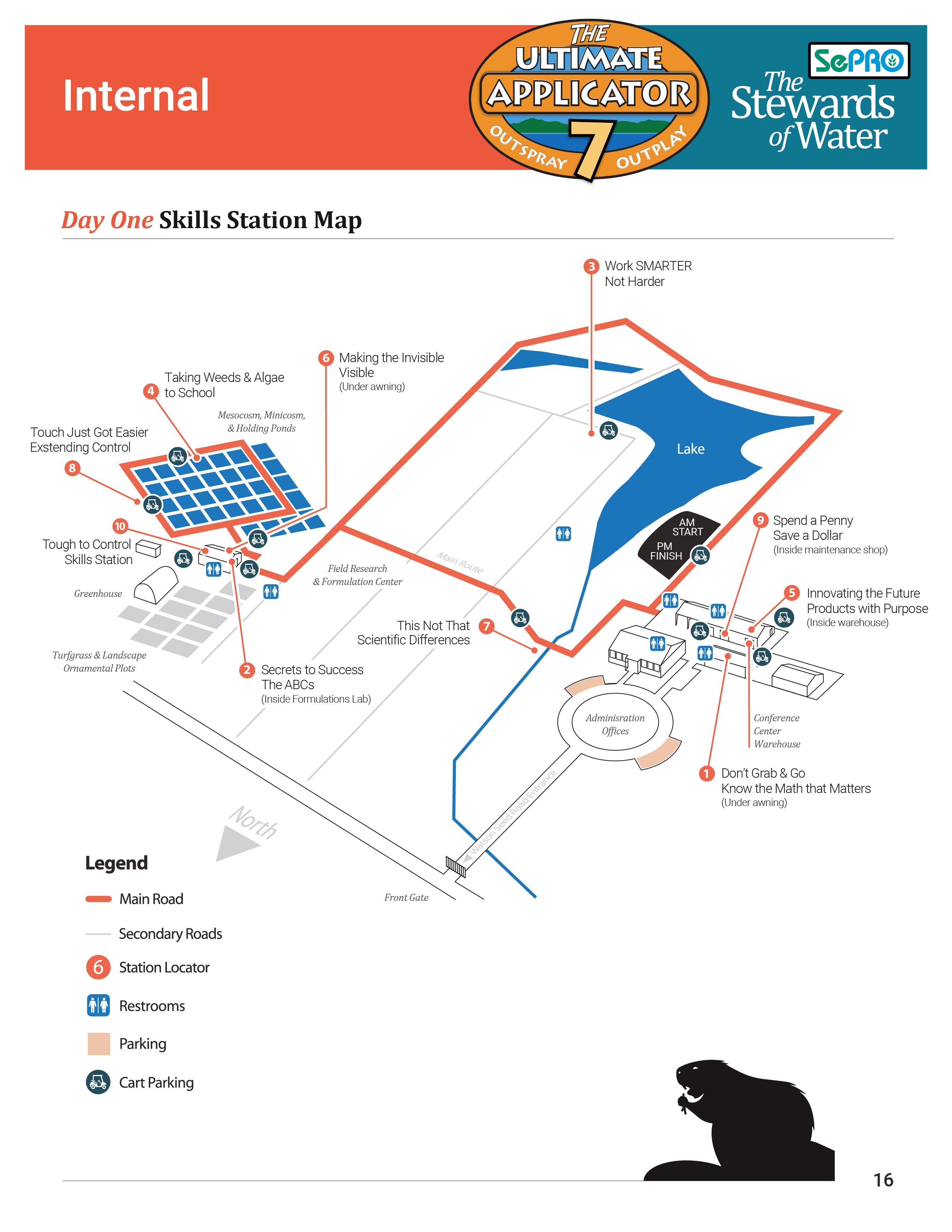
We arrived at a solution that incorporated both brand alignment and event character. We chose minimalistic illustrations of lakes and ponds, utilizing bold shapes and vivid colors to create a visually distinct brand language. These illustrations showcased the beautiful work accomplished from the things learned from this event. The Cambria font was selected for its exceptional legibility across digital and print mediums. Additionally, Cambria’s diverse family offered many options. They allowed for creative and engaging applications while staying accessible to all. This font is widely available which ensured that presentations and templates could match the new brand language across many users and operating systems.
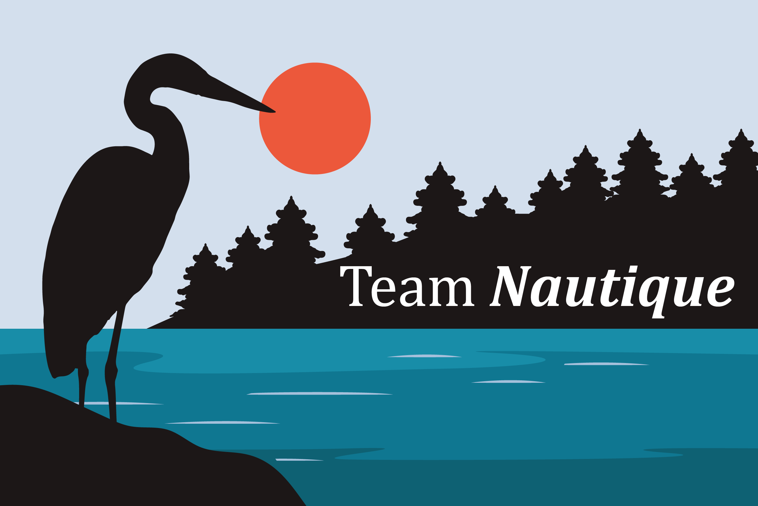
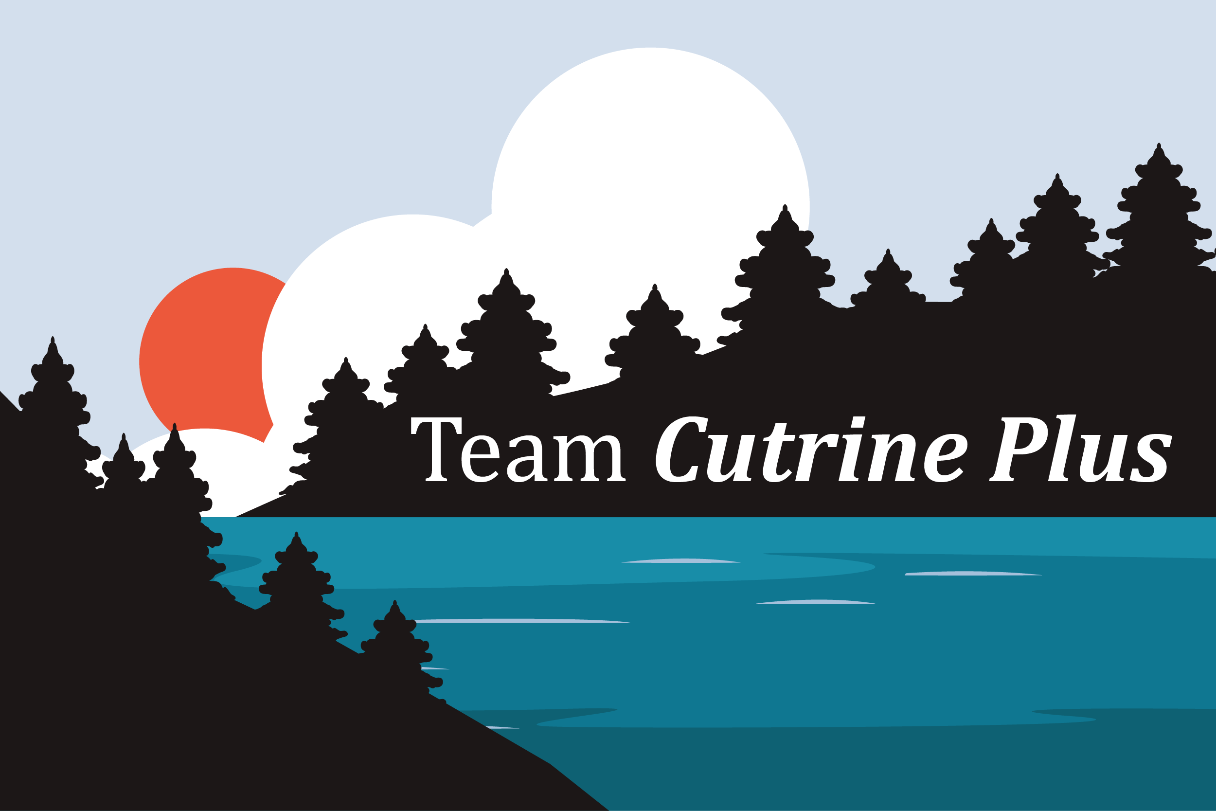
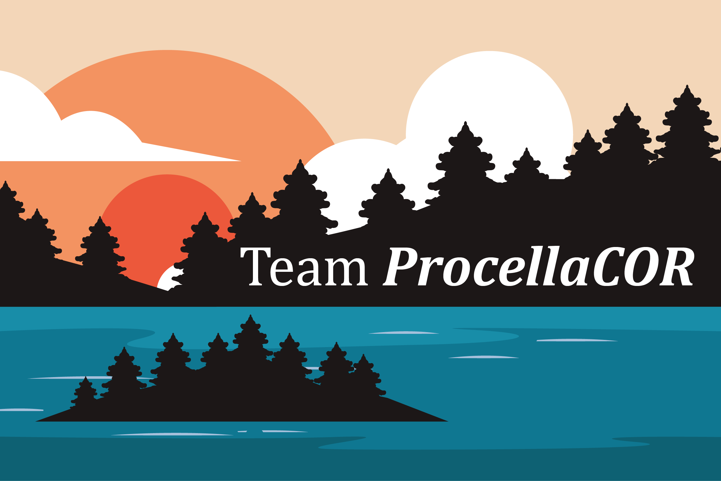
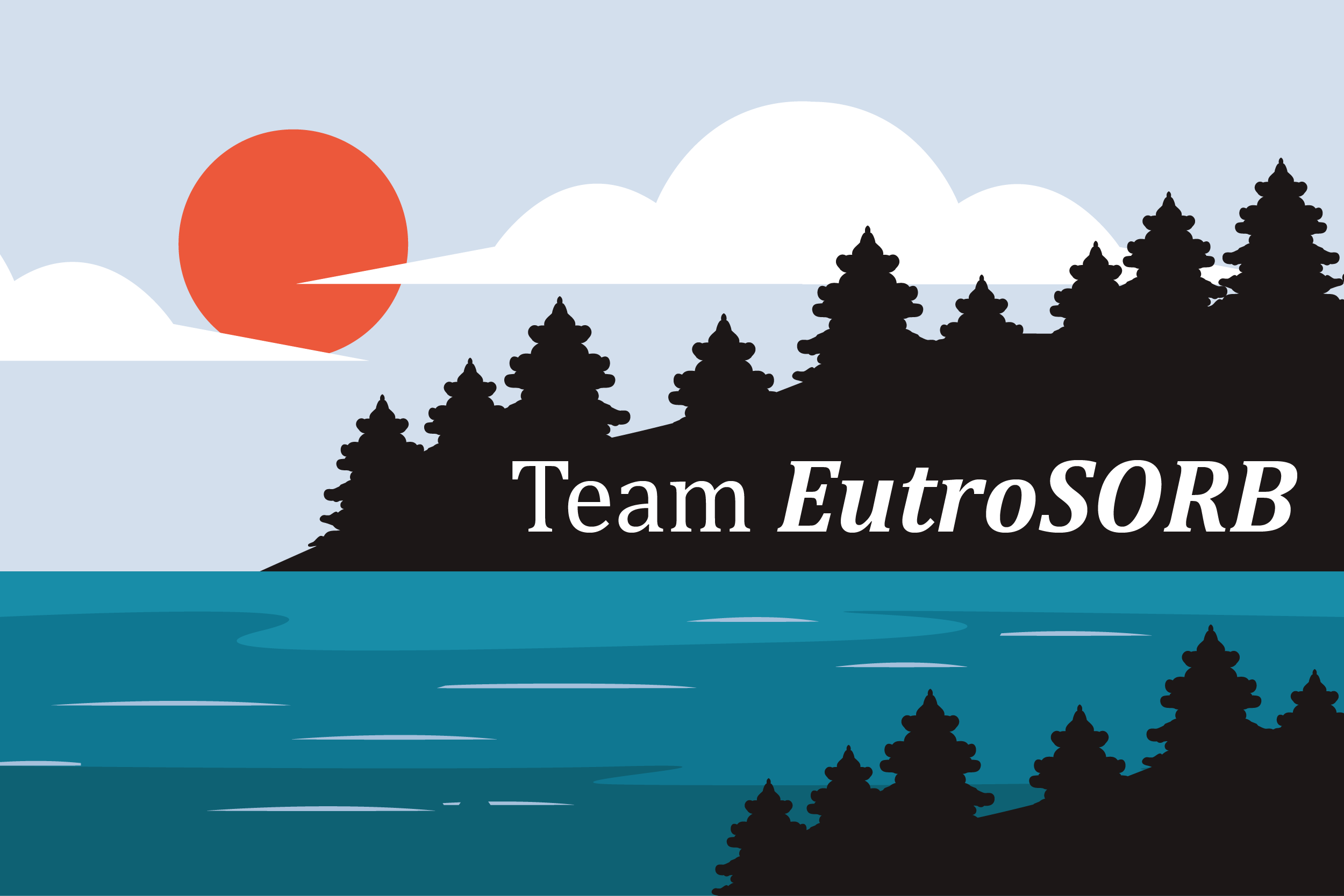
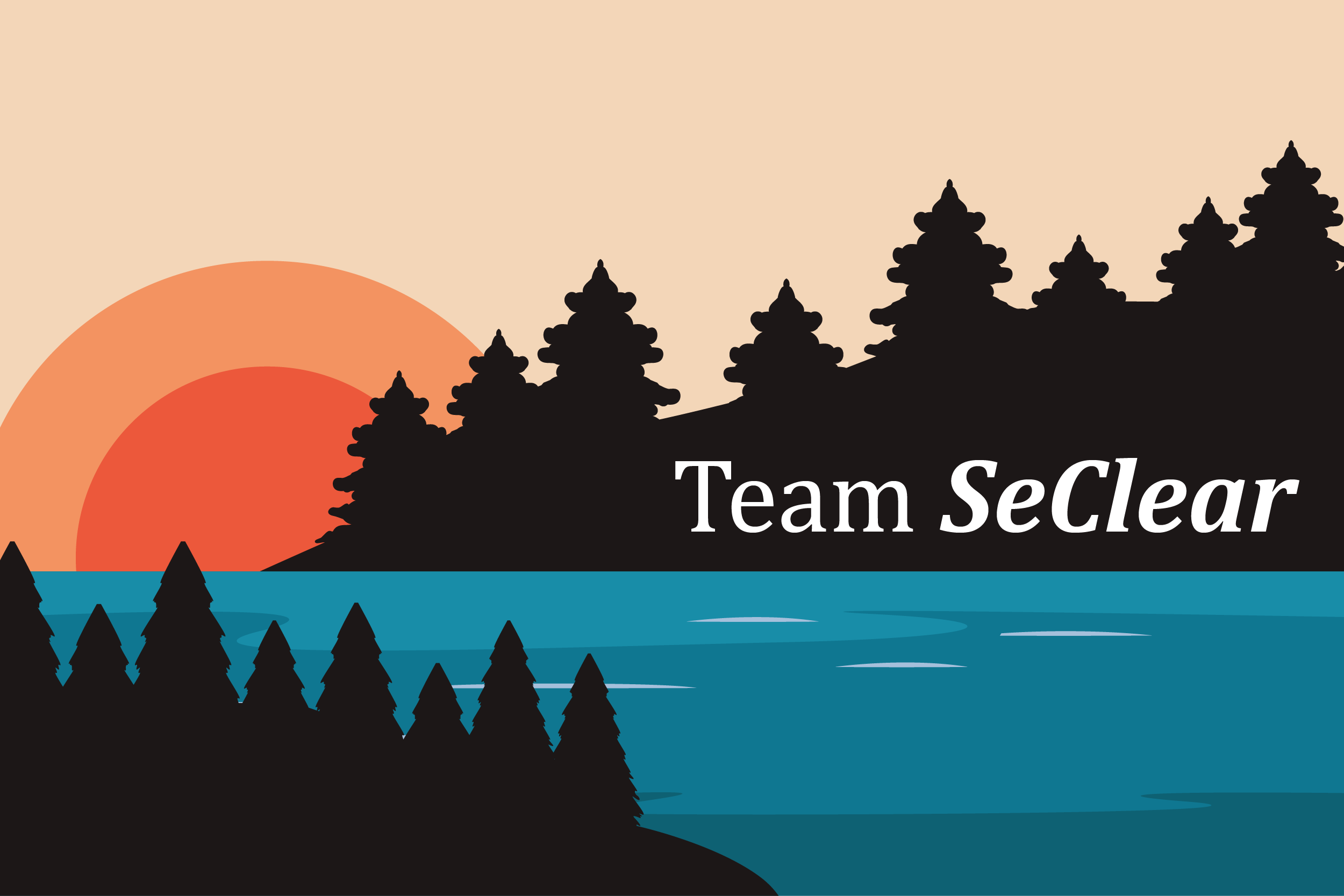
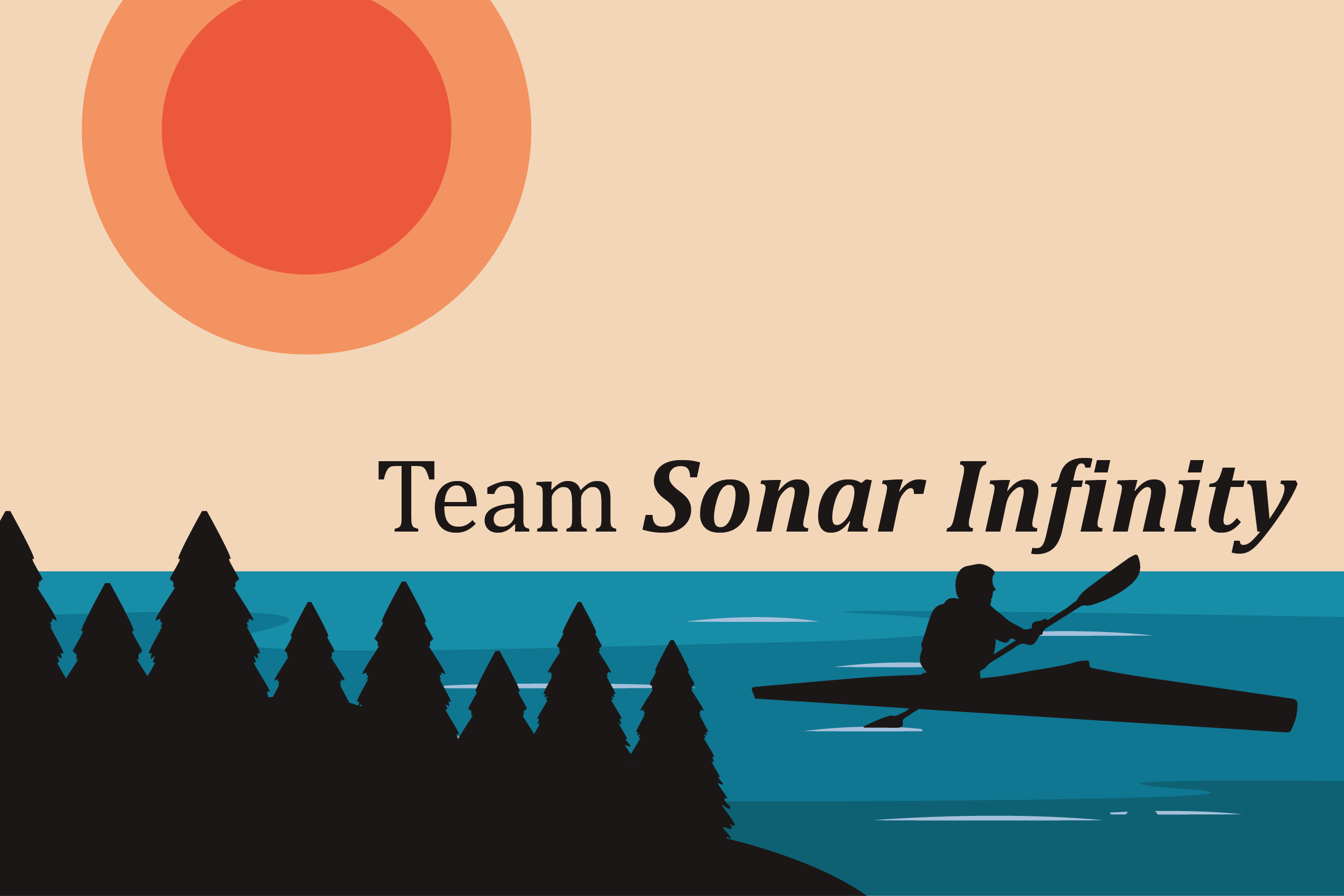
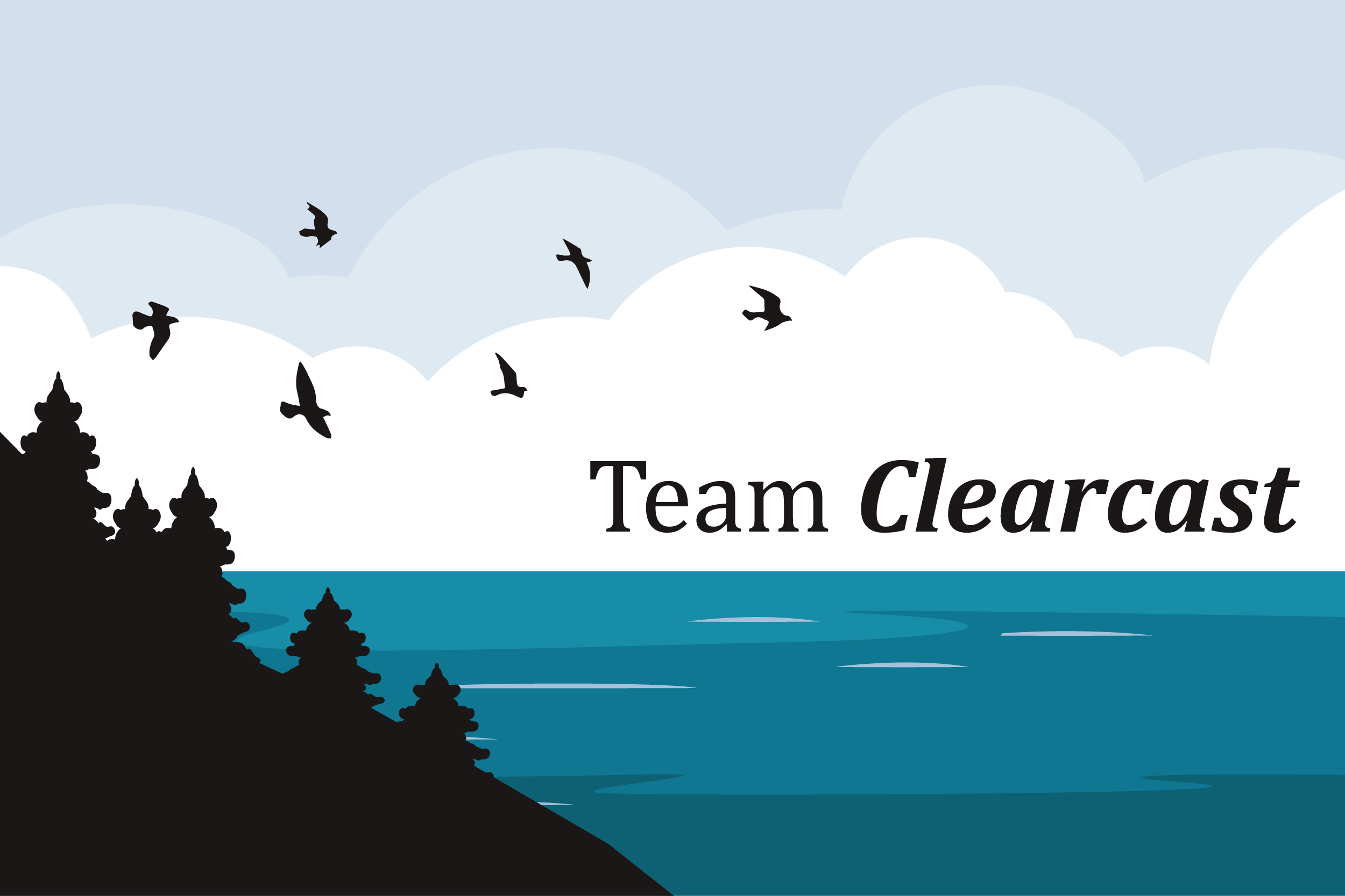
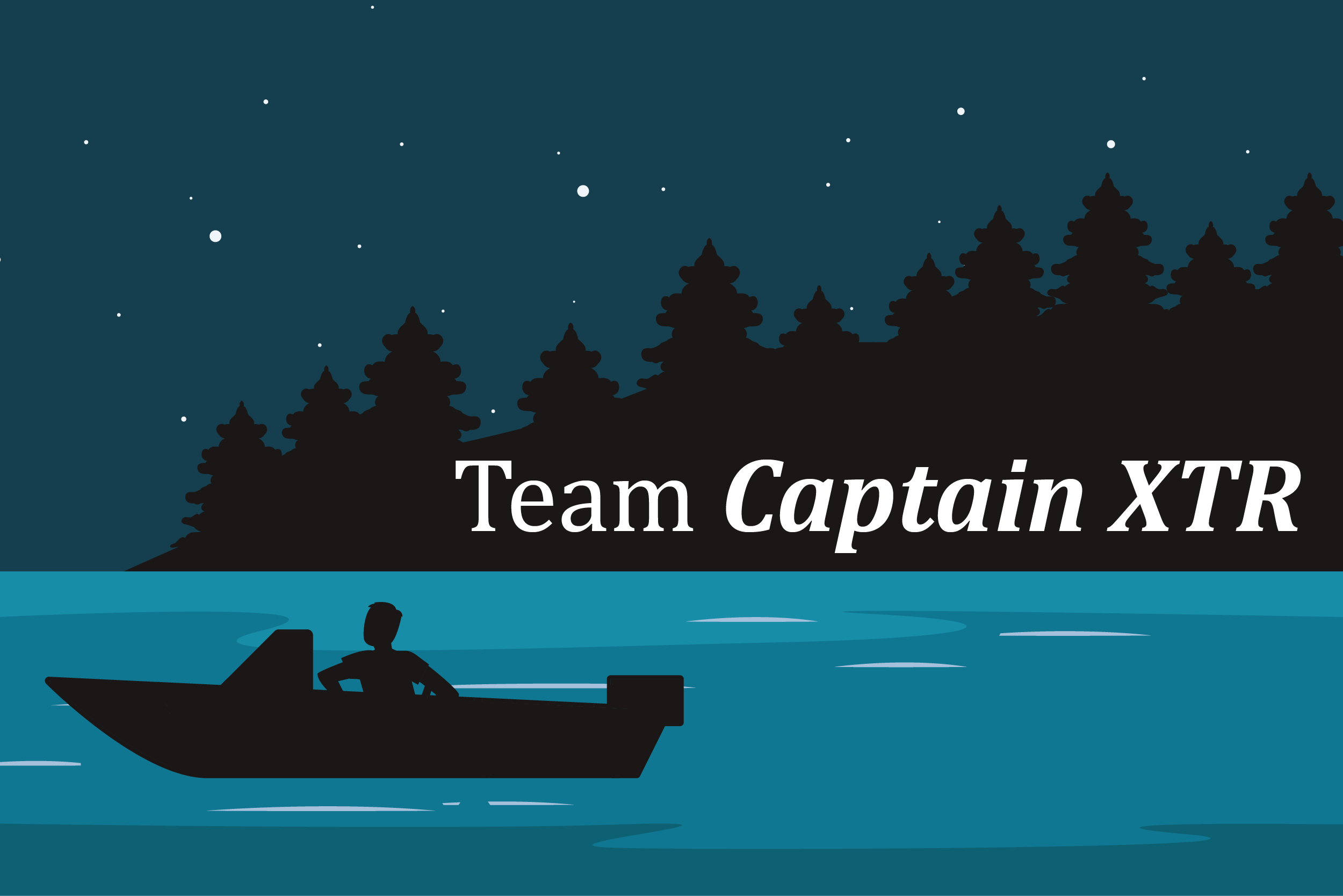
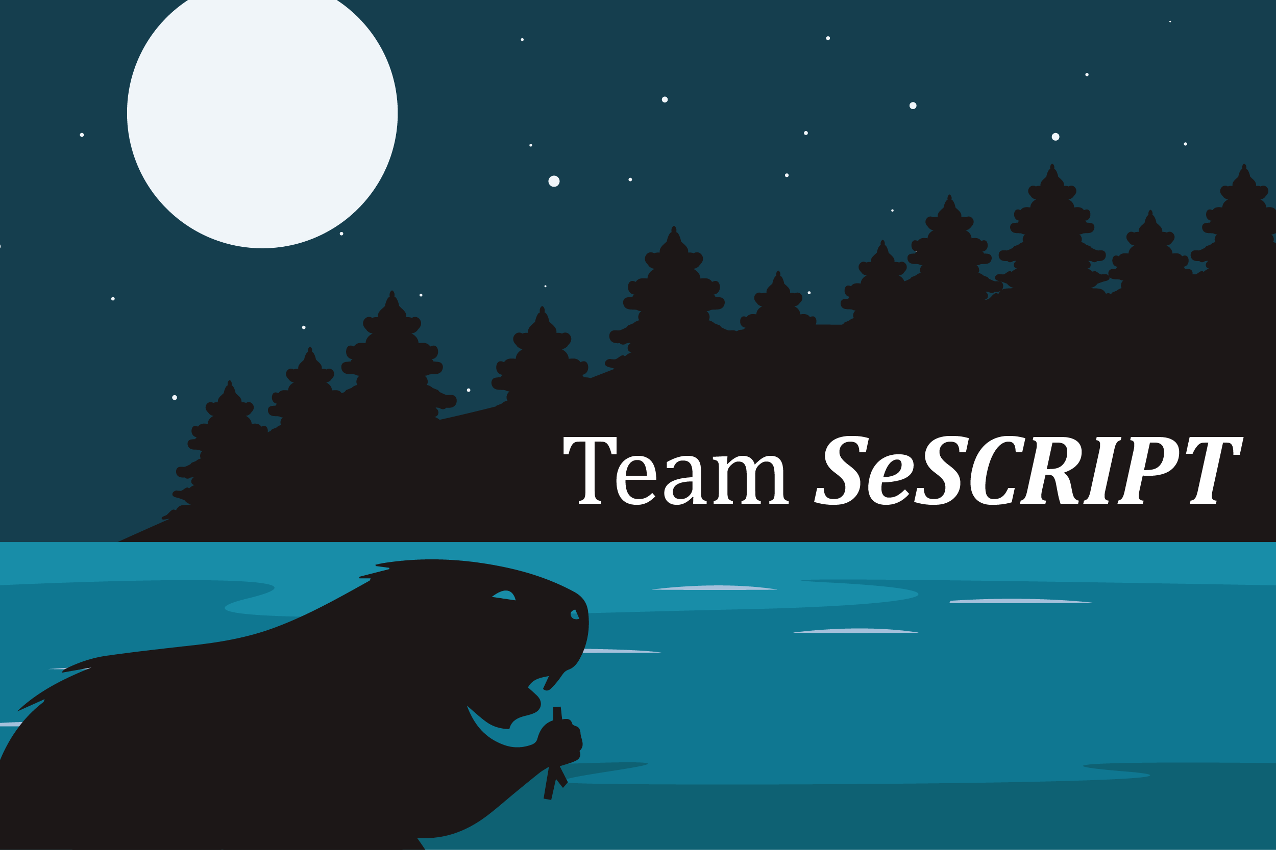
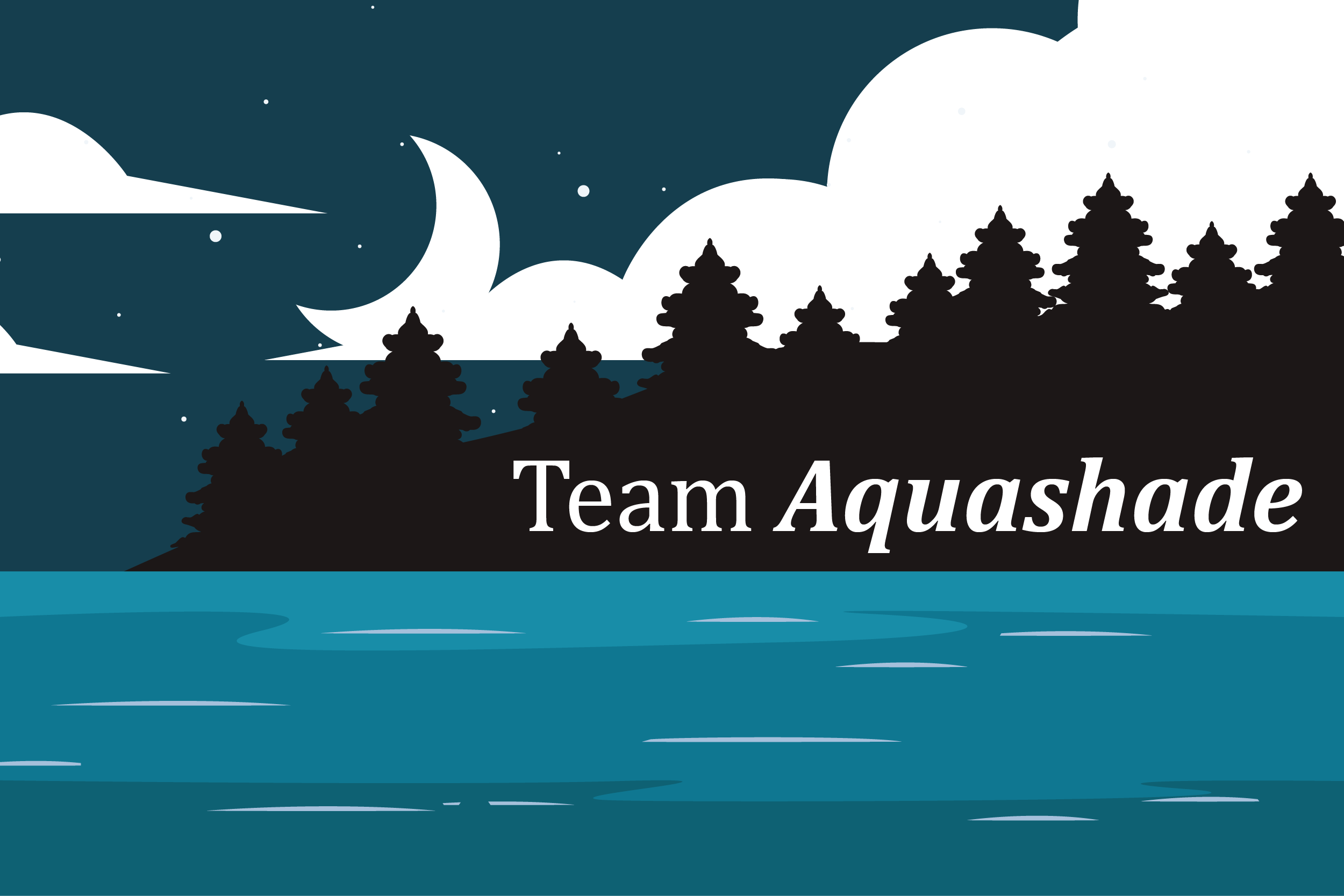

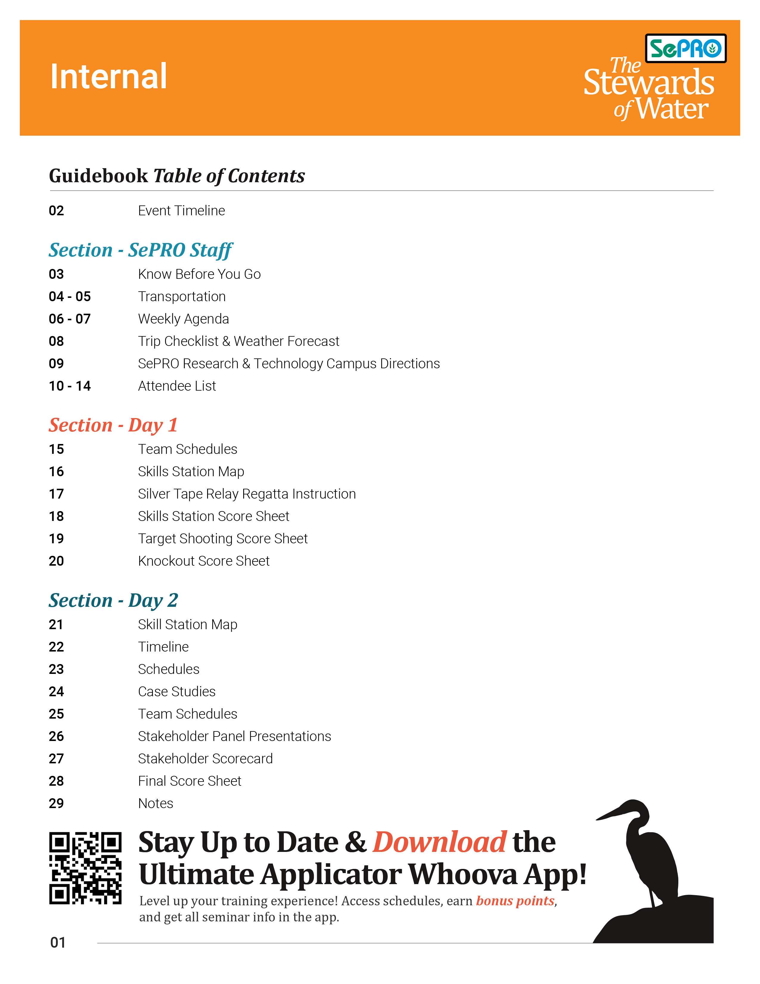
To improve the attendee experience, a custom event app was made with Whoova. This one-stop platform will empower attendees to manage their entire event experience.
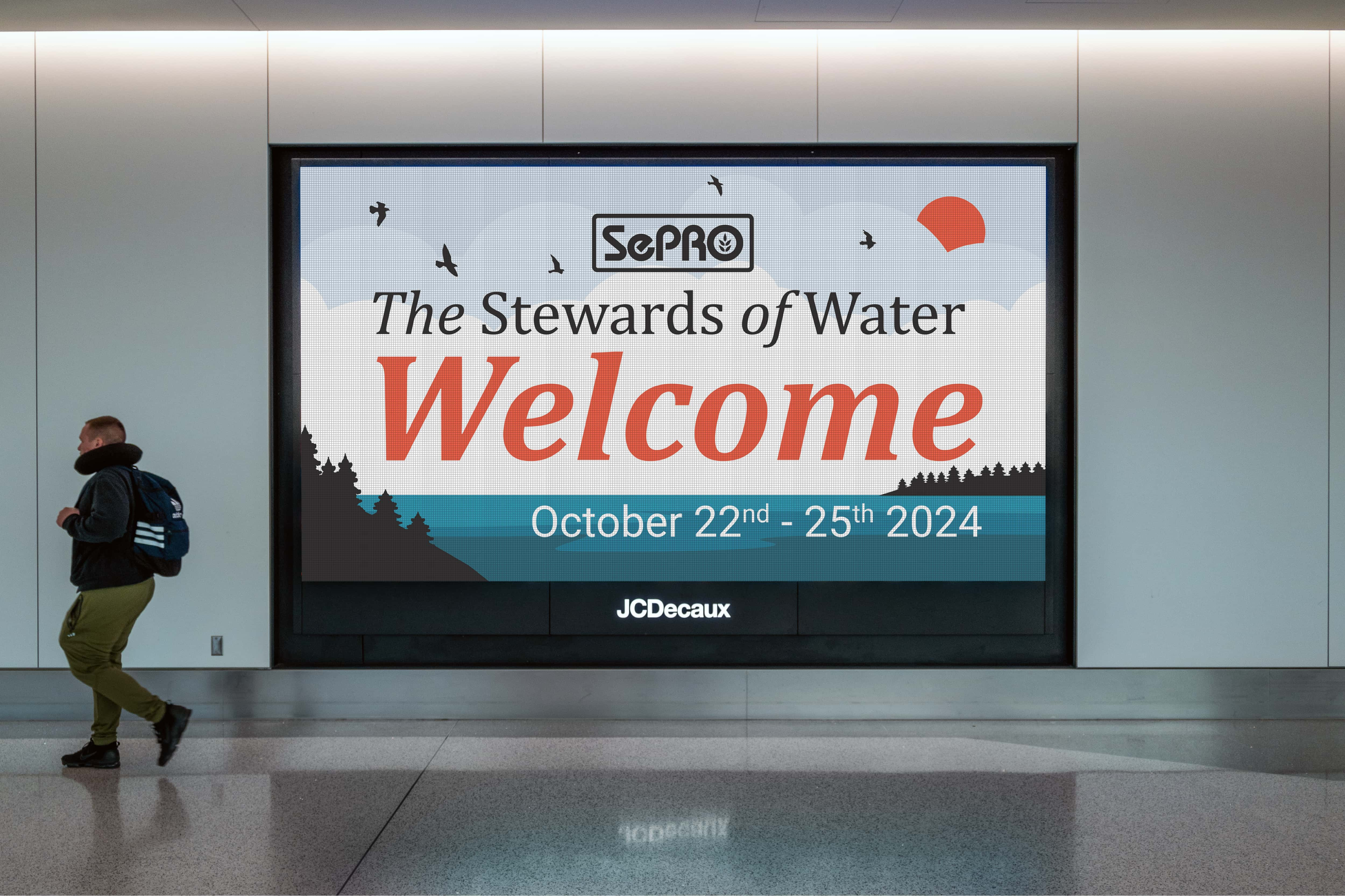

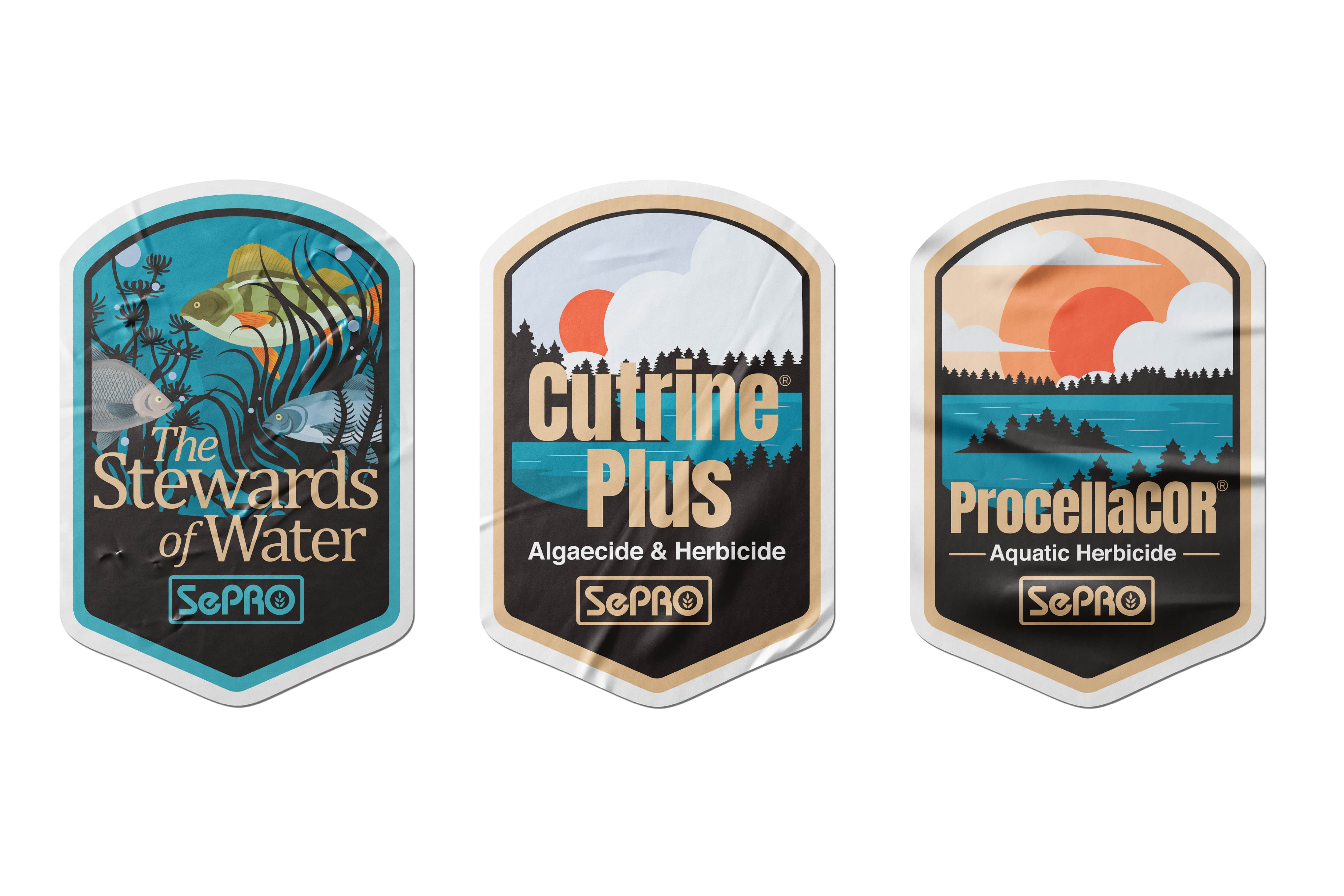

results
An Identity of Excitment
As of the writing of this case study, August, the event has not started but we have received great excitement in the teasers we have revealed and attendance for the event currently stands at a 20% increase from the previously most attended event. The team is excited for October and I look forward to following up here with user comments and thoughts come October.

continue to next case study
As part of a cross-functional team, I helped lead the creation of a full-service lab kit experience—from positioning and messaging to design, collateral, and ecommerce. See how we turned a complex diagnostic product into a co-branded, customer-ready subscription system that makes science feel simple, clear, and actionable.