bundle. brand. deliver.
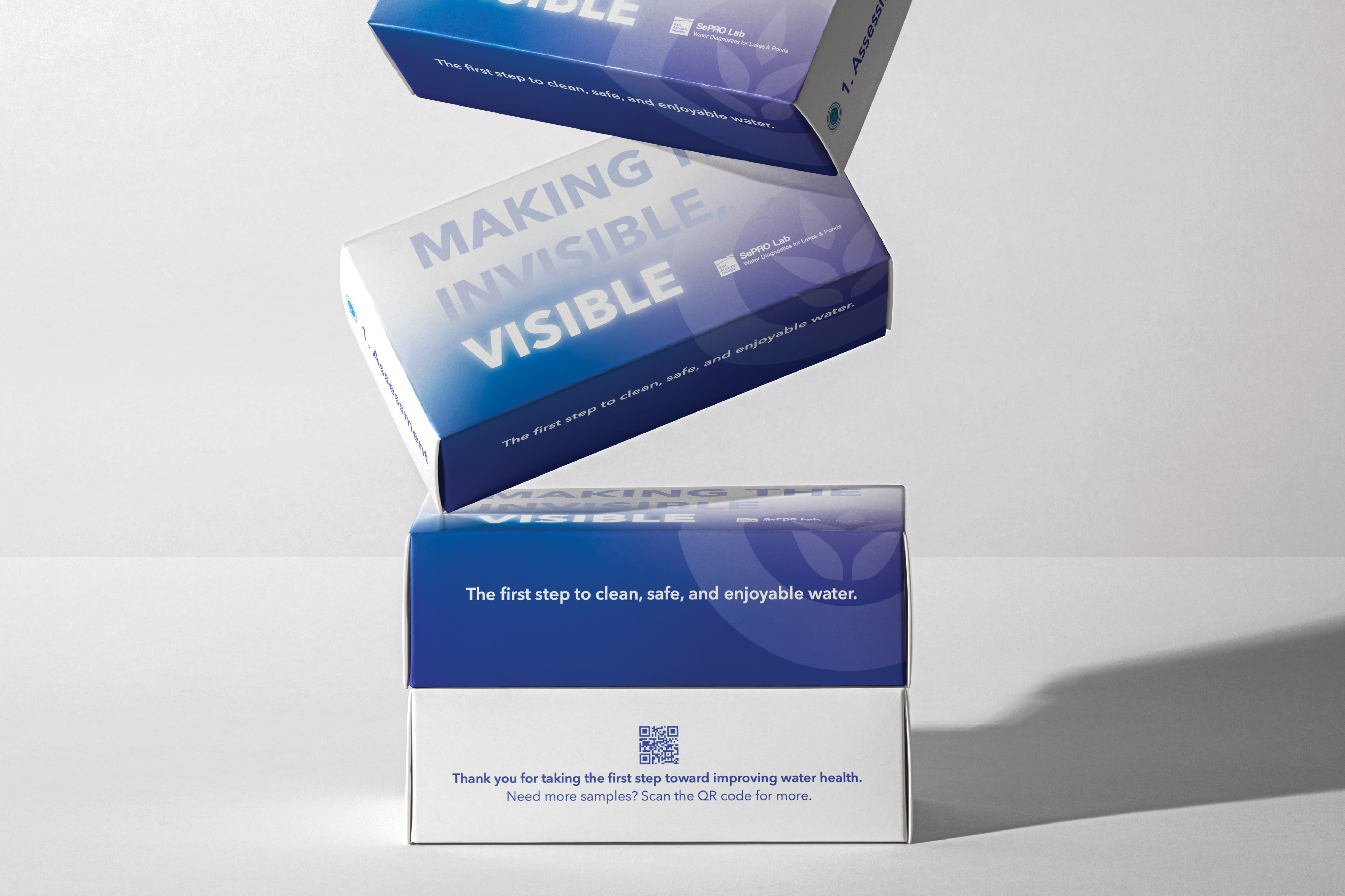
Created a full-service lab kit experience
Caleb’s attitude, teamwork, and commitment were instrumental in enhancing our marketing targeting and developing a new lab diagnostic bundle. His insight, dedication, and collaborative mindset set a strong example for the entire team and significantly contributed to our success.”
— Executive Leadership Team, SePRO

the brief
Designing the Experience
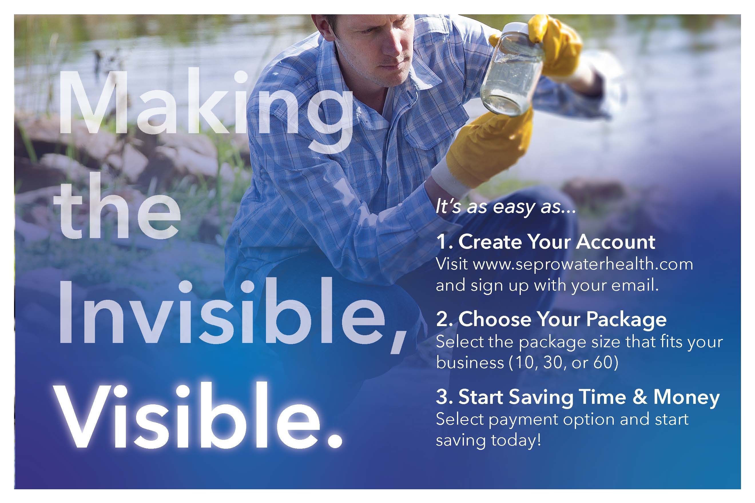
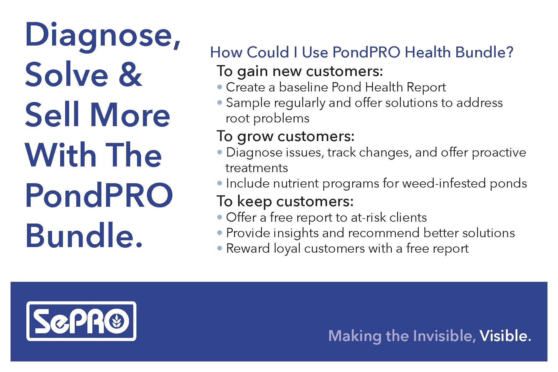
The Lab Bundle Kit was created at the intersection of two rising needs: the growing popularity of subscription-based products, and SePRO’s goal to expand its lab services through a scalable, business-to-business model.
Designed to be sold to water treatment businesses, who in turn offer it to their customers, this product solves real-world problems on both sides of the equation:
- Businesses stay stocked and ready, no waiting, no reordering, no downtime.
- End users get timely diagnostics, faster answers, and smarter solutions, without needing to seek out SePRO themselves.
This recurring kit takes the guesswork out of water testing. Everything arrives on time, every time, eliminating the need to remember schedules or reorder supplies. It saves time, labor, and money, while building trust through consistent, science-driven results.
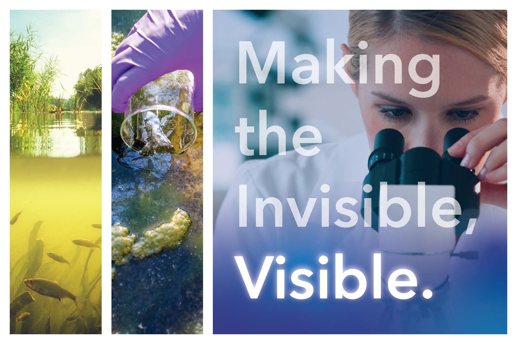
But beyond convenience, the Lab Bundle Kit was built with a bigger purpose: “Making the Invisible, Visible.”
Unlike companies that only treat the symptoms, this diagnostic kit helps identify the actual cause of water quality issues. With a full-spectrum lab analysis, users gain real insight into what’s happening beneath the surface, so they can act with confidence and a true plan of action, not assumptions and reactions.
From concept to execution, the bundle was designed around simplicity and ease. For businesses, it’s a plug-and-play solution they can promote with confidence. For their customers, it’s a stress-free path to cleaner, healthier water, grounded in data, not guesswork.
And throughout it all, SePRO embraced its StoryBrand philosophy, making the customer, not the company, the hero of the story. SePRO simply plays the role of guide: empowering professionals to solve meaningful problems in their communities and become the trusted resource their customers rely on. Because at the end of the day, when our customers succeed, so does SePRO.
the problem
Branding Challenges & Creative Problem-Solving
One of the core challenges we faced was developing branding and imagery that could serve multiple purposes without causing confusion. The collateral needed to feel SePRO-authentic, maintaining our brand’s professionalism and trust, but also remain flexible enough for third-party water treatment businesses to personalize and use as their own.
This created a careful balancing act:
- The visuals had to reflect SePRO’s authority and expertise, without overshadowing the businesses promoting the product.
- The language had to be clear and inviting, eliminating technical jargon that could overwhelm the end user, while still delivering precise information.
- Every piece of collateral, from flyers to instructions, needed to feel polished yet approachable, and modular enough for businesses nationwide to edit, co-brand, and distribute with ease.
- Most critically, we had to communicate the concept of “making the invisible, visible”. Explaining that this kit reveals underlying causes of poor water quality, without getting too technical or confusing the user. The message had to educate without alienating, and inspire trust without sounding clinical or critical.
We repeatedly tested and refined messaging to ensure it anticipated customer questions rather than created more. Simplicity became the filter for every design decision, from iconography and typography to the copy tone and call-to-actions.
Ultimately, the result was a brand-forward yet co-brand-friendly system that communicates clarity, builds trust, and helps drive adoption, both by the businesses we support and the customers they serve.
results
Thoughtful Brand Adaptation
To strike the right balance between brand consistency and partner customization, we selected a deeper blue tone from within SePRO’s color palette. This shade differs from the commonly used SePRO blue, allowing the materials to maintain a strong visual connection to our brand without feeling overwhelmingly branded.
This subtle color shift ensured that partner businesses could confidently use and adapt the collateral in their own marketing efforts, helping them promote the Lab Bundle Kit to their customers without the materials feeling too corporate or exclusive to SePRO alone.
Additionally, some collateral was designed to be easily editable, enabling partner businesses to add their own logos and personal contact information. This flexibility empowered them to localize the materials, making the Lab Bundle Kit feel like a seamless extension of their own customer communications.
for the end user, the message is simple:
If you’re tired of continually treating your water without lasting results, it doesn’t have to be that way. With this kit, you can finally get ahead of the problem, by identifying and treating the actual cause. Because everyone, from our children to our pets, deserves clean, safe, and enjoyable water.

website research & creation
To support the launch, we built a Shopify-based ecommerce site that mirrors the best of modern subscription experiences. Our web research focused on brands like BarkBox, HelloFresh, BeanBox, and Loot Crate, leaders in subscription services with simple, high-converting flows.
We learned that the most successful sites:
- Explain the offer clearly within 2 minutes
- Allow users to subscribe fast and without friction
- Prioritize benefits over features
So, our site followed suit: clear copy, visual storytelling, and a streamlined path from interest to checkout. It’s intuitive, mobile-ready, and built to support recurring subscriptions with zero hassle, for both business owners and end users.
takeaways & a funny end
This project proved the power of combining clarity, flexibility, and storytelling. By aligning with StoryBrand principles, guiding our customers, not spotlighting ourselves, we built a product that was easy to promote, easy to adopt, and easy to love.
One funny surprise? During the build phase, a customer somehow found our test website (yes, still labeled “Under Construction”), and subscribed to a kit anyway. No ads, no formal launch, just a good product and a clear story.
Sometimes, when you put the right tools in the right hands, people show up before you’re even ready.

continue to next case study
I helped lead the creative direction, messaging, and multi-channel strategy behind SePRO’s yearlong print campaign. Explore how we brought clarity to complexity, building a monthly cadence of results-driven ads that earned attention across Turf, Landscape, Ornamental, and Ag. From concept to copy to final print, we proved that with the right strategy, print still delivers.