words that work
Led redesign of Trail’s End Fundraising Guidebook and other collateral pieces.
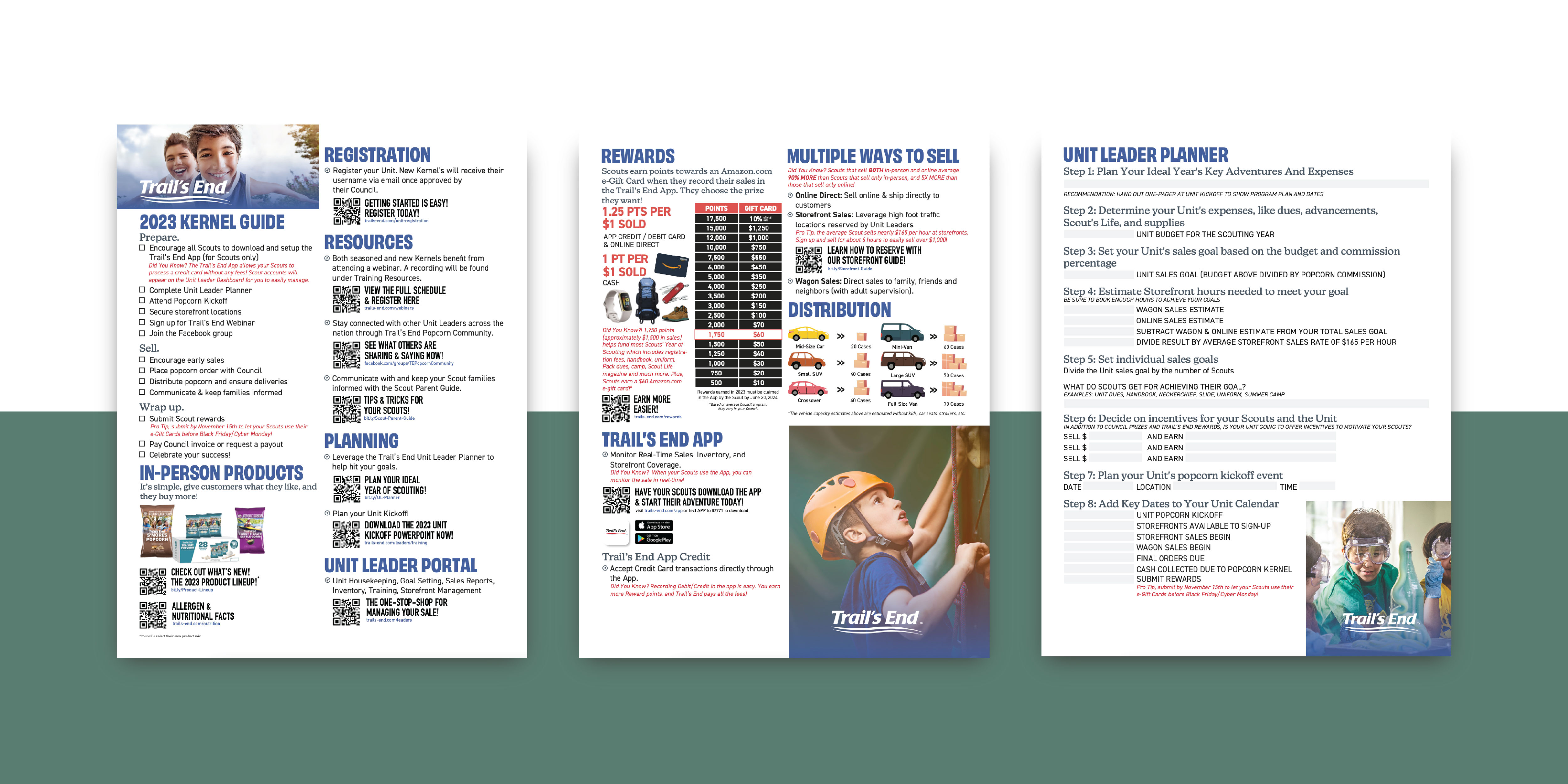
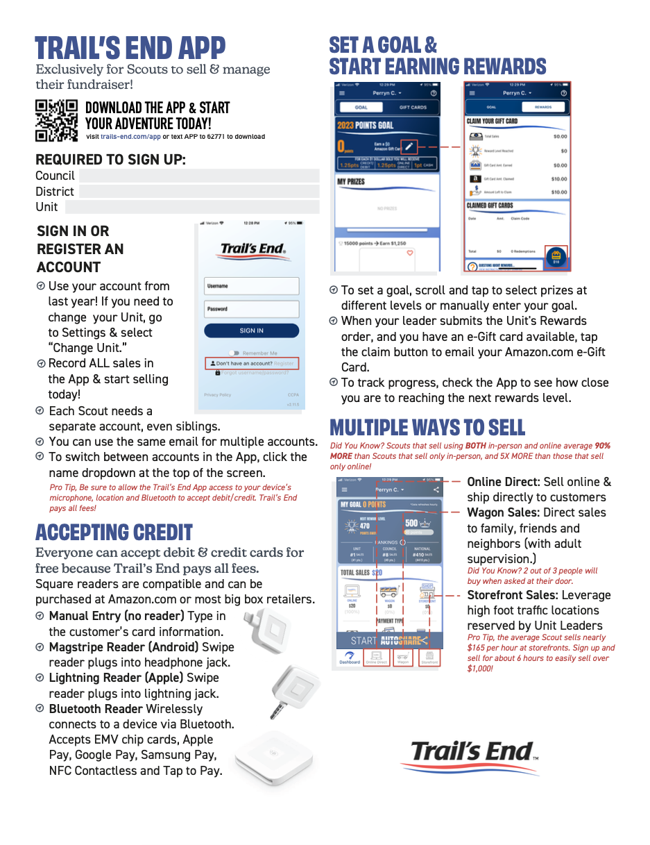
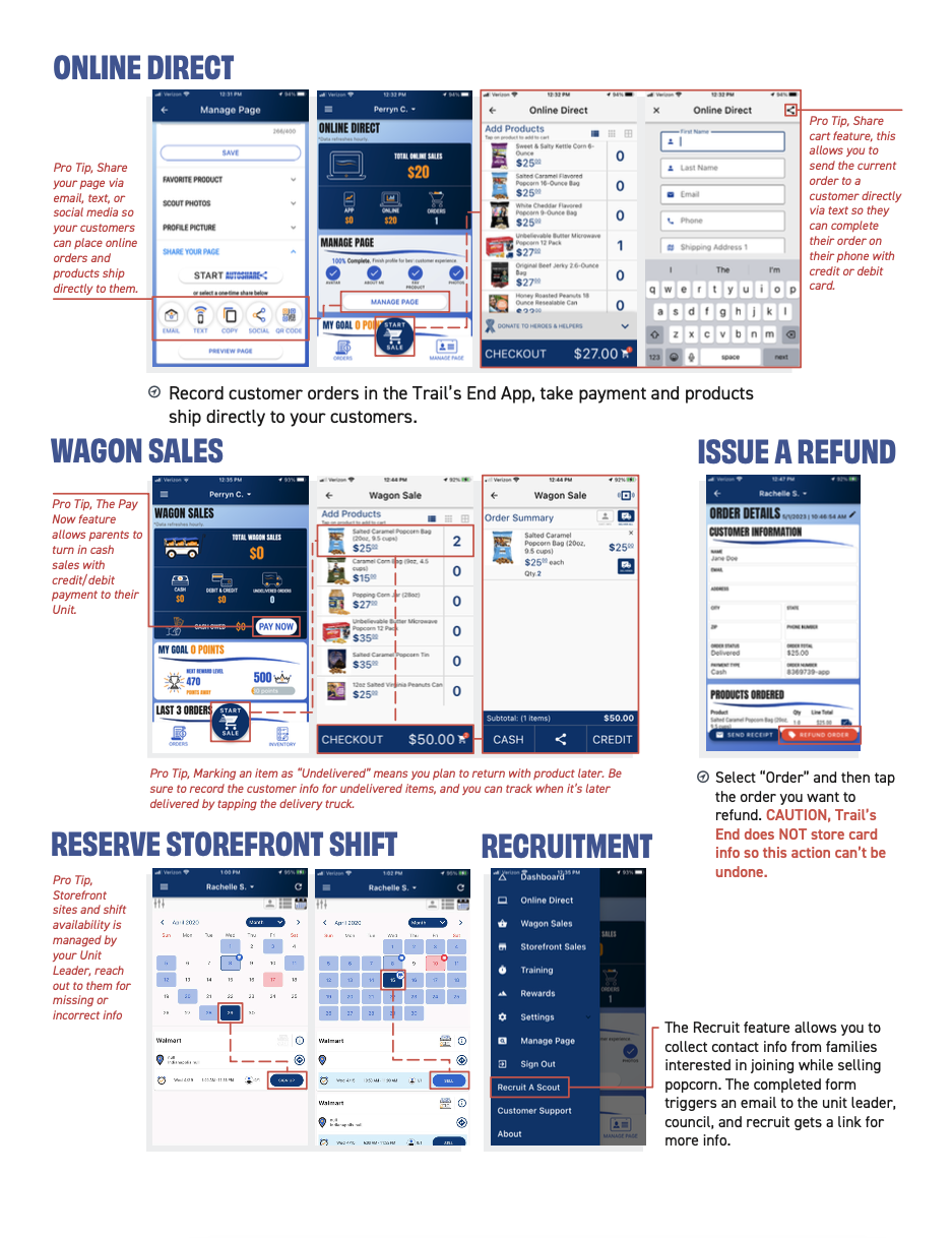
The Trail’s End guidebook is the center for all data and instructions for fundraising activities at Trail’s End. It is the ideal place for Scouts and parents to visit when they need aid in selling their products easily and successfully.
the challenge
Simplify.
The collateral was too complicated and muddled the clear-cut sale we were trying to make. Its presentation felt outdated and didn’t appeal to our target audience of kids eager to sell and busy volunteers. We needed to focus on simplifying it and making it more modern and attractive.
- Unclear Sales Message: The collateral was cluttered and didn’t effectively communicate the simple sales pitch.
- Outdated Design: The presentation felt dated and failed to resonate with the target audience of tech-savvy kids.
- Lack of Appeal for Volunteers: The collateral wasn’t engaging for busy volunteers who needed clear and concise information.
- Complexity for Users: The materials were difficult to understand, hindering both kids’ sales efforts and volunteers’ ability to provide guidance.
kickoff & discovery
A Mammoth Task
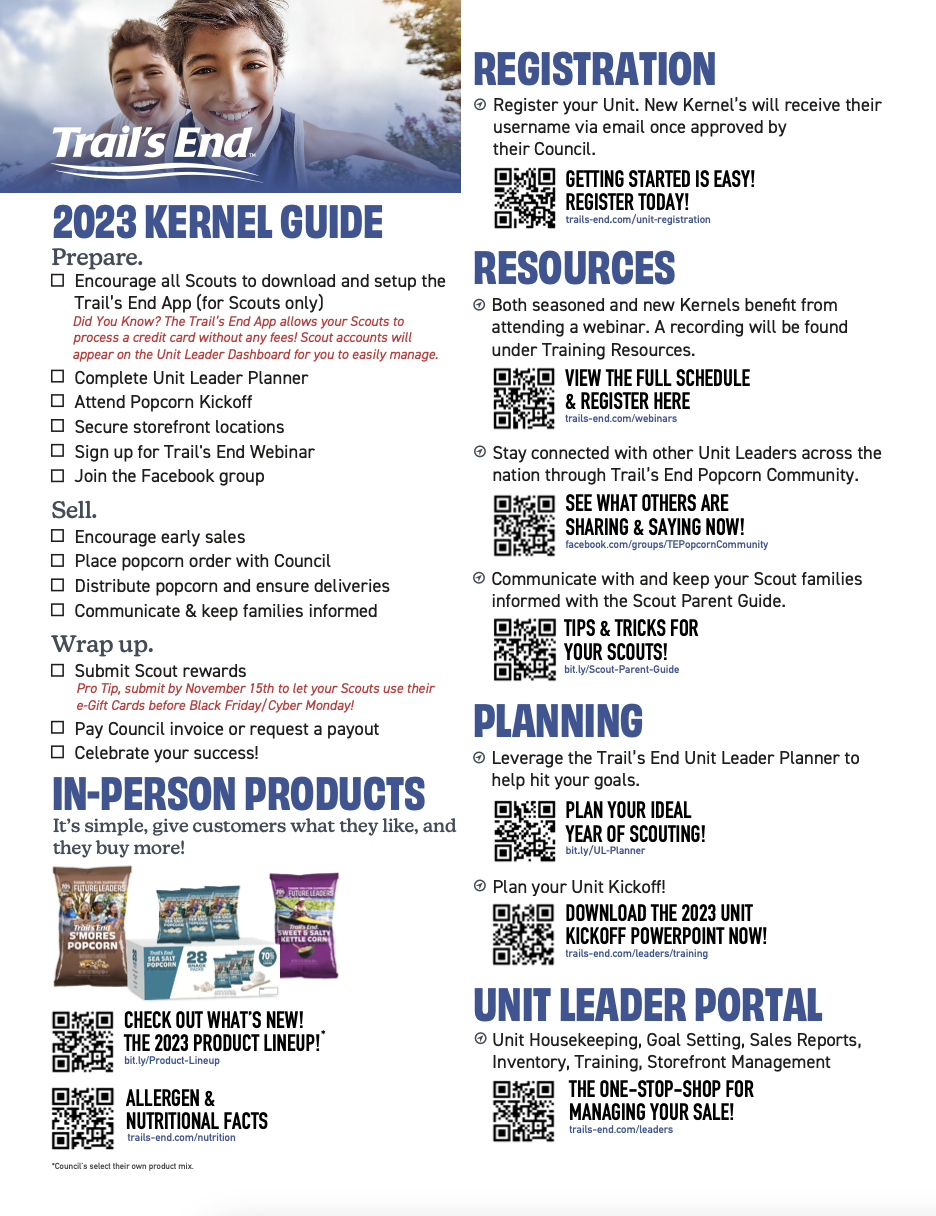
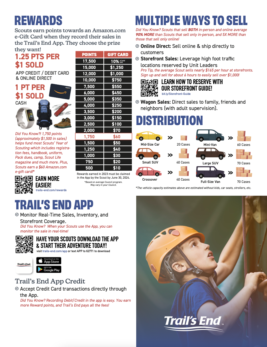
We faced a daunting task: transforming a 32-page popcorn fundraiser guidebook for scouts into a single, digestible page. We embarked on an intense editing mission. Duplicate information, outdated tips, and unnecessary details were cut and important information was simplified and made more accessible. This initial round yielded a significant reduction, but we were still far from our goal. At 7 pages, the guide remained intimidating.
the result
An Epiphany
The answer was staring us in the face – QR codes! These little squares became our portal to a world of detailed information. This approach catered perfectly to the busy lives of both scouts and parents. The one-page guide wouldn’t overwhelm them on first glance. It offered a clear picture of the basics, putting them in control without feeling intimidated by a massive document. For those who craved more granular details, the QR code provided a convenient on-demand resource. This innovative solution, marrying simplification with technology, transformed our cumbersome guidebook into a user-friendly launchpad for a successful popcorn fundraiser.
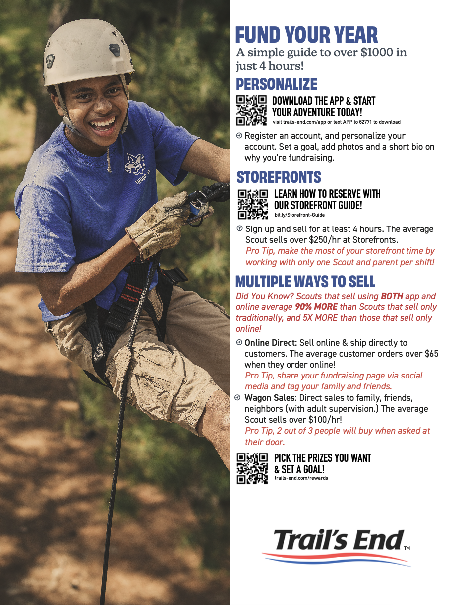
“The new popcorn fundraiser guidebook was a lifesaver! Last year, I felt overwhelmed with explaining everything to my son about selling popcorn. This year, the guidebook was much simpler and easier to follow. It had clear steps, pictures, and even a practice sales script. We were confident this time around!”
— Scout Parent
continue to next case study
Led the UI design as well as the creation and conducting of user surveys. Discover how I turned fresh ideas into a user-friendly interface that sets a new standard for podcasting enjoyment. Dive into my case study to see how I created an app that listeners love, one survey response at a time.